STRUCTURE
structure
ˈstrʌktʃə/
noun
ˈstrʌktʃə/
noun
- the arrangement of and relations between the parts or elements of something complex.
- a building or other object constructed from several parts.
IDEAS
I collected a combination of photos on pinterest that related to structure, as inspiration. I made sure to look at variety of photos that included structure in different forms like in portraits, architecture and nature.
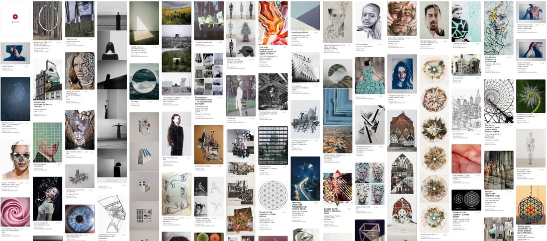
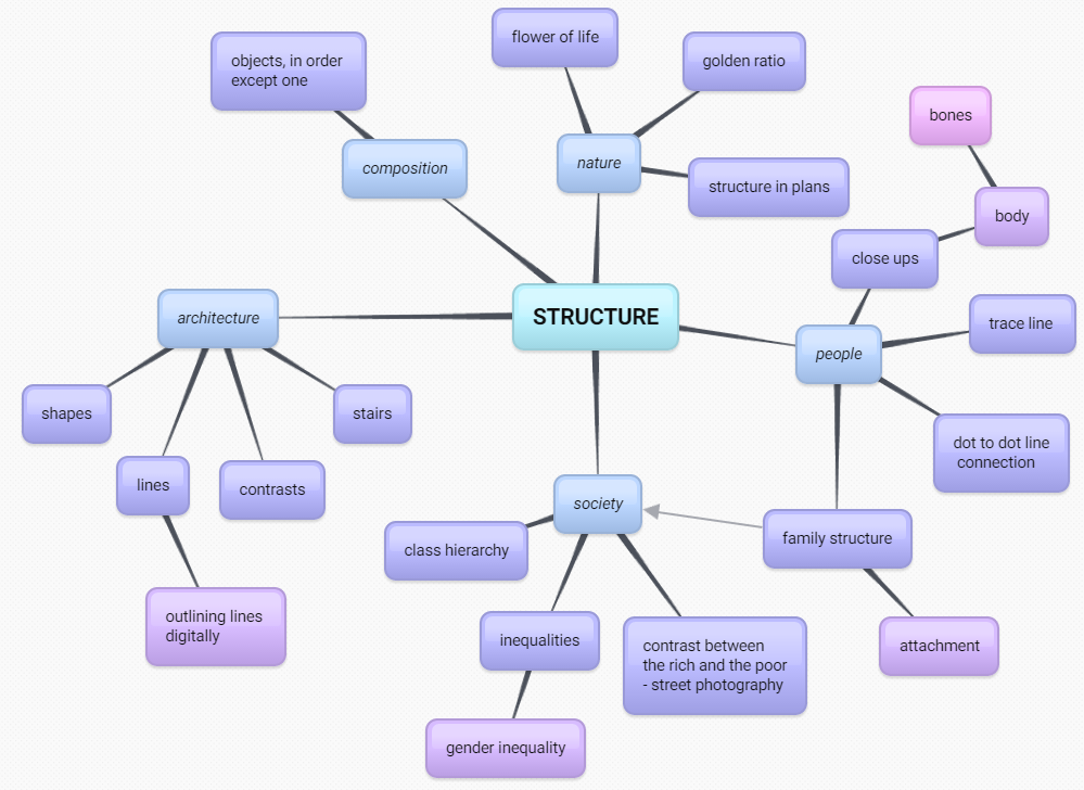
By creating a mind map of all of the things that relate to structure I produced a web of ideas that I could use for my strands as well as my final piece.
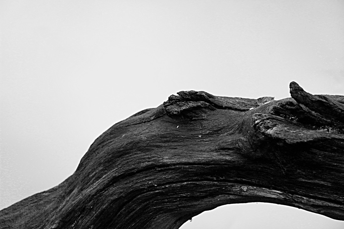
TASK 1 - STRUCTURE IN NATURE
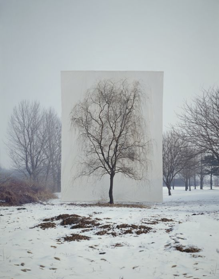
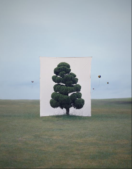
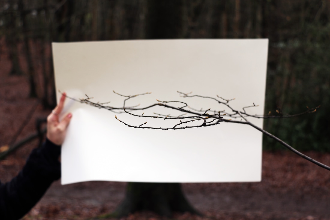
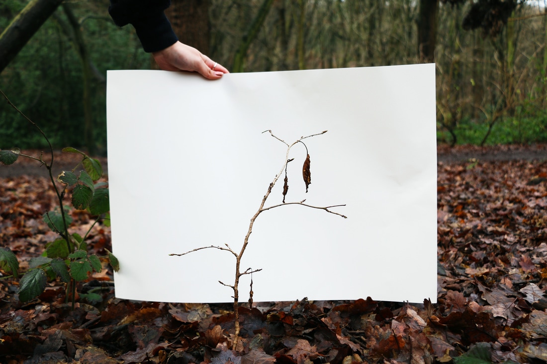
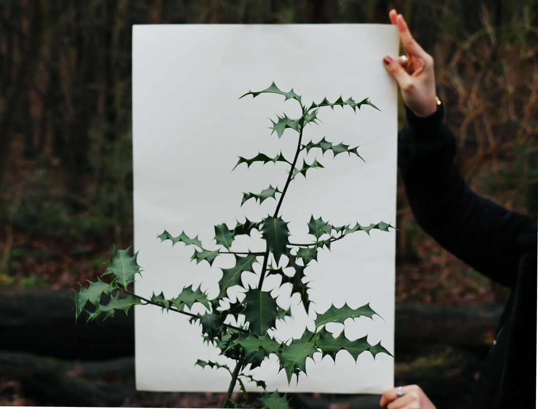
MYOUNG HO LEE:
Myoung Ho Lee is a photographer from South Korea, who focuses on nature in his work. The idea behind his photos is really simple but actually the production of the final outcome is difficult. The artist uses a white backdrop that is the same size as the tree, and places it behind it to present the tree as the main focal point of the photograph. Myoung concentrates on the foreground of the photo as much as on the background and makes sure the two still have a similar colour palette and a clear link to each other. He uses this technique of separation to emphasise the beauty and reality of nature.
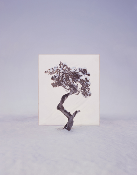
RESPONSE:
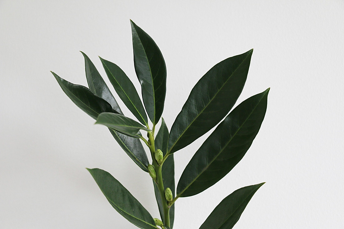
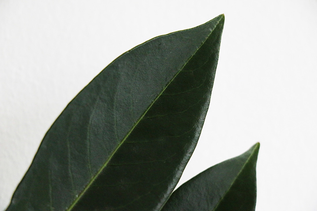
As a response to this artist, we have created a series of photographs of singular aspects of nature against a white background. I took two different photographs of the same object; I took a close up of an interesting structure in nature against a white background, and then I zoomed out so that the environment was also visible. This created a contrast and made the subject even more visible.
CONTACT SHEET:
PHOTOS:
CLOSE UPS:
EDITING:
I edited all of the photos the same way; I increased brightness and contrast, colour and sharpness. Then for the close ups, I made them black and white.
|
|
|
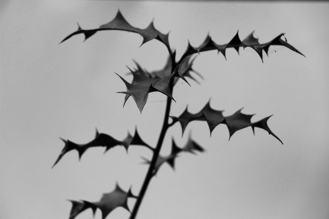
FIELD WORKS
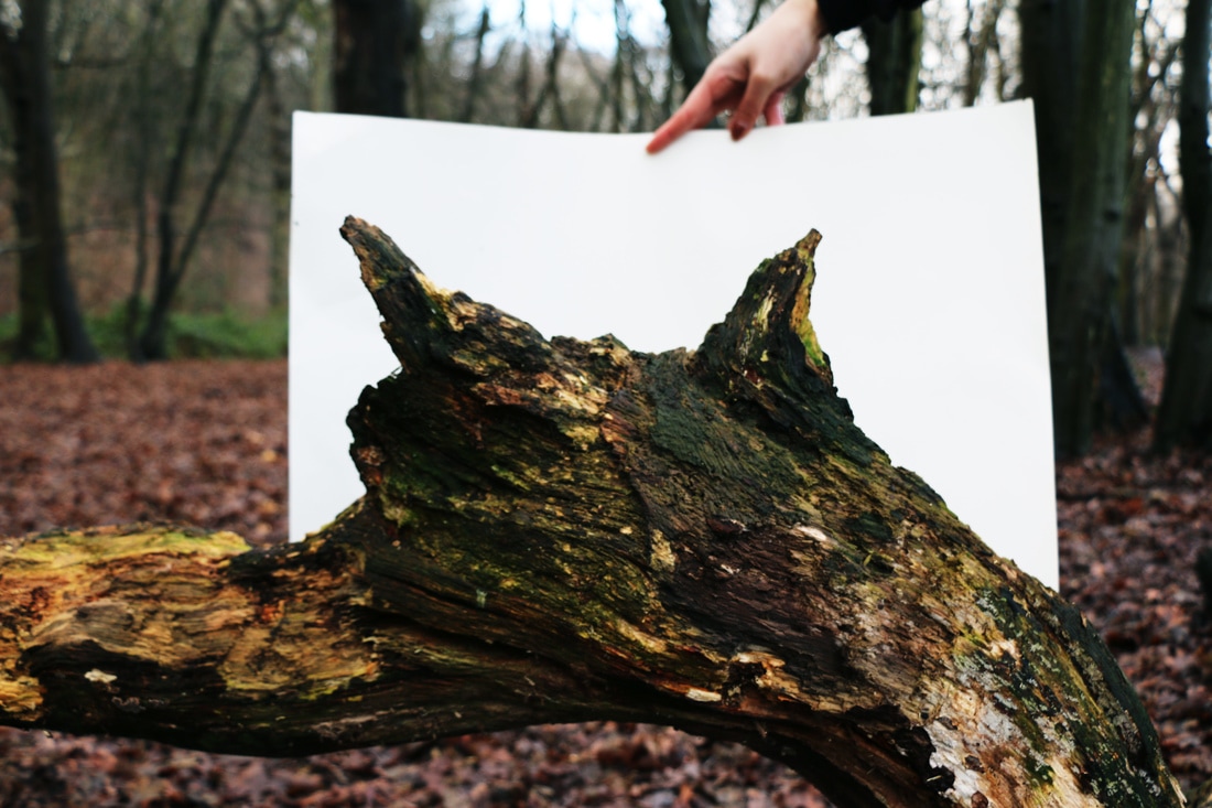
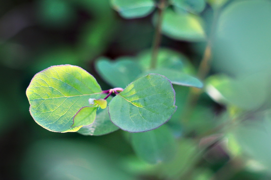
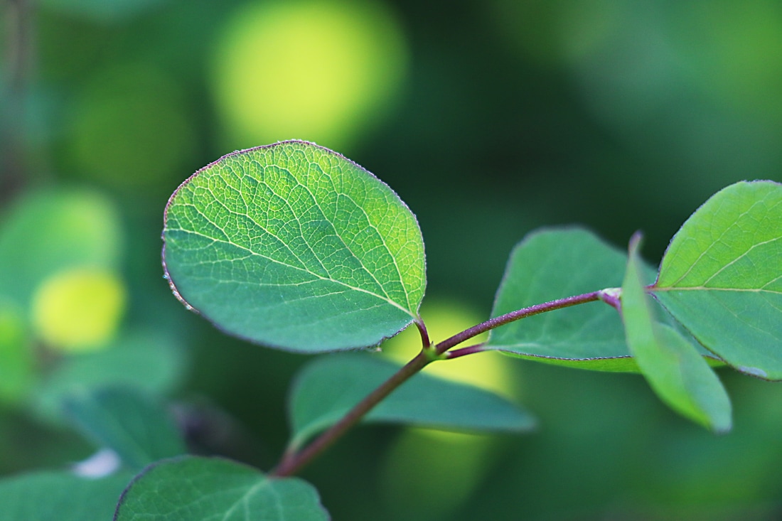
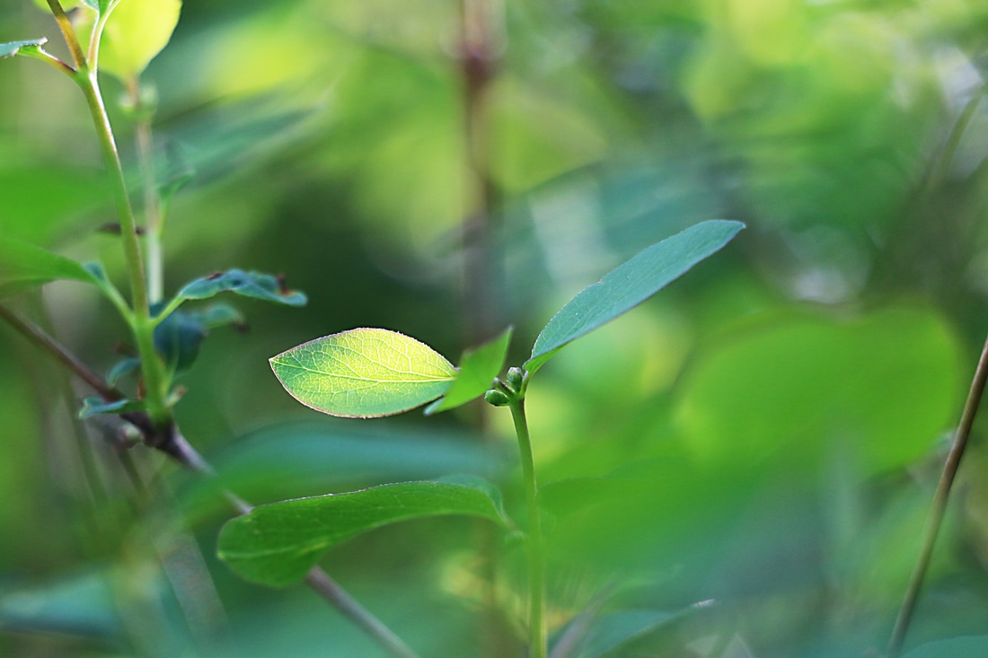
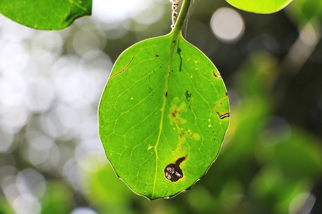
SANNA KANNISTO:
Kannisto's most recent work is a collection of photos titled 'Field Works'. She photographs nature in a conventional and artificial way; she uses studio light instead of natural and the background is usually plain white. Her inspiration comes from rainforests, science and still life paintings of the 16th century. Her work presents the interesting composition and contrast of man made structure and and structure in nature.
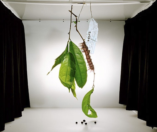
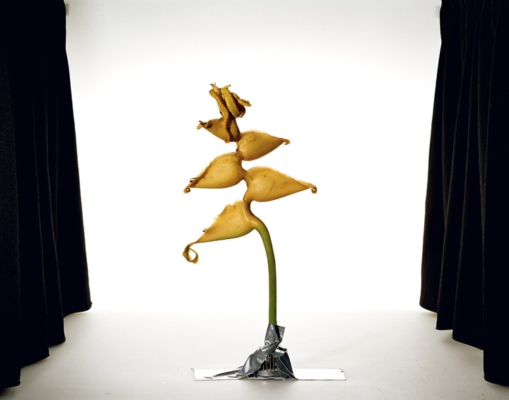
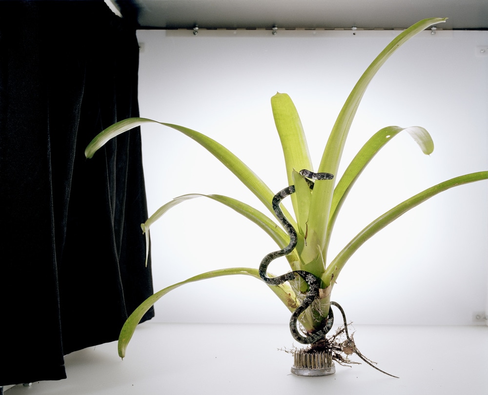
RESPONSE:
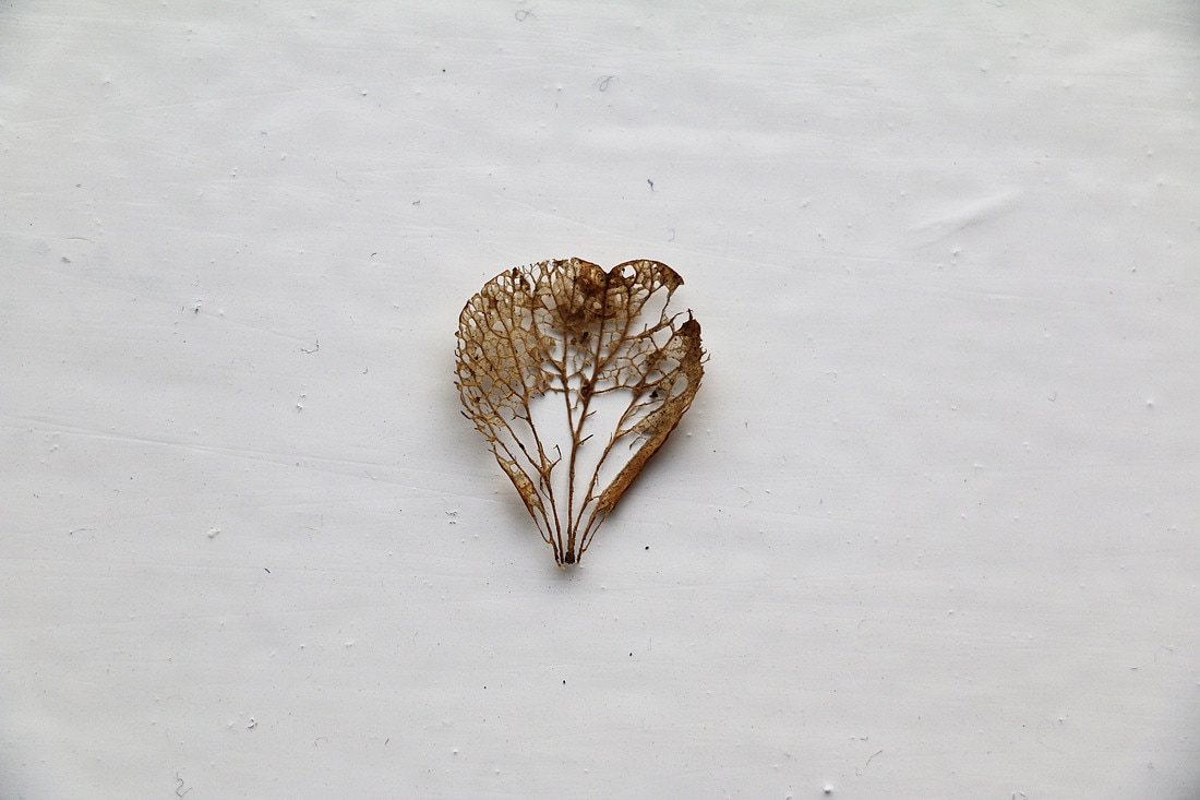
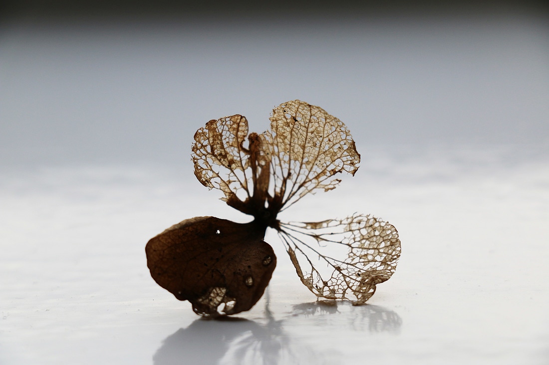
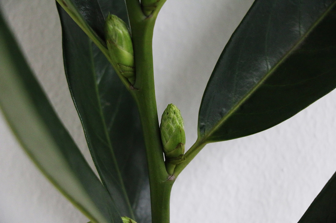
For this response, I presented the plants on a white background by taping them onto a white wall and making them the centre focus. I shot most of the photos in macro to bring attention to the detail in the structure of nature. I focused more on the structure in nature in in my response to the artist.
I wanted to recreate Kannisto's work and put my own twist to it. Instead of using artificial lighting, I used natural, and I did use a white background but I wasn't constrained to it so I also shot some close ups. I did focus on light a lot while taking these photos because I wanted these photos to be very bright in order for the detail of the plant to really show.
|

|
CONTACT SHEET:
PHOTOS:
EDITING:
|
|
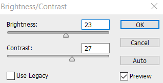
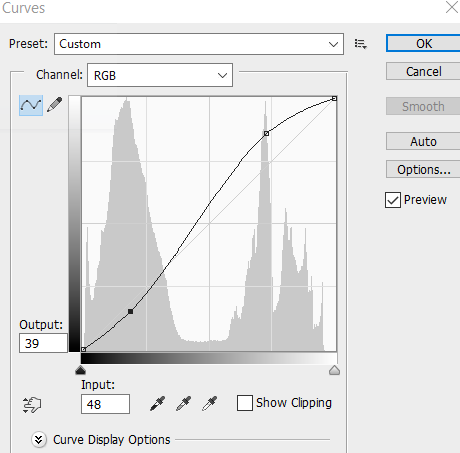
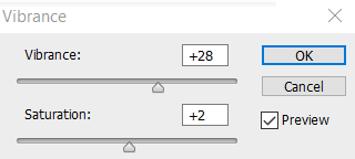
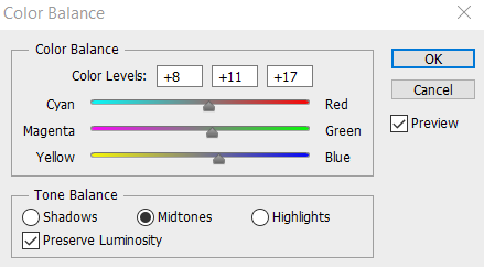
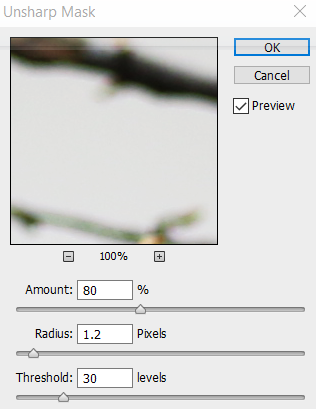
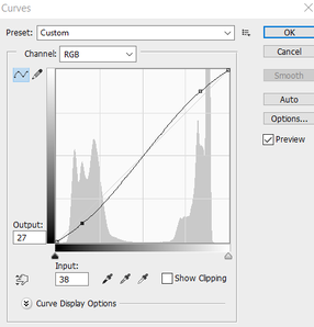
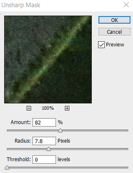
I edited all these photos in a similar way, so that they all had a theme in common. I made a 'S' shaped curve to increase the contrast and the vibrance of the shadows. Next, I sharpened the photo using the unsharp mask option, and finally increased the brightness and contrast further.
|
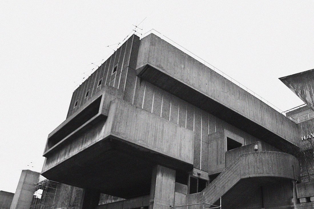
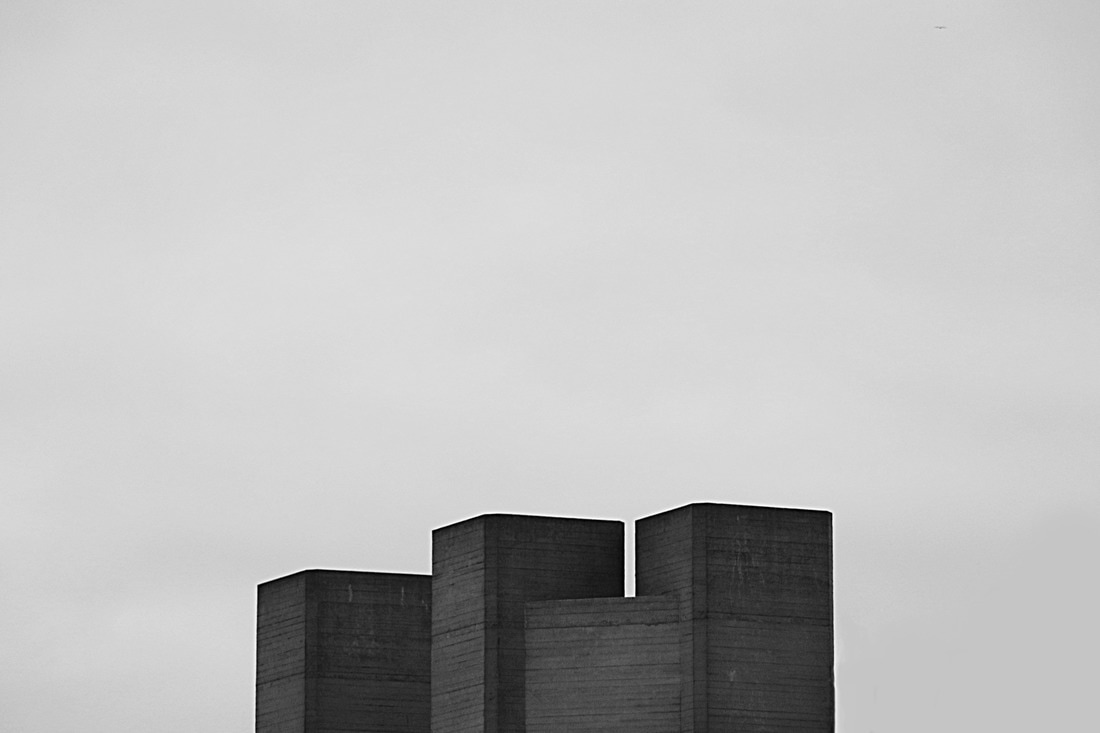
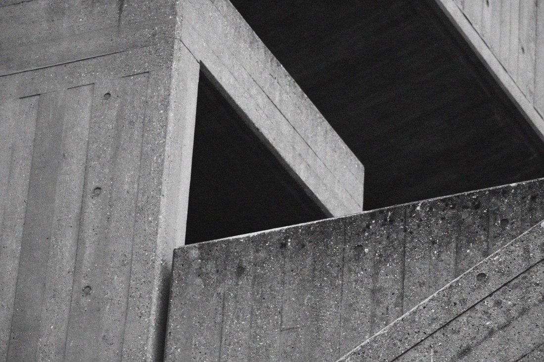
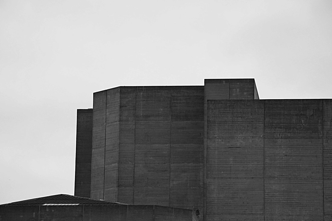
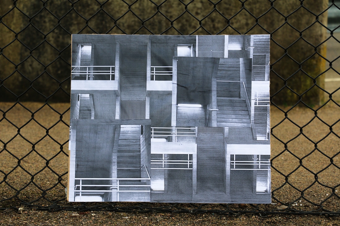
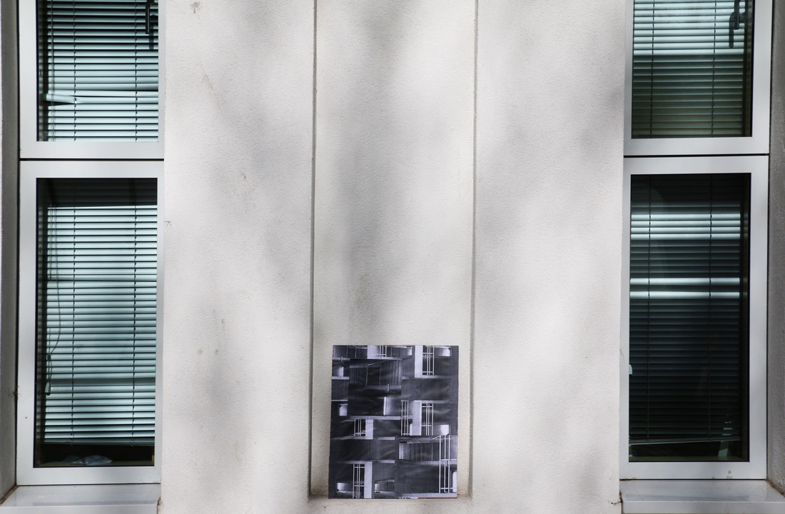
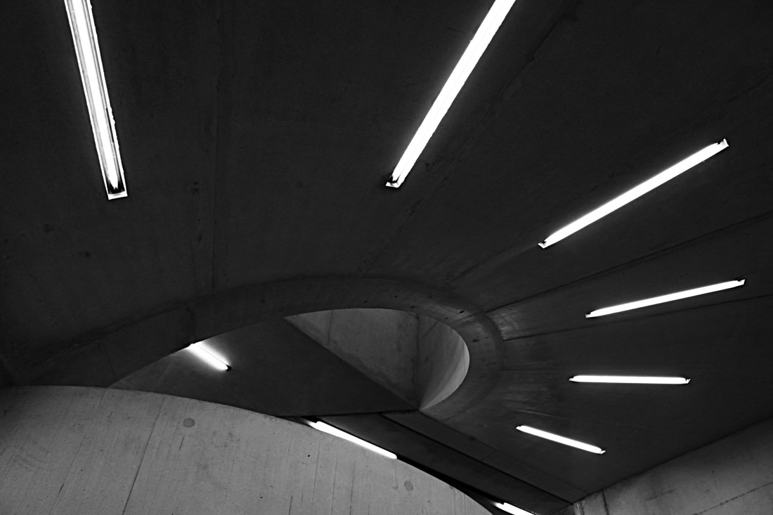
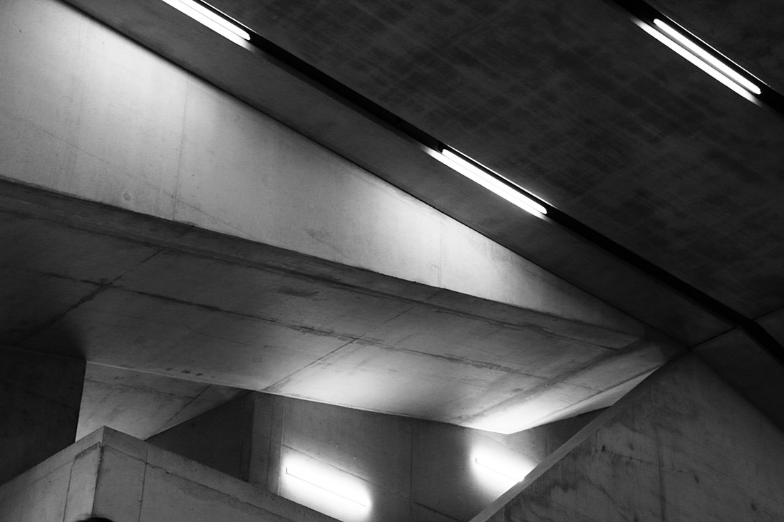
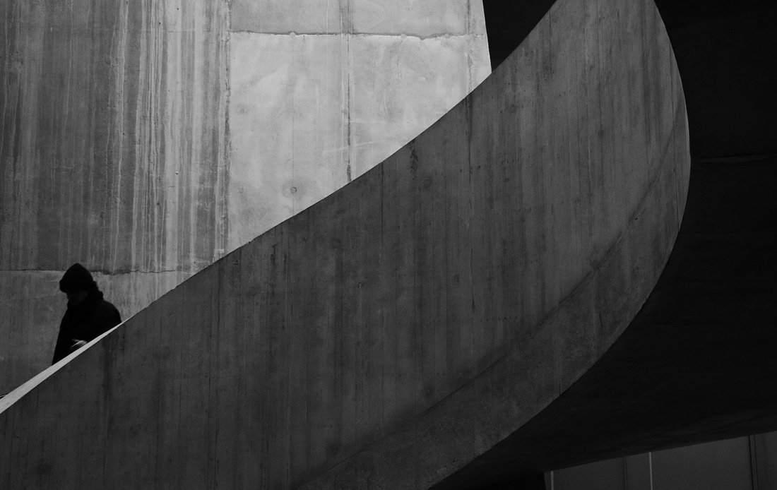
BRUTALIST STRUCTURE
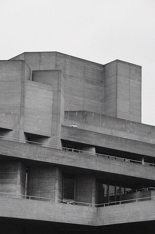
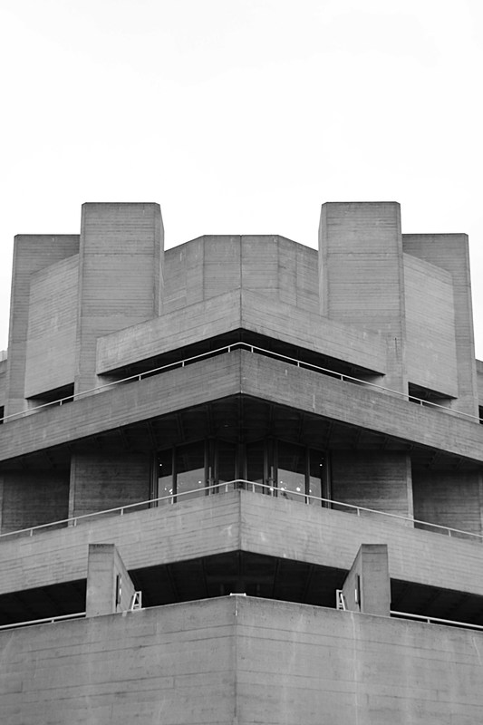
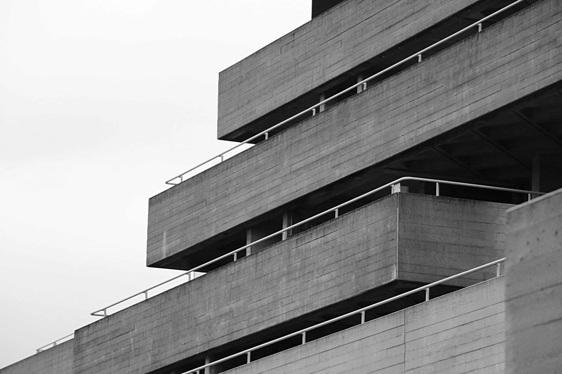
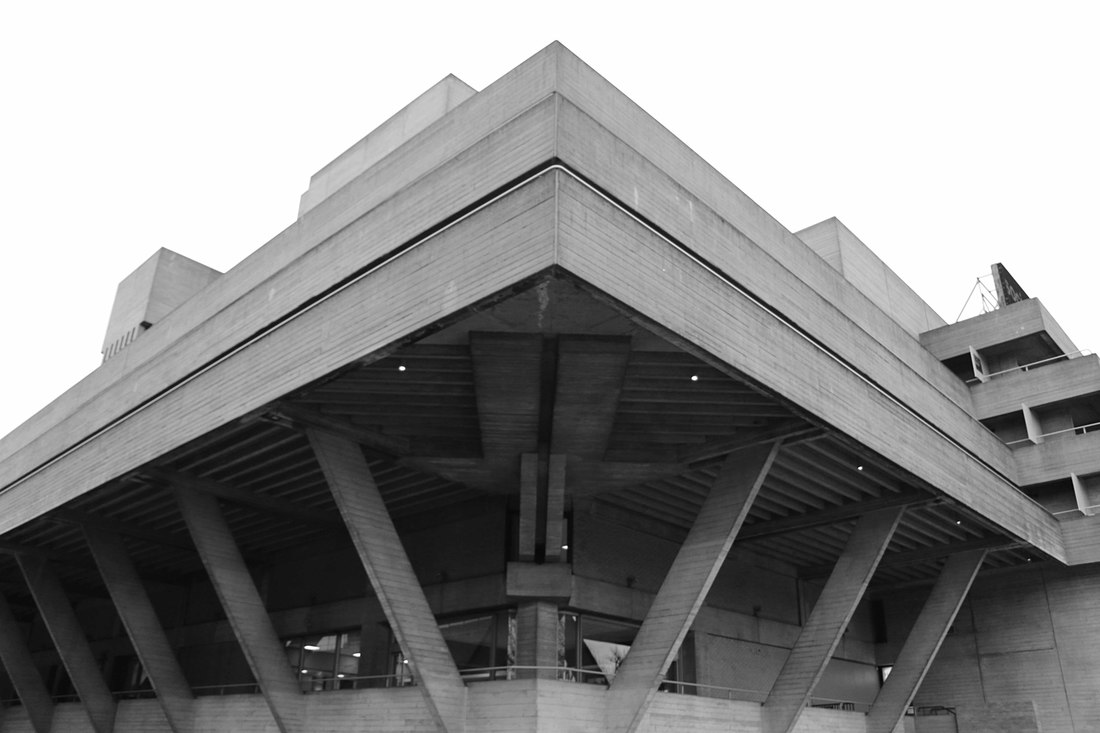
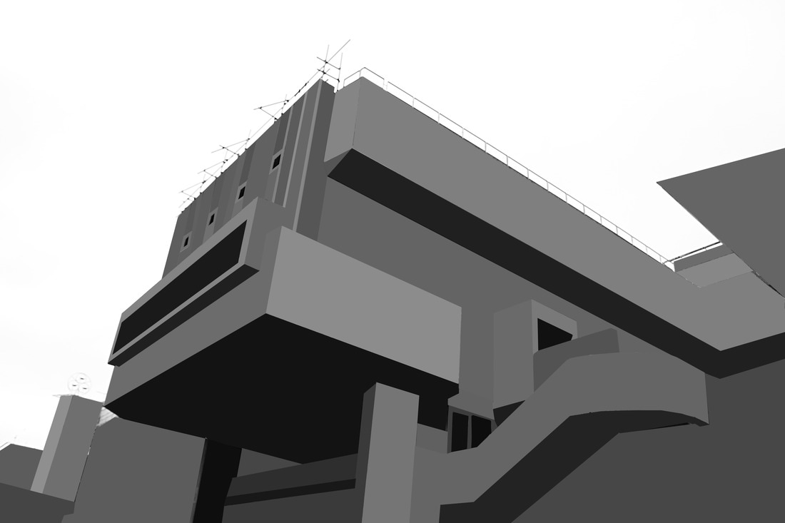
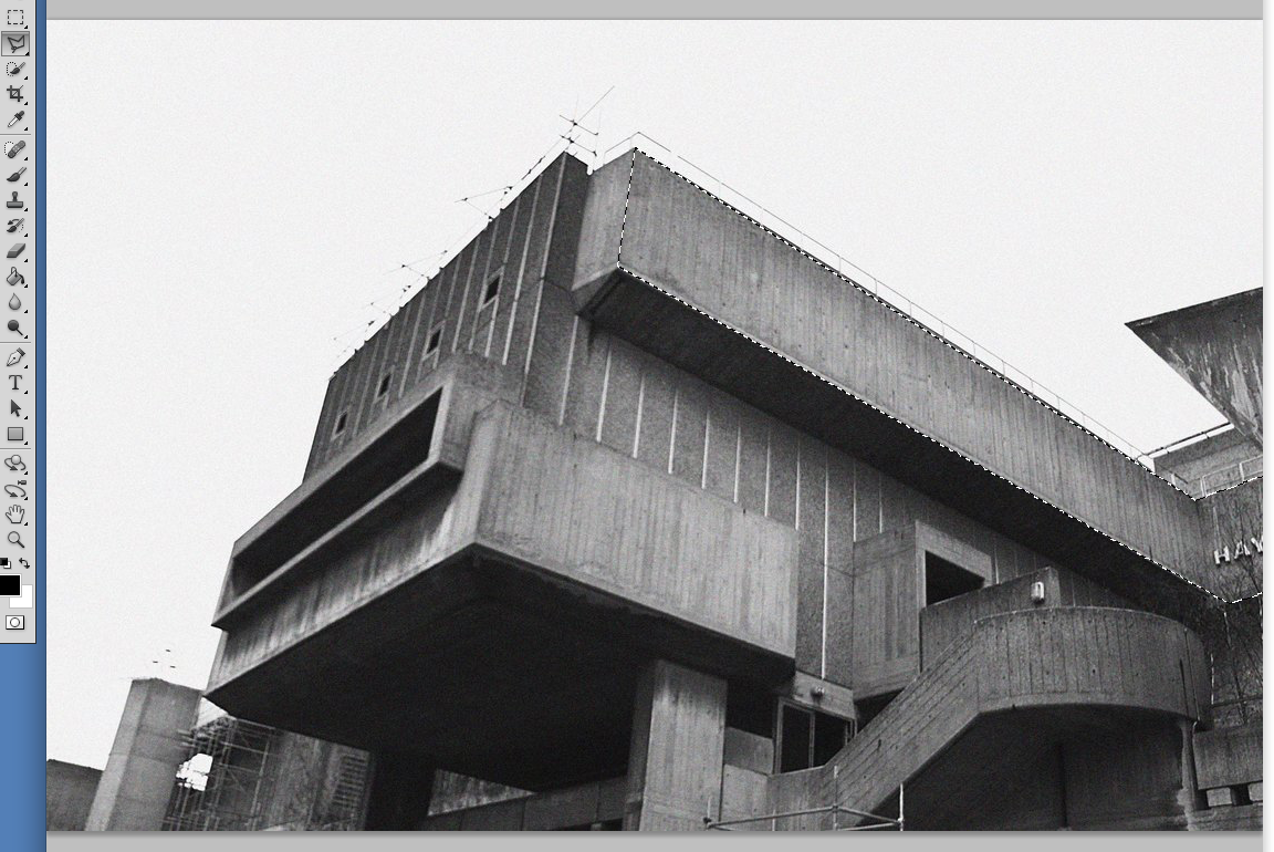
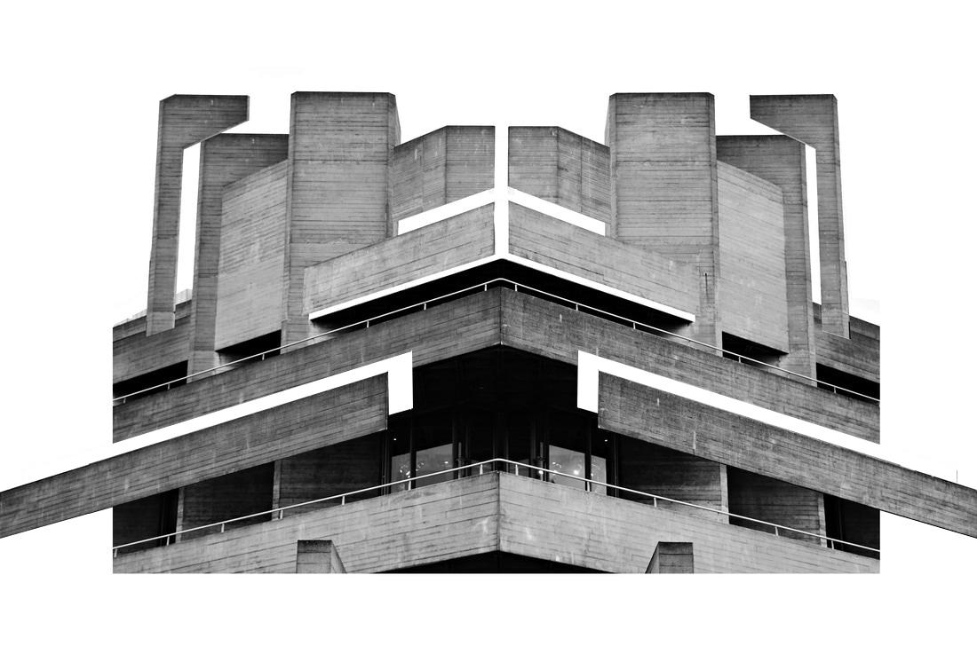
SIMON PHIPPS:
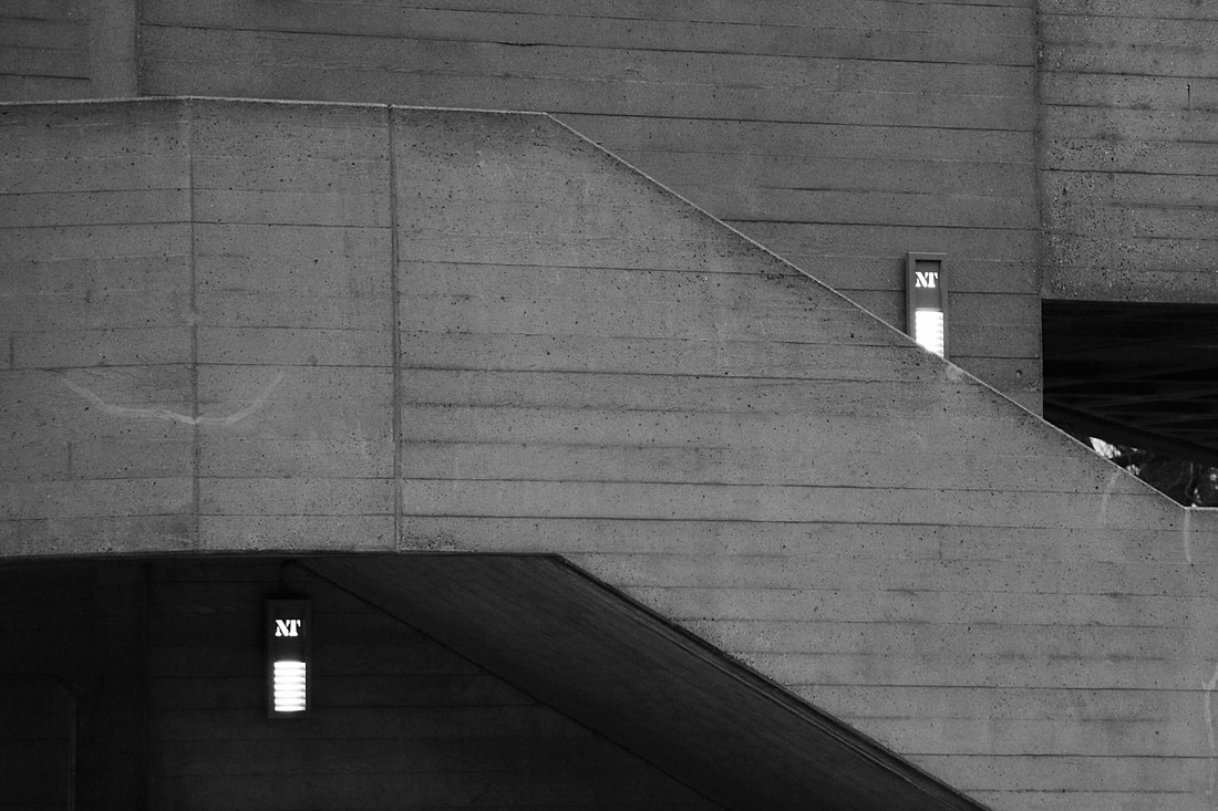
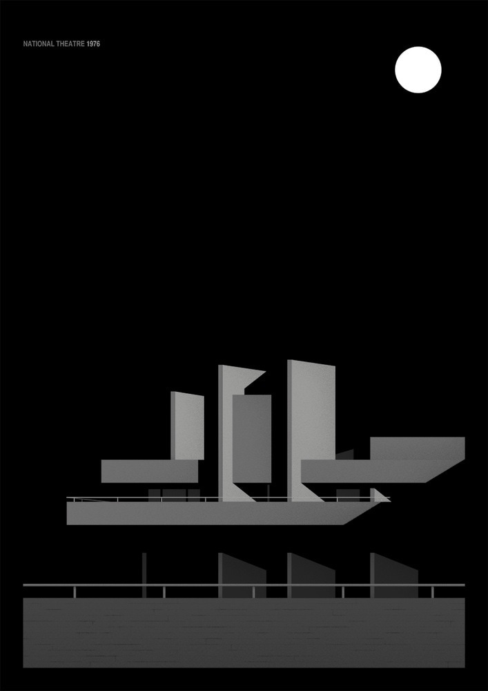
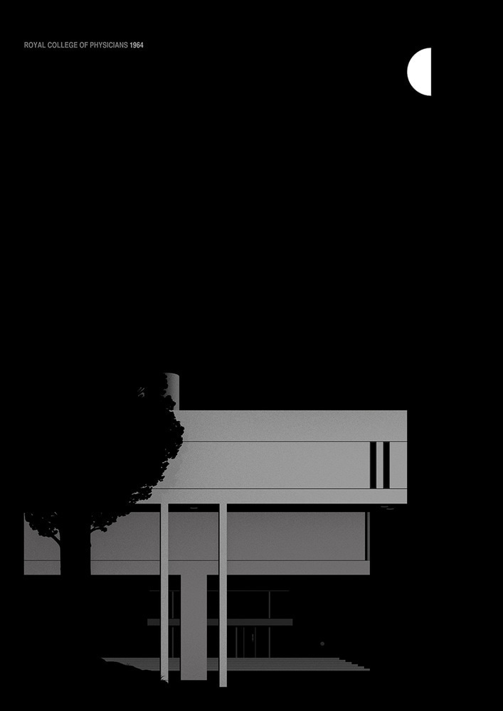
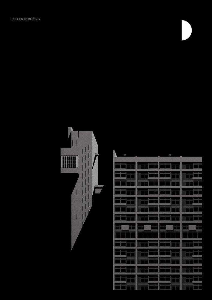
Simon Phipps is a photographer that captures the brutalist architecture around London. He visits places like the National Theatre and Balfron Towers and his photos focus on the sharp, straight lines and shapes seen in brutalist buildings. The word 'Brutalist' is used to describe a particular style of concrete architecture. This type of architecture emerged from post war offices, and can still be seen today.
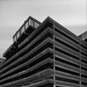
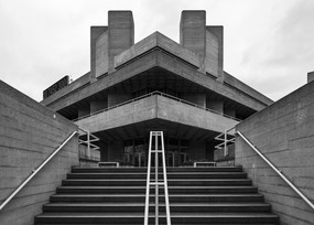
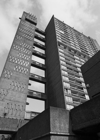
RESPONSE:
For my response to Simon Phipps, I visited the National Theatre in South bank and took photos of the brutalist architecture that I've come across. I focused on sharp lines, shapes and symmetry. I then edited the photos to be black and white and increased contrast to recreate a similar dramatic effect to Phipps.
CONTACT SHEET:
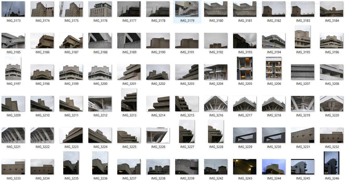
PHOTOS:
EDITING:
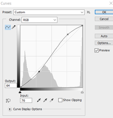
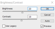
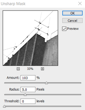
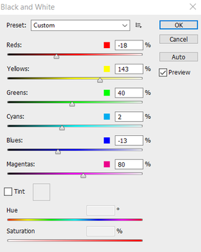
To edit these photos I exaggerated the lightness and contrast using the Curve and increased sharpness using the Unsharp Mask option. I also edited all of my photos black and white so emphasise the shapes and tonal contrasts.
|
|
|
EXTENSION:
TOM DANTHONY: Danthony is a French artist based in London. His work focuses on graphic design, illustration and even animation. He creates his artwork using simple colours and shapes, especially in his brutalist work that I used as inspiration for my work. He puts a lot of emphasis and focus on the shadows in his work, which is effective because it reflects the style of brutalism.
RESPONSE: I decided to create this piece as the extension to the brutalist task, because it really shows the contrast that the light creates and presents the buildings as even more geometric.
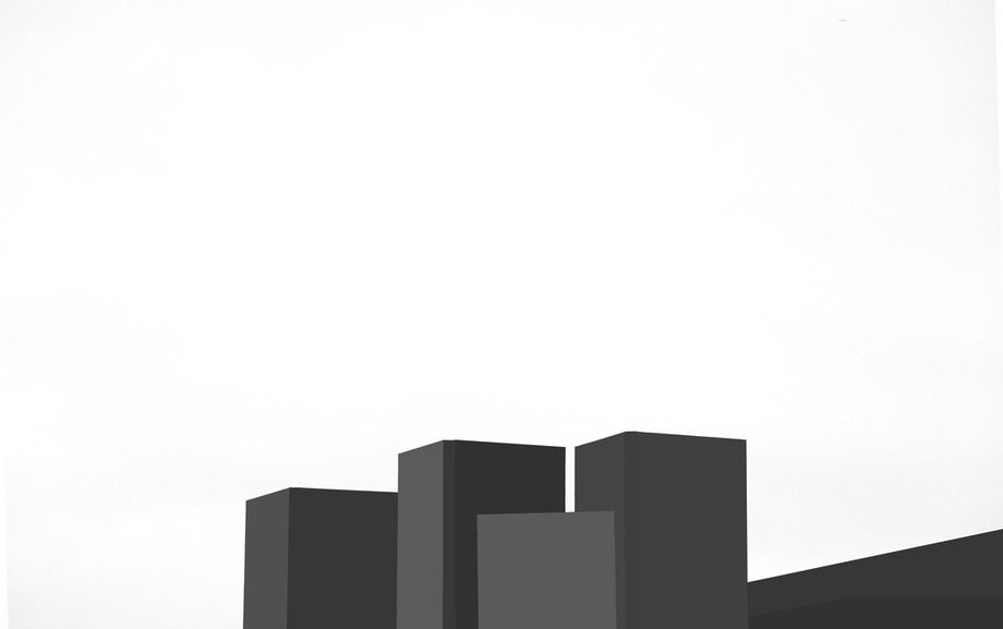
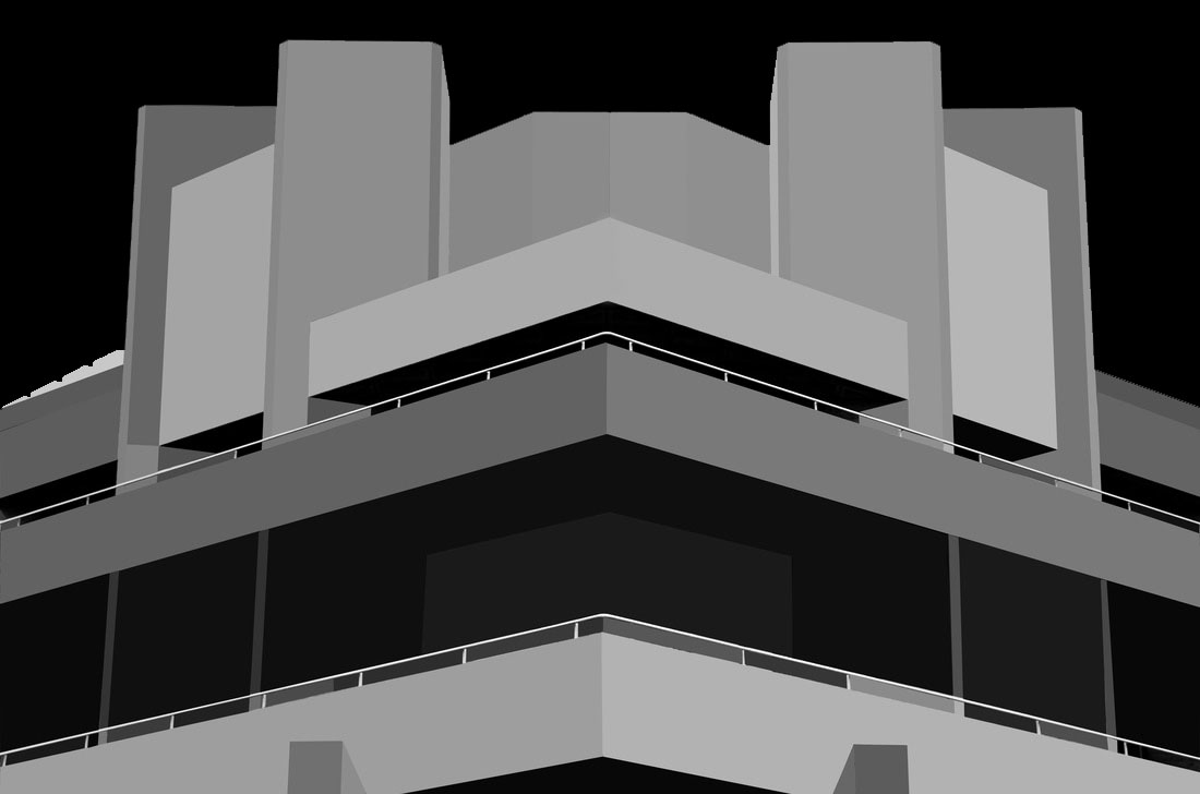
EDITING:
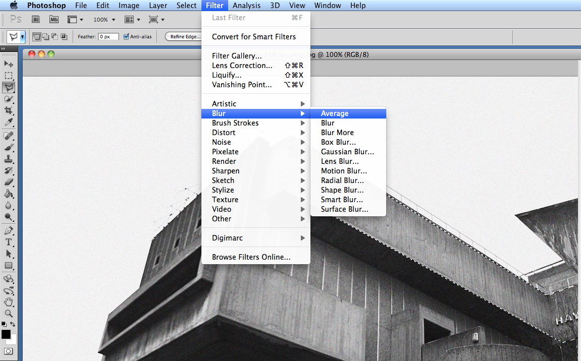
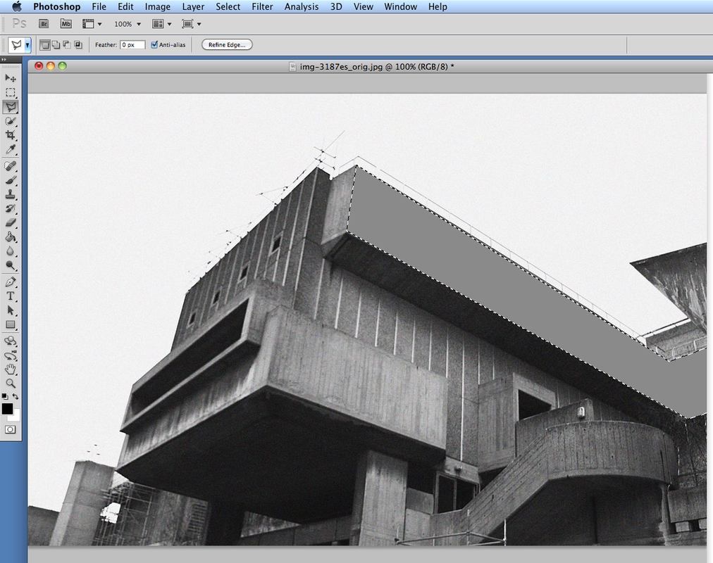
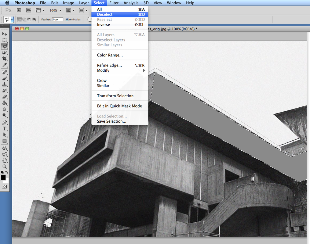
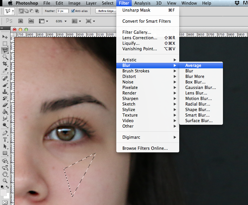
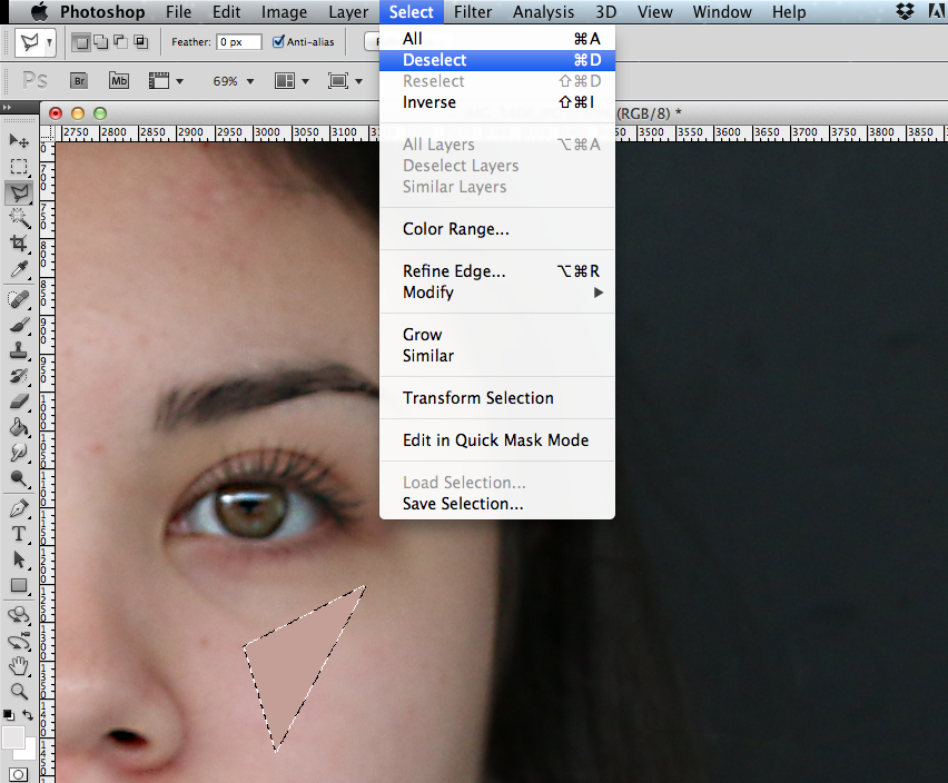
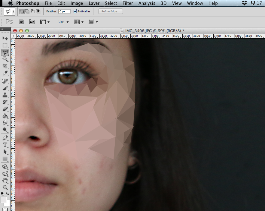
 The Polygonal Tool
To create these photos, I used the polygonal tool to select shapes that had different shades and then went to Filter > Blur > Average. This averaged out all the shades to one. I had to repeat this step on all shapes of the building to create the final simple 'cartoon' effect. I had to repeat this process on all of the shapes that had a similar shade.
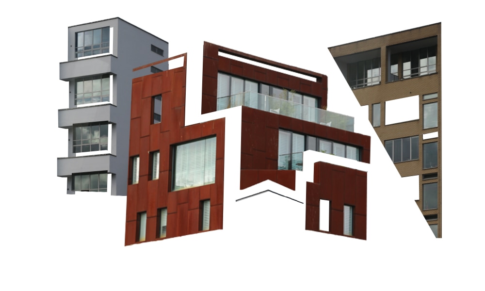
EXTENSION: EVOL is a German artist who transforms surfaces into miniature buildings. He uses cardboard and places it against different street backgrounds. I recreated his work but made mine more abstract.
I thought it would be interesting to print out my photos and stick them to a cardboard cut out, to create an illusion of a mini building, and place them in locations. This task links to structure because it combines two types of architecture together.
I thought it would be interesting to print out my photos and stick them to a cardboard cut out, to create an illusion of a mini building, and place them in locations. This task links to structure because it combines two types of architecture together.
CONTACT:
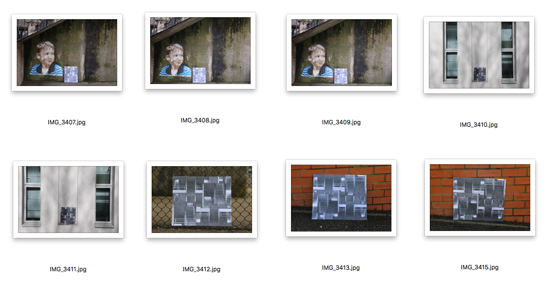
|
|
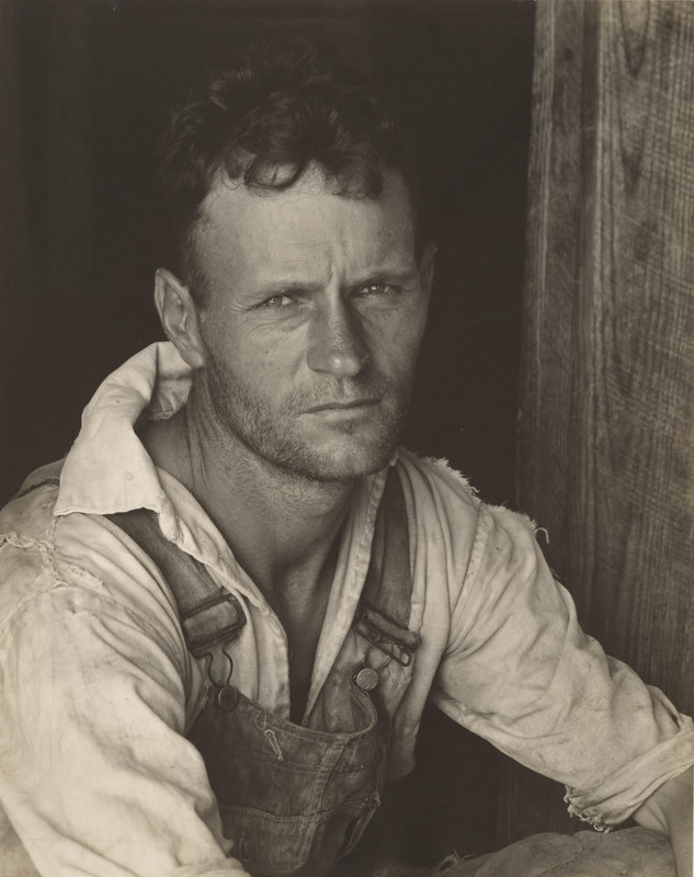
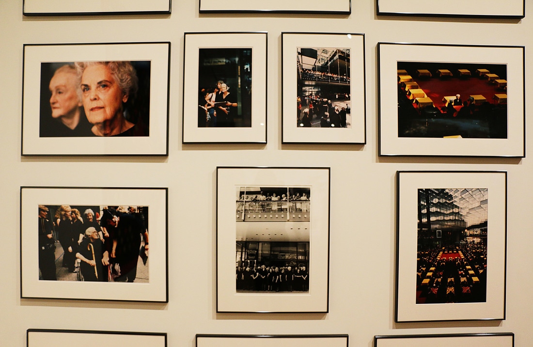
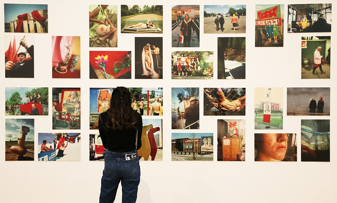
GALLERY VISIT
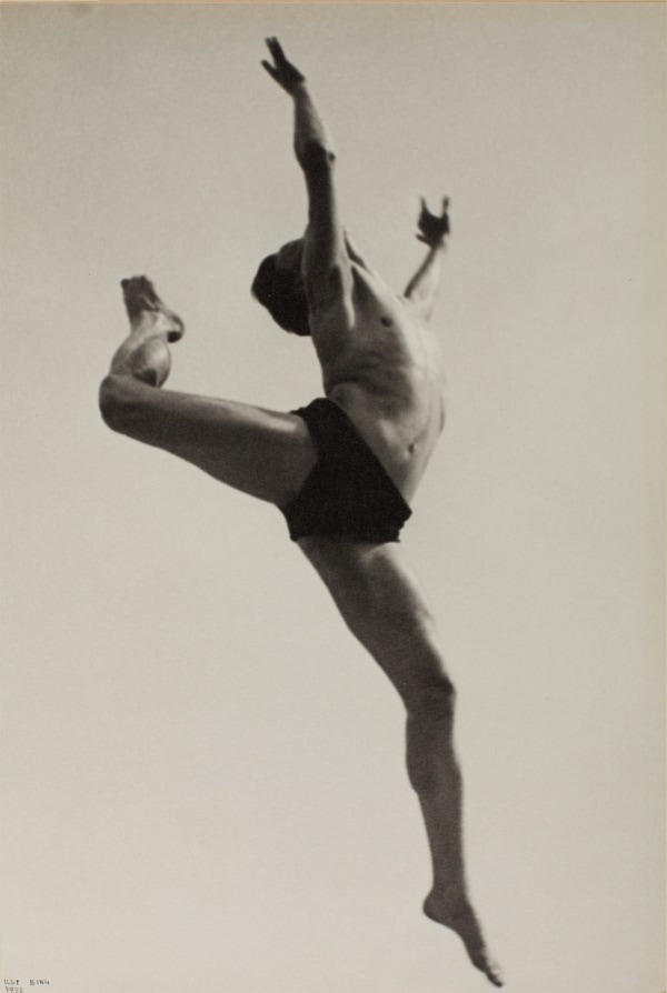
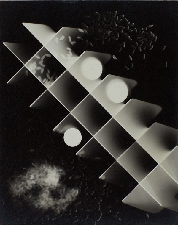
As a class, we visited the Tate Modern and went to the Elton John's Photography Collection, that mostly consisted of photographs from 1920 to 1940. There was a selection of amazing artists like Man Ray, Dorothea Lange and Walker Evans. Many of the portraits found in the collection were of artists, writers and musicians which reflected the culture over time. Along with portraiture, the exhibition also consisted of experimentations, like Herbert Bayer's Humanly Impossible, and photos that focused on bodies, like Ilse Bing's Dancer.
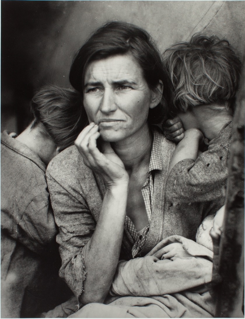
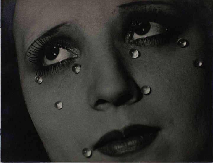
Some of the photos really related to our theme of structure, for example: Dancer by Ilse Bing Willem, Shukov by Alexander Rodchenko and Ice Cube Tray with Marbles and Rice by Margaret de Patta. The first photo (dancer) relates to the structure of the body, which link exactly to the work that we are working on as a class.

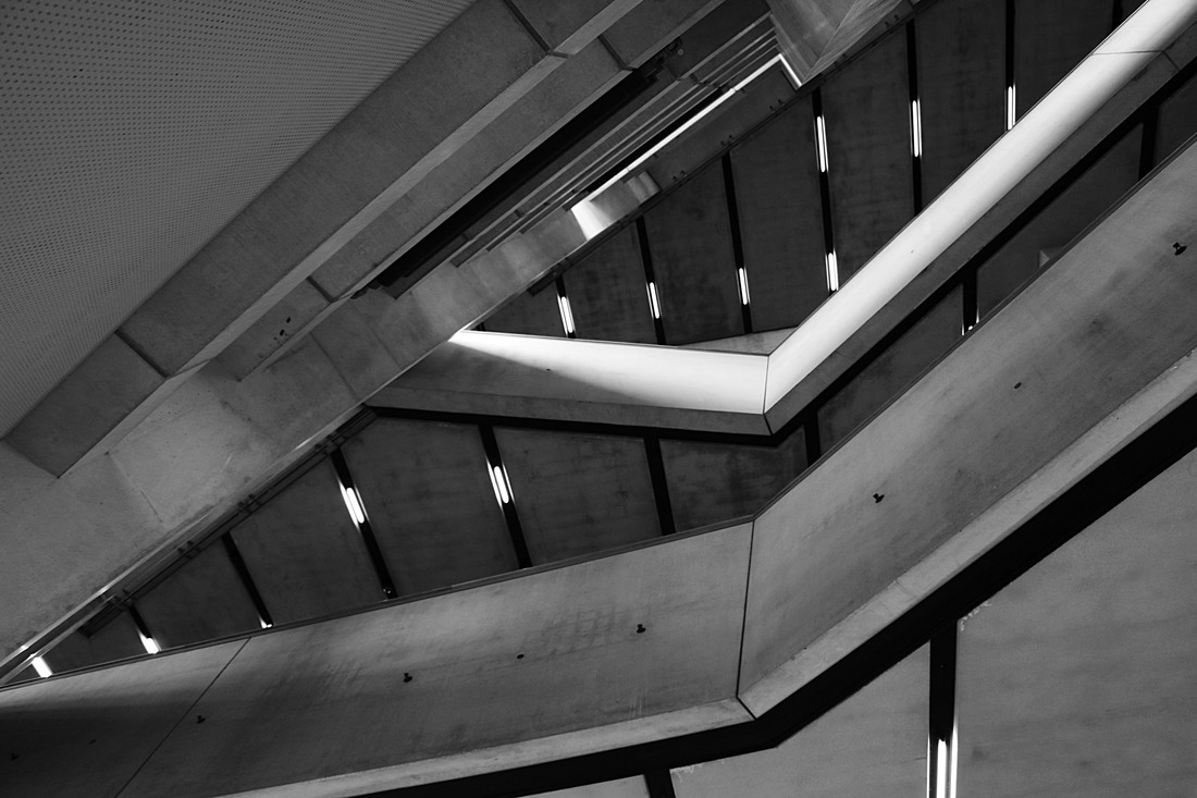
PHOTOS TAKEN IN TATE: I took these photos as a way of documenting the trip and the structure that could be found in the gallery.
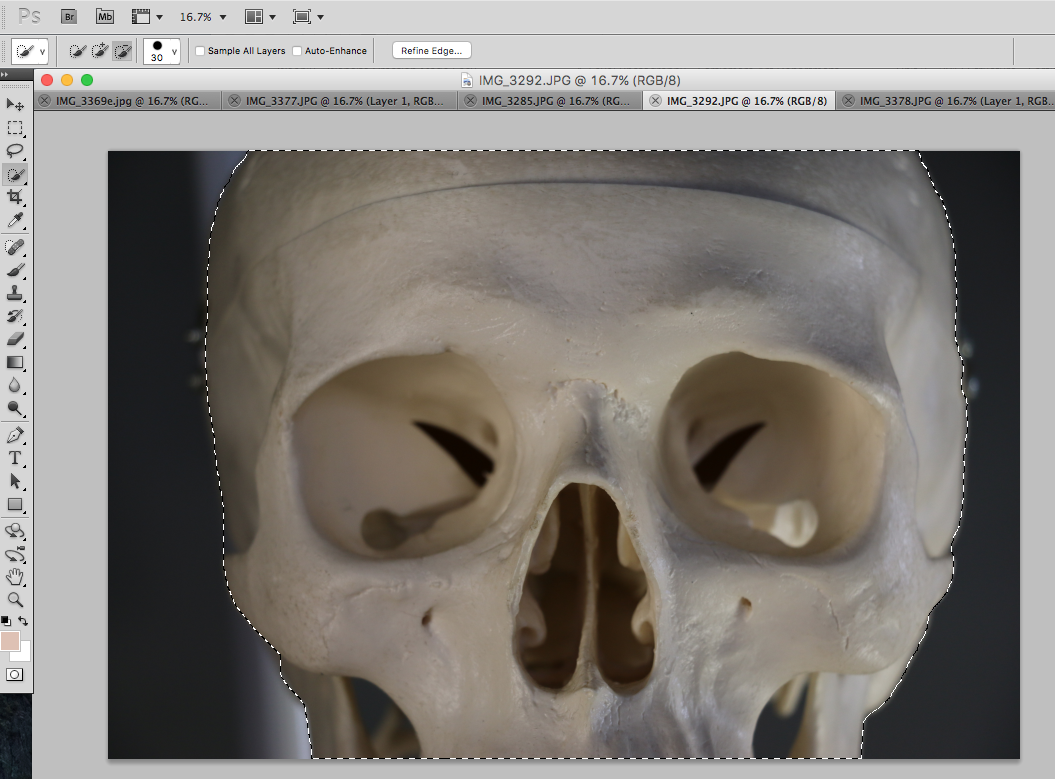
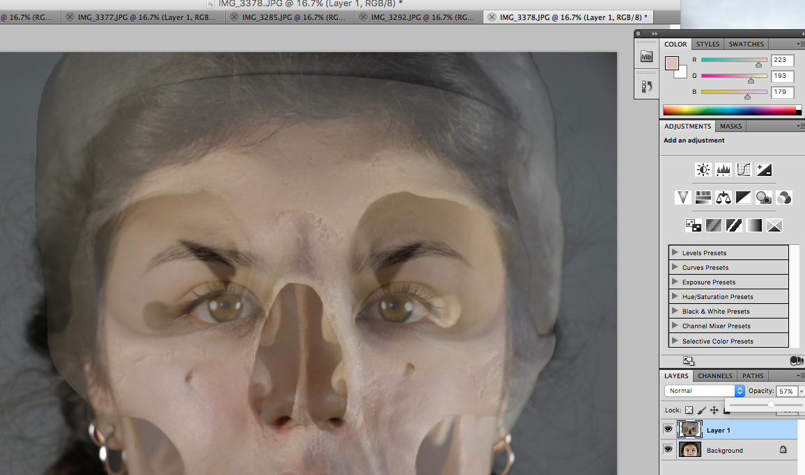
STRUCTURE OF THE BODY
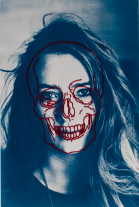
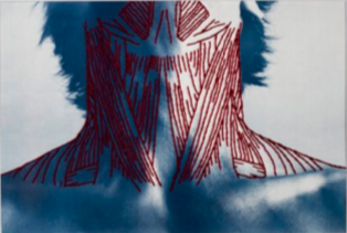
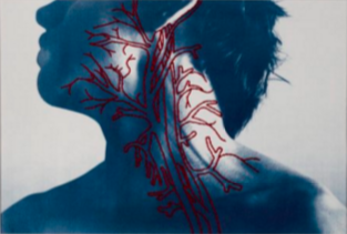
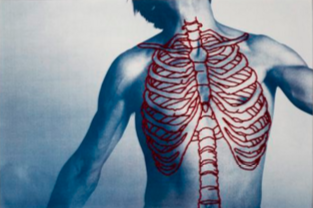
Peter Hickley looks at layers of the body and their hidden structure. His work is created by stitching with thread the different muscles and bones of the body.
RESPONSE:
To explore the structure of the body, I photographed a model and then layered photos I took of a skeleton.
CONTACT SHEET:
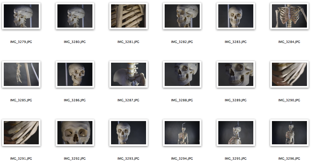
PHOTOS:
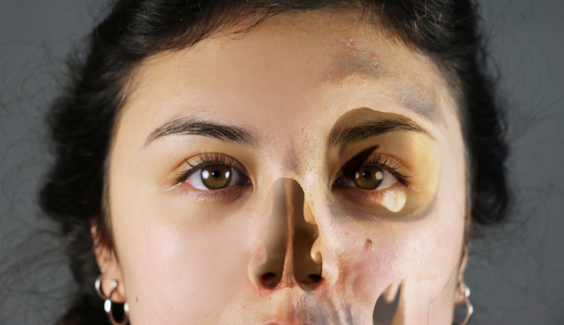
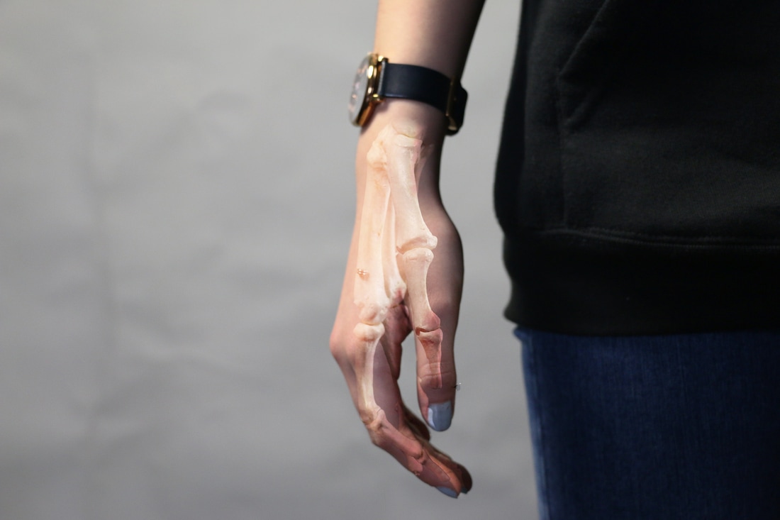
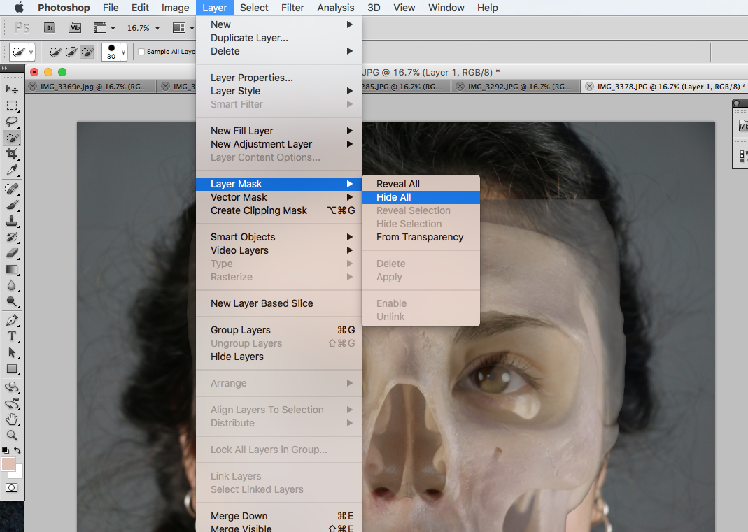
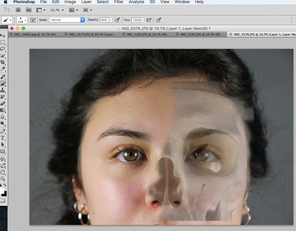
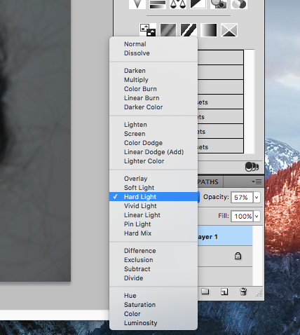
EDITING: To create these photos I had to layer the photo of the skeleton on the original picture and position it so that it lines up correctly, to make this process easier I decreased the opacity to 60%. Then I layered the mask by going to Layer > Layer Mask > Hide All and then using a paintbrush 'paint in' the parts of the skeleton that I want visible. To blend the two, I selected the mask layer and blended them using the Hard Light option.
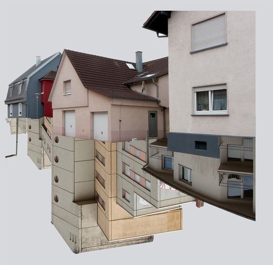
STRAND 1 - TAKING APART ARCHITECTURE
For my first strand I wanted to look at architecture in more detail. I wanted to experiment with photoshop to understand how part of the buildings are structured together, and how I can bring more attention to the detail of different shapes. To create my photos for this strand I will look at the following artists and use their work as inspiration.
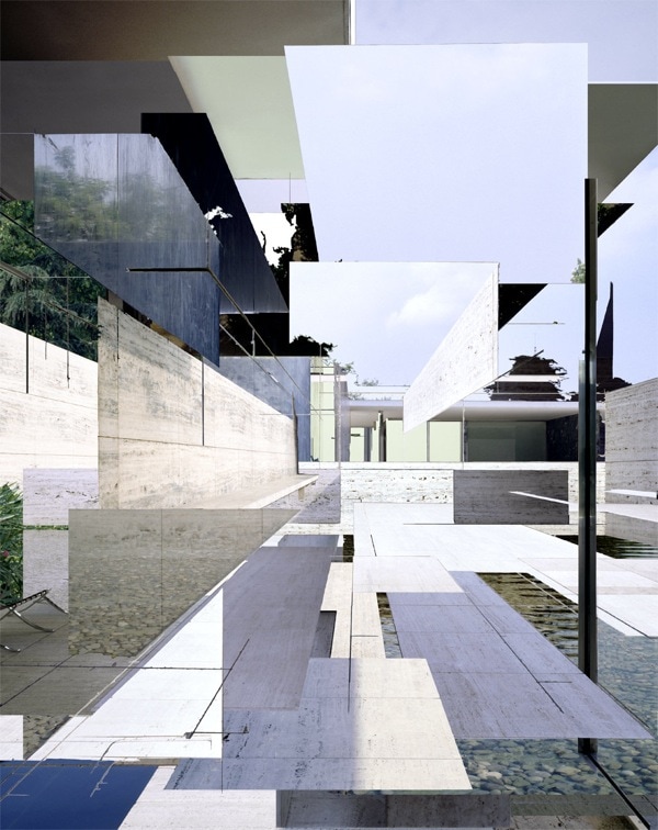
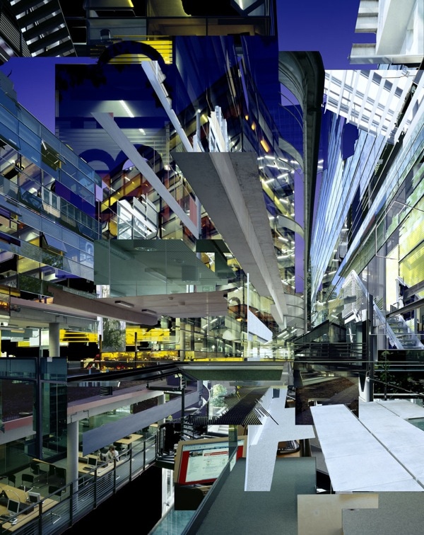
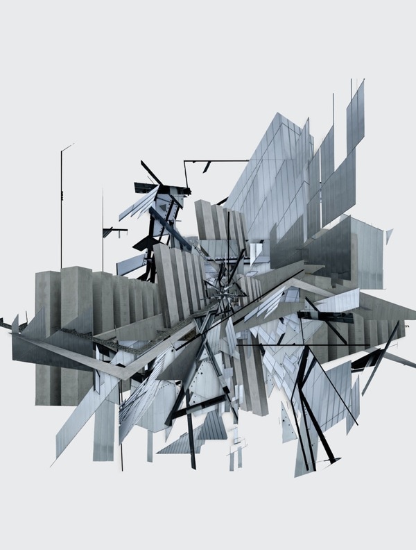
KLAUS FRAHM: This artist's work reminds the viewer of an explosion; using selecting and misplacing parts of the architecture found in the photographs Frahm creates an abstract composition of sharp shapes. The photographs are so distorted but we can still understand what the artist is trying to show.
KLAUS FRAHM: This artist's work reminds the viewer of an explosion; using selecting and misplacing parts of the architecture found in the photographs Frahm creates an abstract composition of sharp shapes. The photographs are so distorted but we can still understand what the artist is trying to show.
PATRIC DREIER: Dreier's work is more simple in composition; he uses a blank, bright colour as a background instead of filling up the whole image. In his art, there is a clear focal point of a distorted building. In some of his photos we can see more than one style of architecture combined with another, whereas in some of his other work, we see one building separated bit by bit.
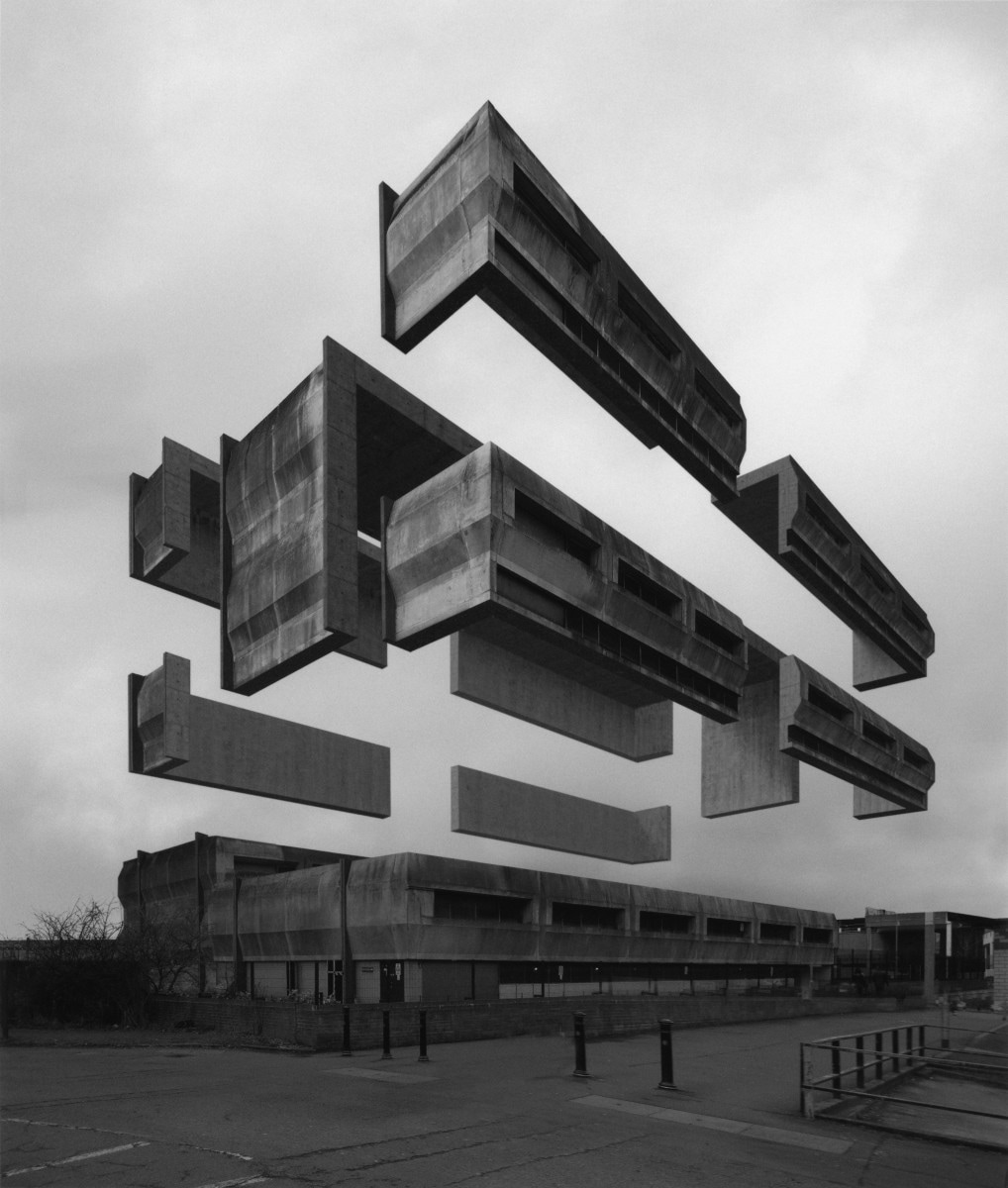
ESPEN DIETRICHSON: is an Norwegian artist, who pulls apart buildings, which again gives the illusion of an explosion, as the building expands into all directions. His work caught my attention because it is similar to the photos I took of the brutalist architecture.
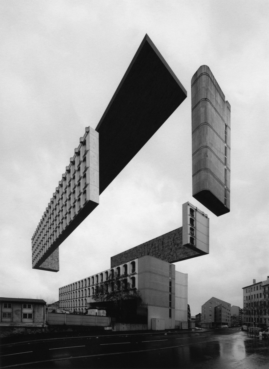
PHOTOS: I had a lot of photos that I already took that I can work for this strand perfectly - some of them are my photos of the brutalist architecture, that I took for the set task.
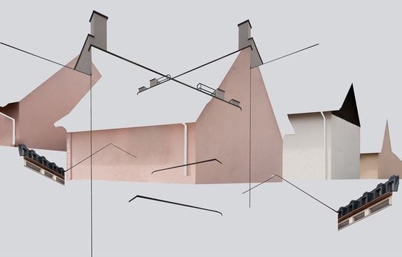
For my first attempt I tried to combine Dietrichson's style with Dreier to create a simple 2D response by separating pieces of the building.
For my first attempt I tried to combine Dietrichson's style with Dreier to create a simple 2D response by separating pieces of the building.
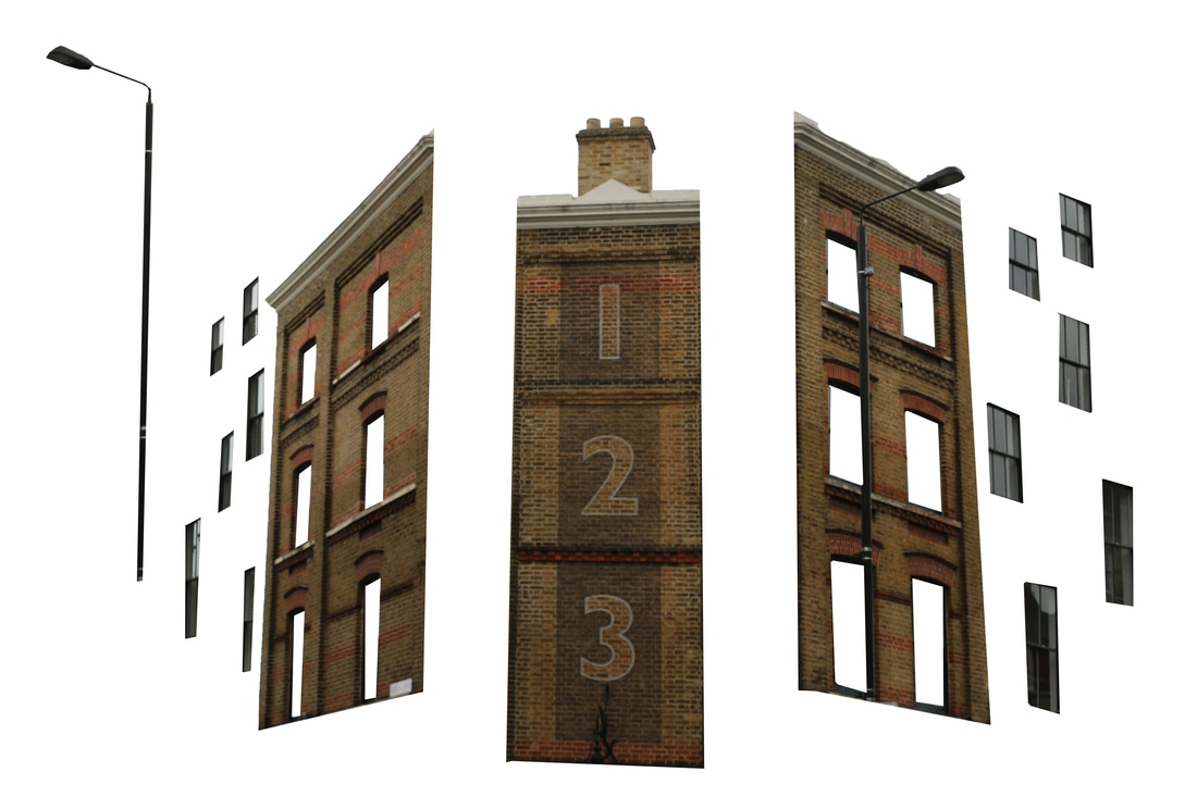
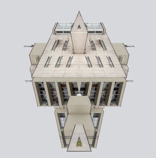
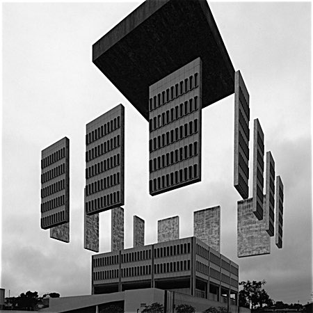
I think my response turned out well, but I thought it was really simple and wanted to challenge my PhotoShop skills more. Therefore I decided to create a development and attempt to take apart architecture but do this in 3D, similarly to Dietrichson.
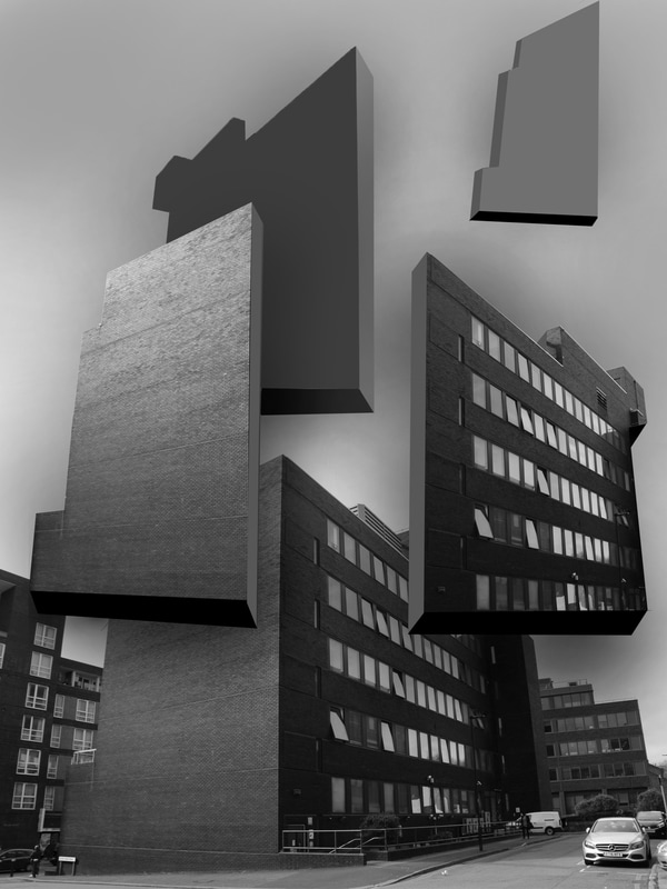
DEVELOPMENT
As a development I wanted to explore structure of architecture using more complex editing. For this response I sticked to the same idea of 'taking apart' buildings, but in order to make the final photo look 3D I looked at Dietrichson's work and used it as inspiration. I took photos of simple buildings and used Photoshop to edit them.
CONTACT SHEET:
STRAND 2 - STRUCTURE IN NATURE
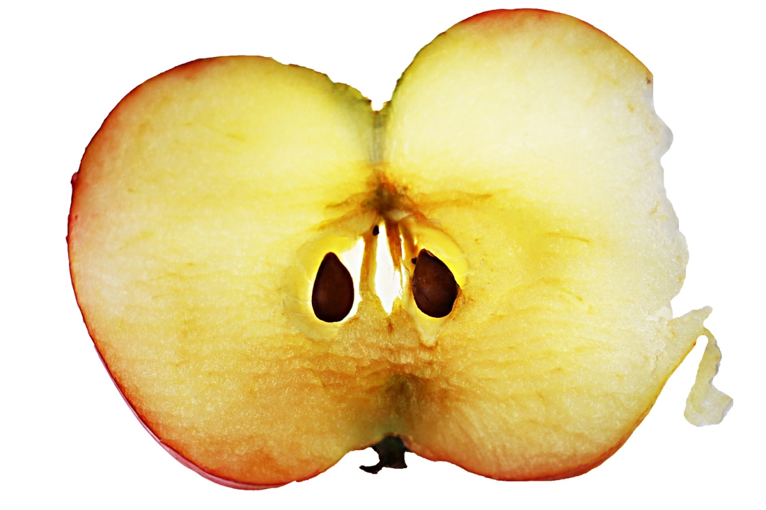
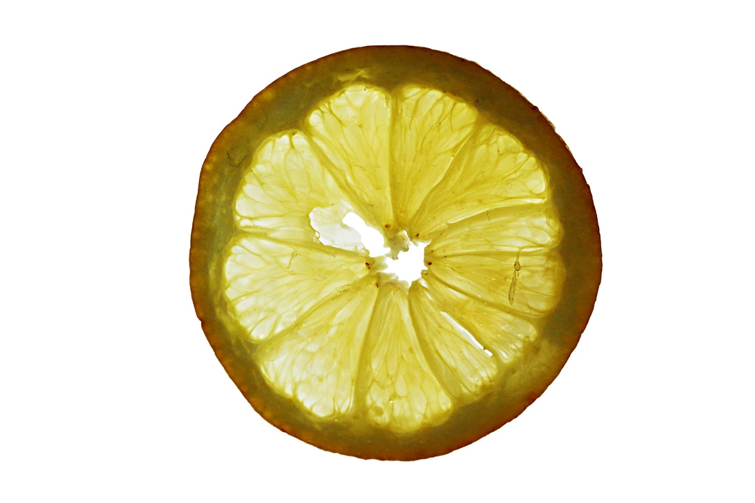
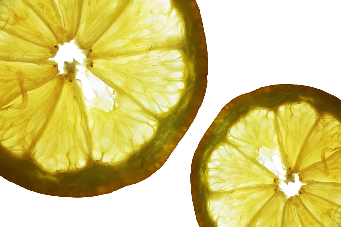
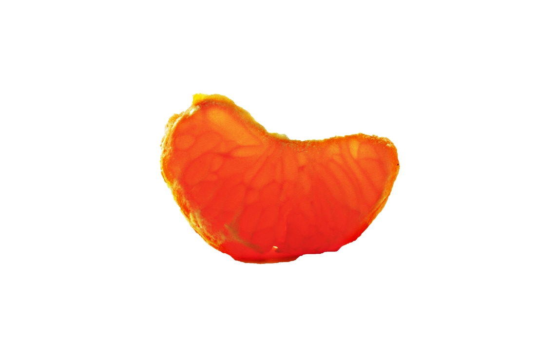
DENNIS WOTJKIEWICZ: Is a painter, whose work includes a lot of detail. The work that I found interesting is the 'Citrus' Series paintings. His paintings present slices of different fruits with light coming from behind of them, this brings attention to the detail and structure of the the fruit itself. I thought I could take similar photos for this strand, but not only of fruit but also of other objects and body parts.
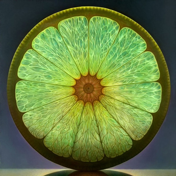
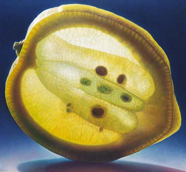
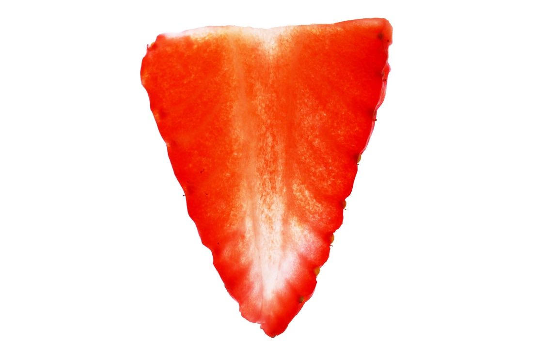
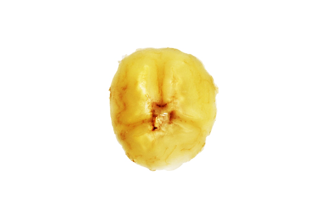
RESPONSE: For this response I will take a series of photographs of thinly cut fruit, using a lot of light in order to bring attention to the detailed structure. I will continue to work on these photographs on Photoshop to increase contrasts and make the photos more dramatic.
CONTACT SHEET:
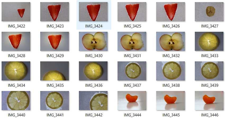
PHOTOS:
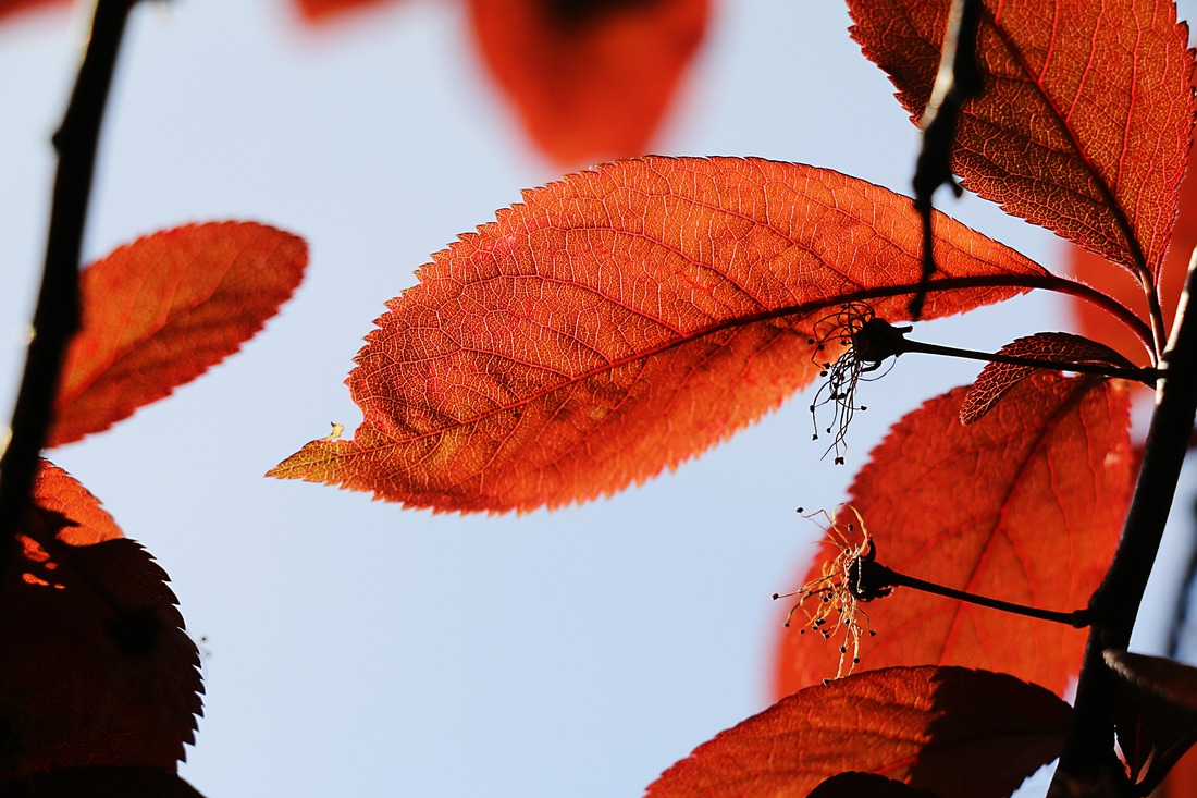
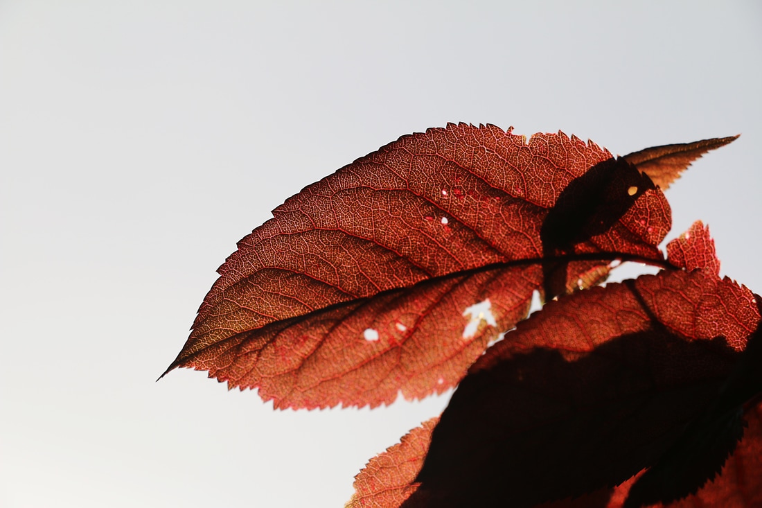
DEVELOPMENT:
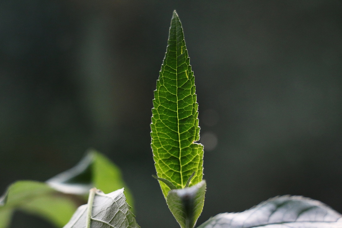
As an improvement for this strand I will take photos of more things in nature like leafs, with light shining from behind to explore even more detail and structure.
As an improvement for this strand I will take photos of more things in nature like leafs, with light shining from behind to explore even more detail and structure.
CONTACT SHEET:
PHOTOS:
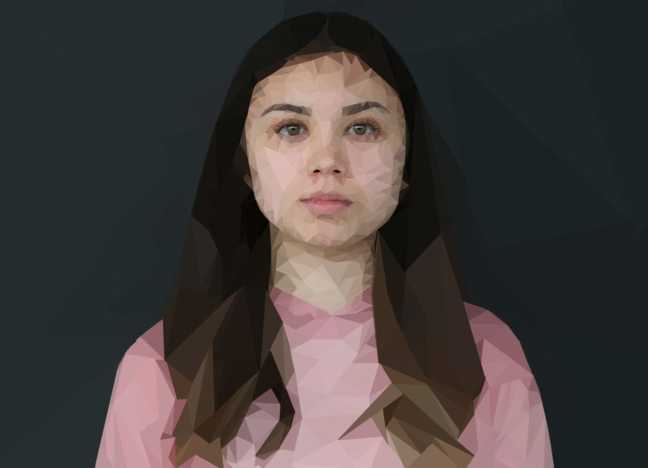
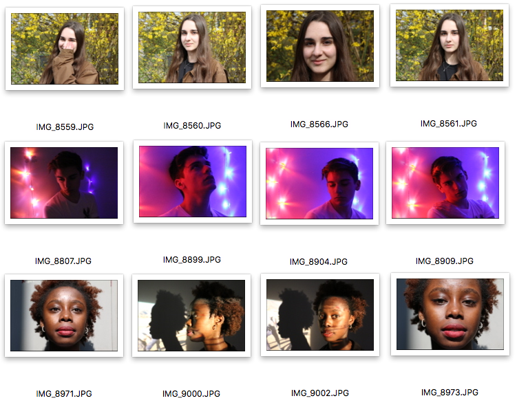
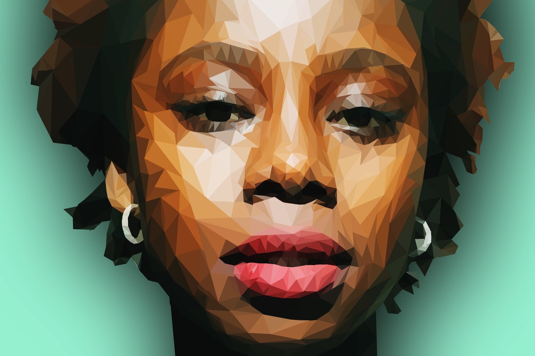
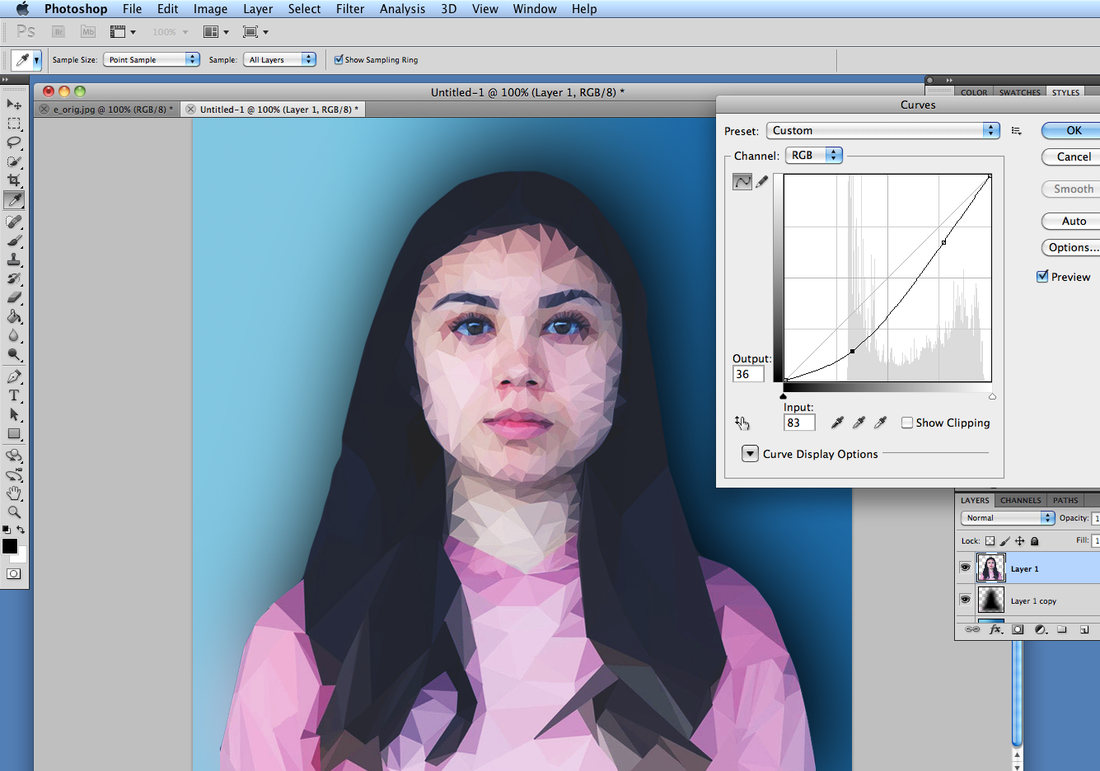
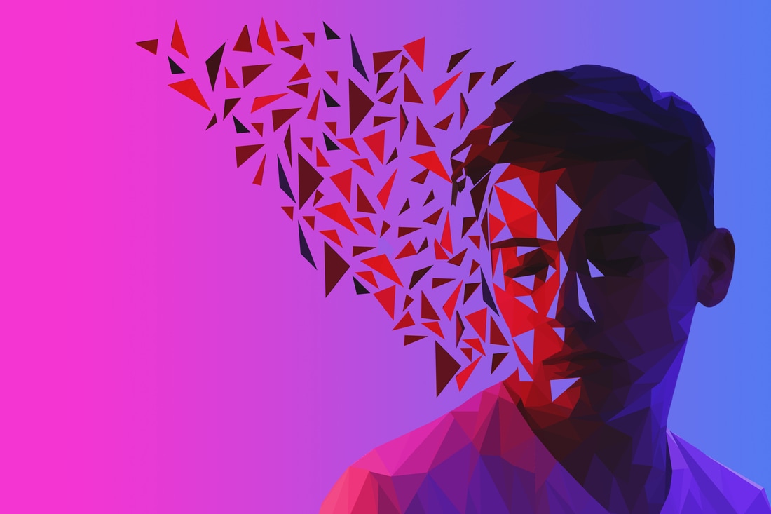
STRAND 3 - STRUCTURE OF A FACE
For this response I will be exploring the shape and geometry within a face, by simplifying the and shades of the facial features into simple shapes.
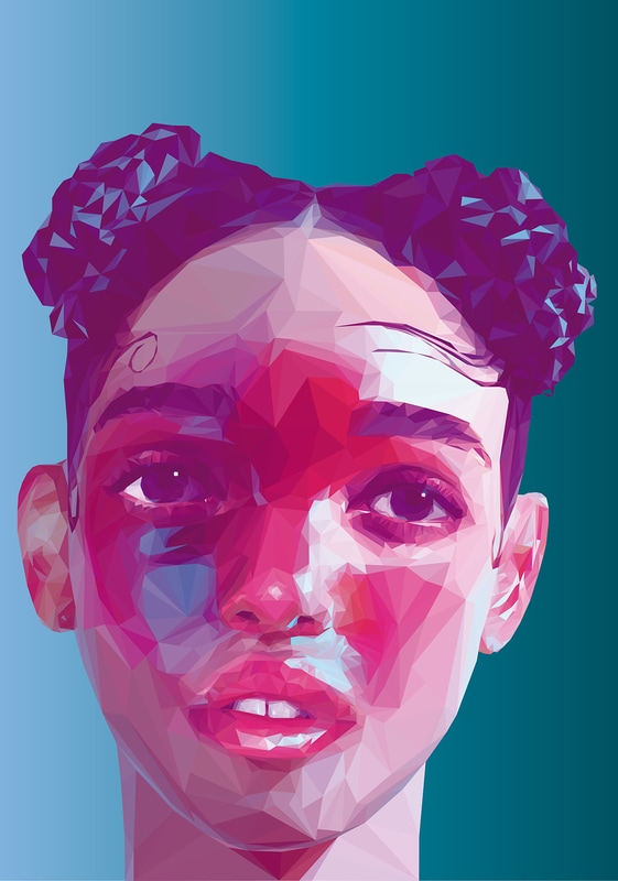
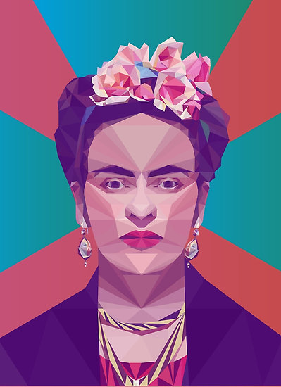
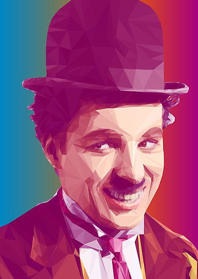
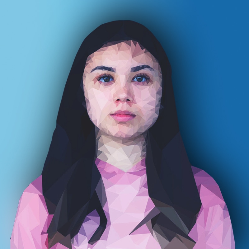
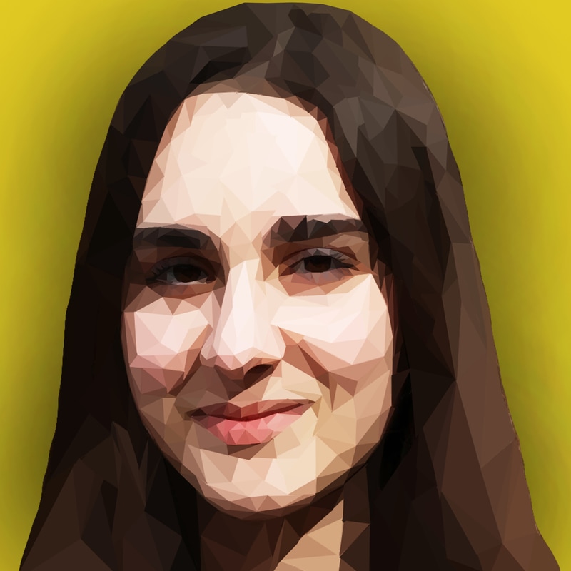
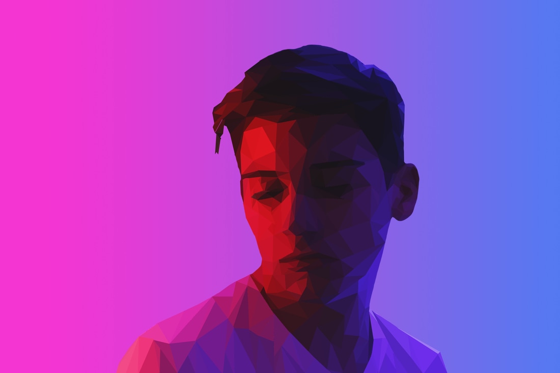
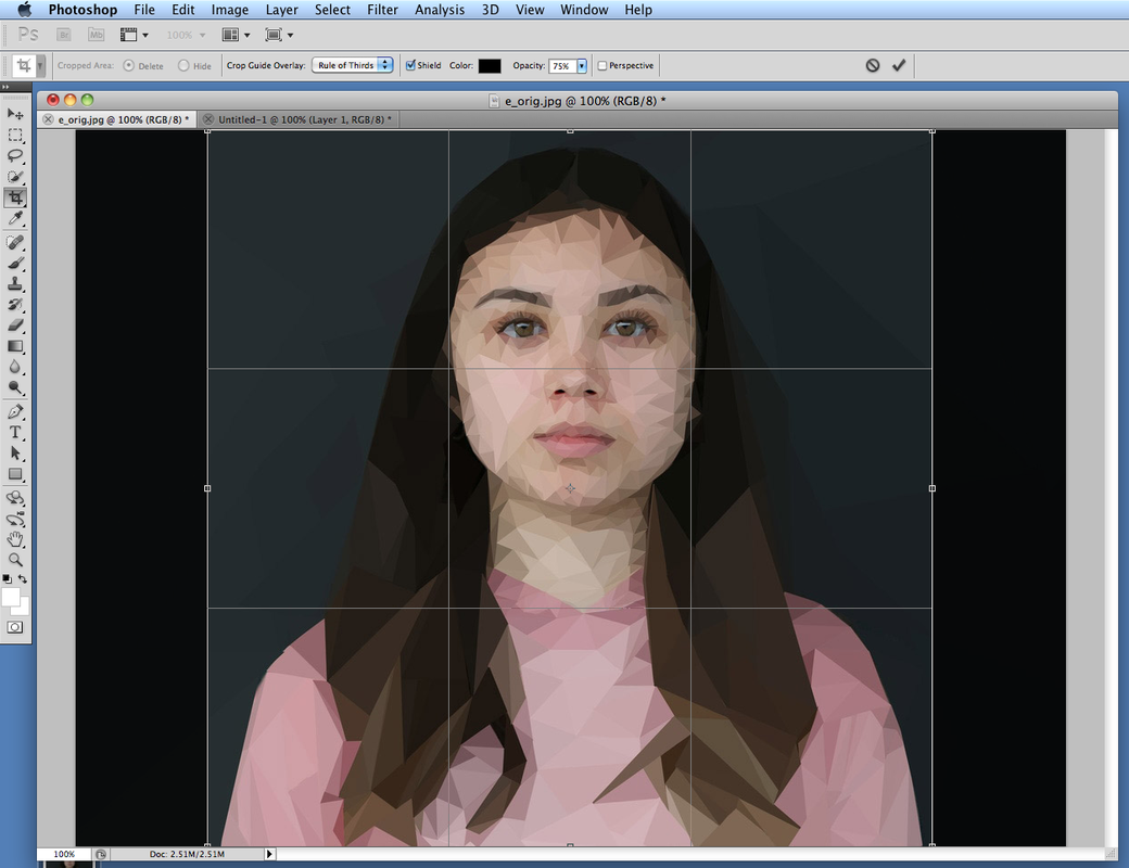
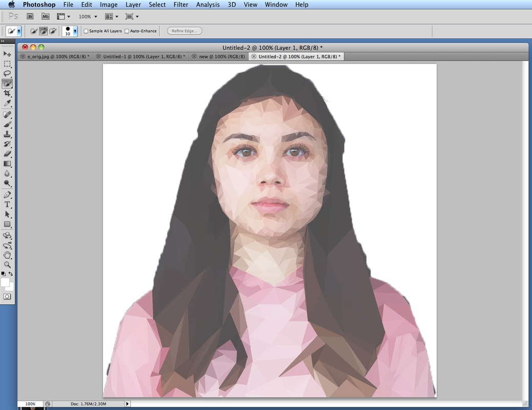
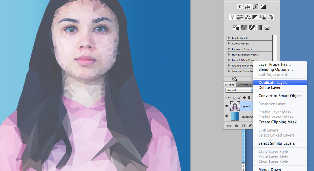
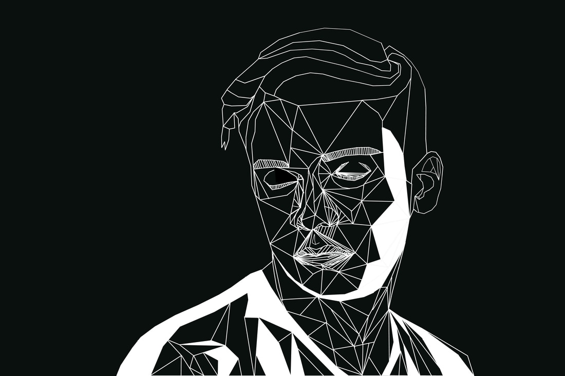
GISELLE MANZANO RAMIREZ: For one of my strands I wanted to create a low poly portrait, which means a simplified portrait that is used in 3D computer graphics. The artist that I came across is a graphic designer based in New York. She created low poly portraits of iconic people through Photoshop and Illustrator software. This work links to the screen prints that I have previously done on the brutalist architecture, as it involves a similar technique that I could furthermore develop.
GISELLE MANZANO RAMIREZ: For one of my strands I wanted to create a low poly portrait, which means a simplified portrait that is used in 3D computer graphics. The artist that I came across is a graphic designer based in New York. She created low poly portraits of iconic people through Photoshop and Illustrator software. This work links to the screen prints that I have previously done on the brutalist architecture, as it involves a similar technique that I could furthermore develop.
CONTACT SHEET:
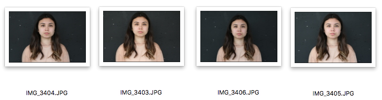
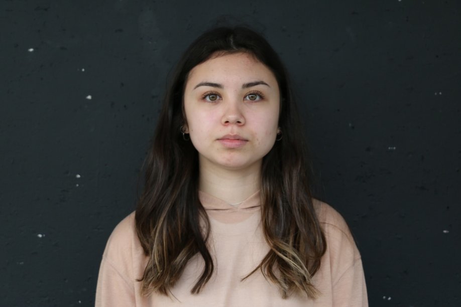
PHOTOS: Before & After
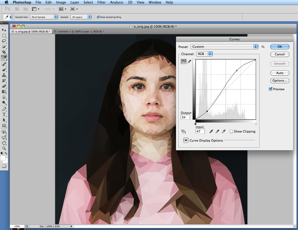
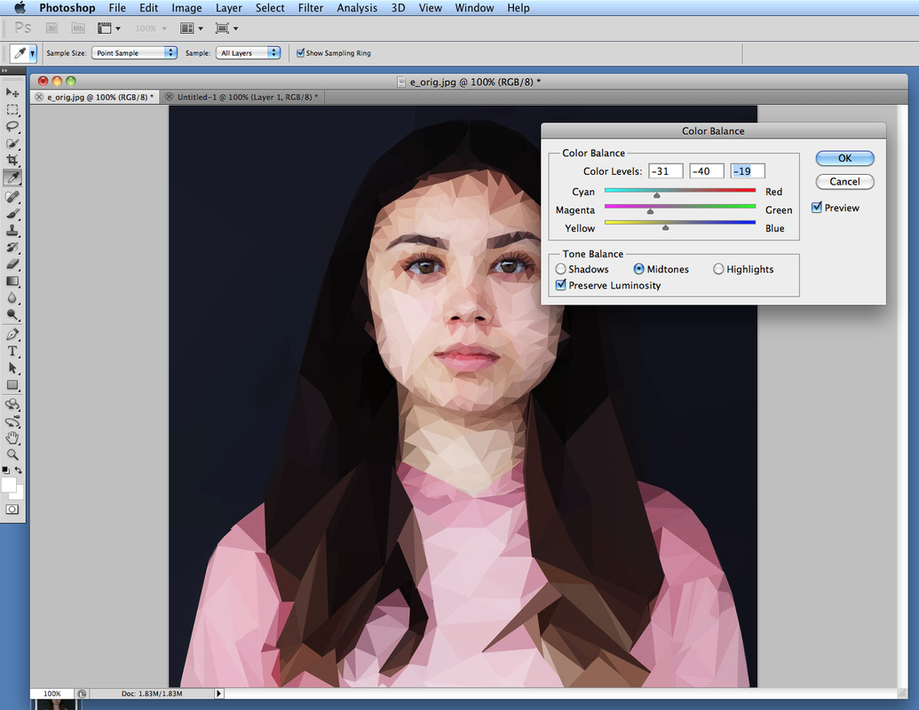
EDITING:
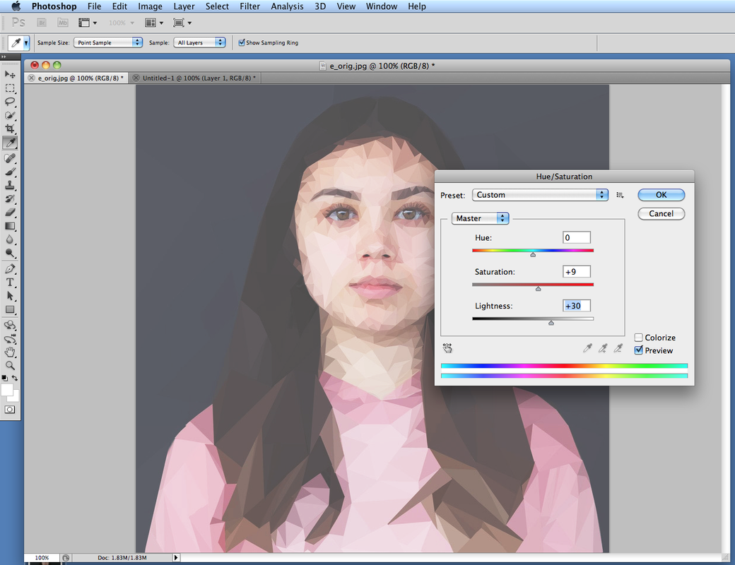
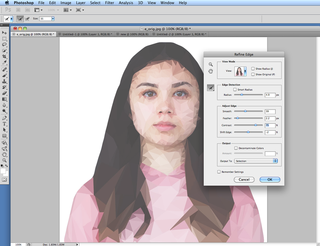
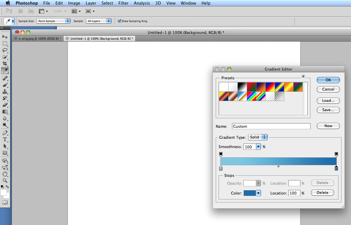
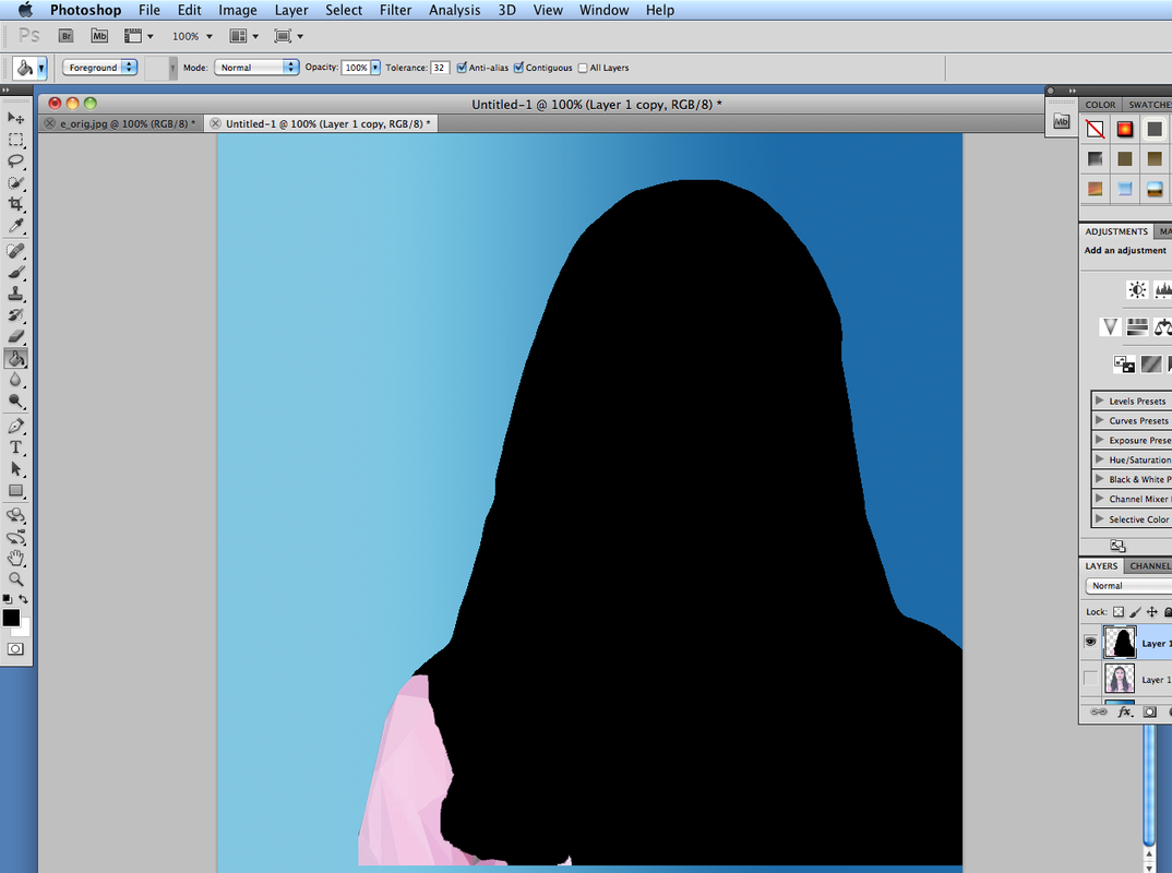
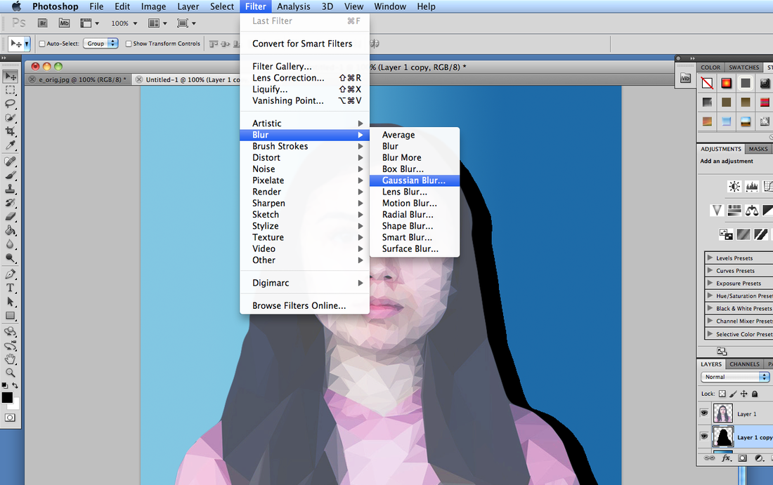
I thought that the technique I used was effective, although I thought the final was too simple, because the colours merged too much with each other. In order to make my work more colourful and dramatic, I continued to work on the piece, and played around with colour, contrast and light. To make my work as interesting as the artist, Giselle Manzano Ramirez, I filled the background using the gradient tool, and added a shadow, in order to make the piece look more 'real'.
CONTACT SHEET:
Here are all of the photos I used for this development before any editing.
Here are all of the photos I used for this development before any editing.
DEVELOPMENT:
|
|
|
|
EDITING:
DEVELOPMENT:
As a further development I explored the structure of a face in greater detail by linking it to my response to architecture, and taking it apart.
As a further development I explored the structure of a face in greater detail by linking it to my response to architecture, and taking it apart.
DEVELOPMENT:
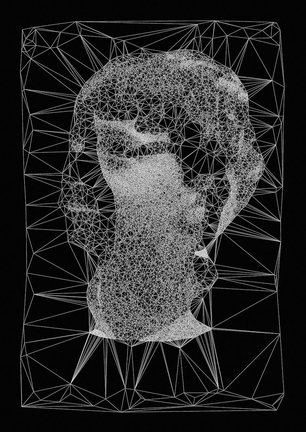
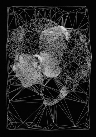
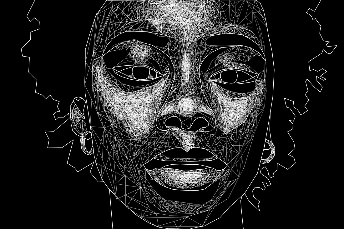
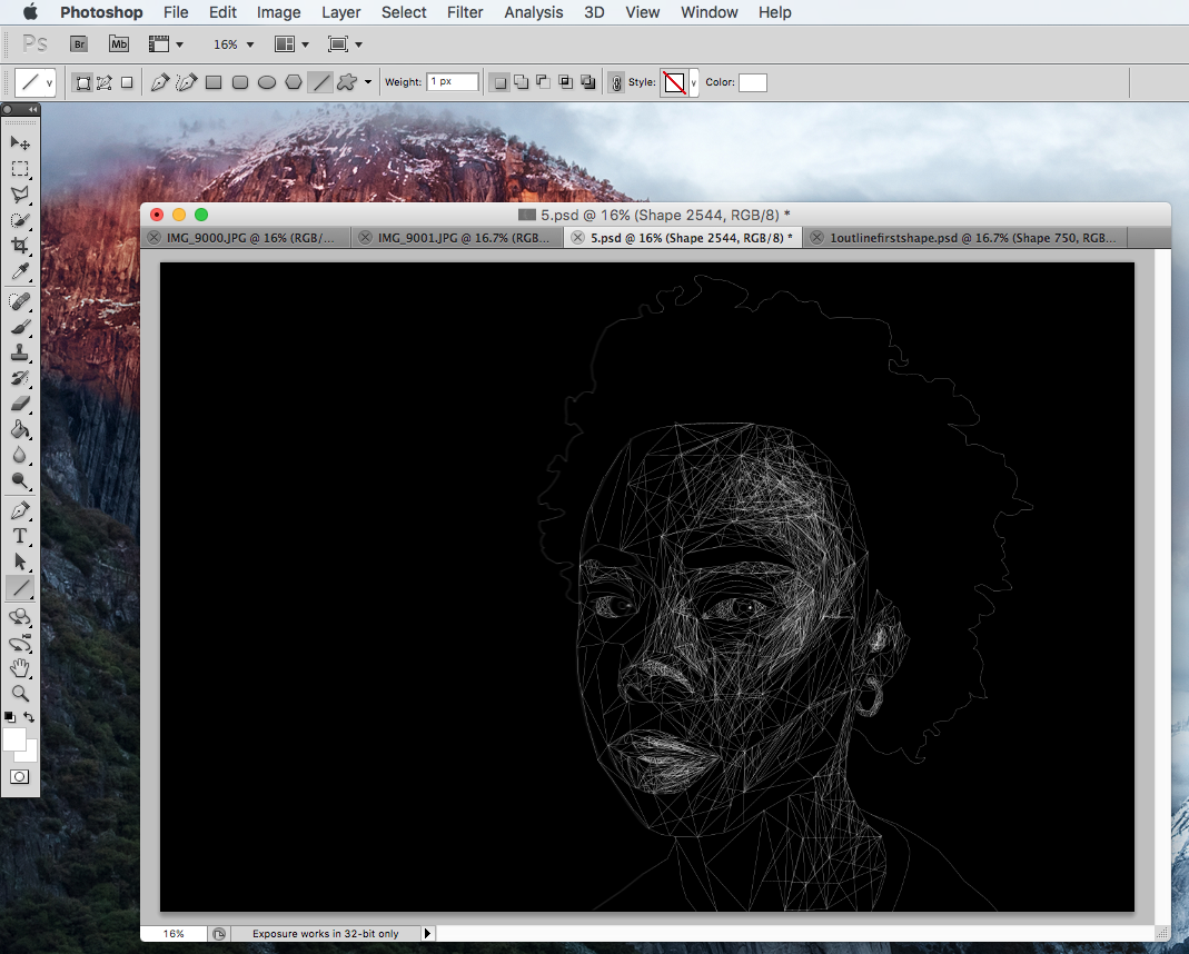
For further development I was inspired by an artist called Diana Lange who transforms regular portraits by applying specific algorithms to the image data using processing.
For further development I was inspired by an artist called Diana Lange who transforms regular portraits by applying specific algorithms to the image data using processing.
|
|
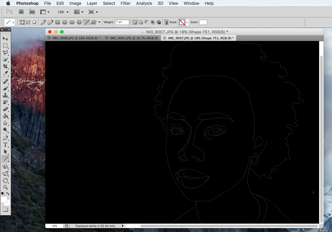
Attempt 1: The first time I attempted my response to this development, I didn't really know how to start it. The photo below is what the outcome was.
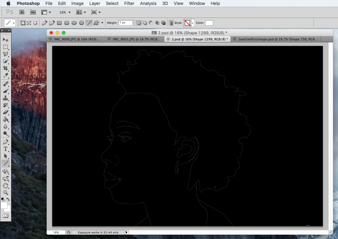
Attempt 2: For the second attempt I took a different approach of making the lightest shades the most dense with lines and the darkest the least - this is how Lange's work was finalised.
FINAL PIECE
For my final piece, I created another pinterest board with more specific inspiration that linked to what I had in mind for my actual final piece, I continued with the theme of drawing with lines, portraiture and geometric shapes. Since I have already done a simple 'headshot' portrait using the technique I wanted to create something more abstract and interesting for my final piece. I explored the option of using photos of hands, architecture and doing the technique not on Photoshop but manually using pins and thread.
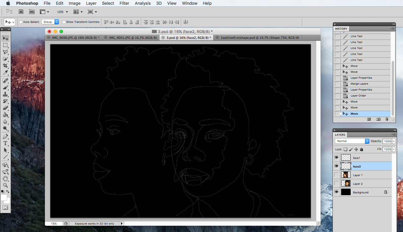
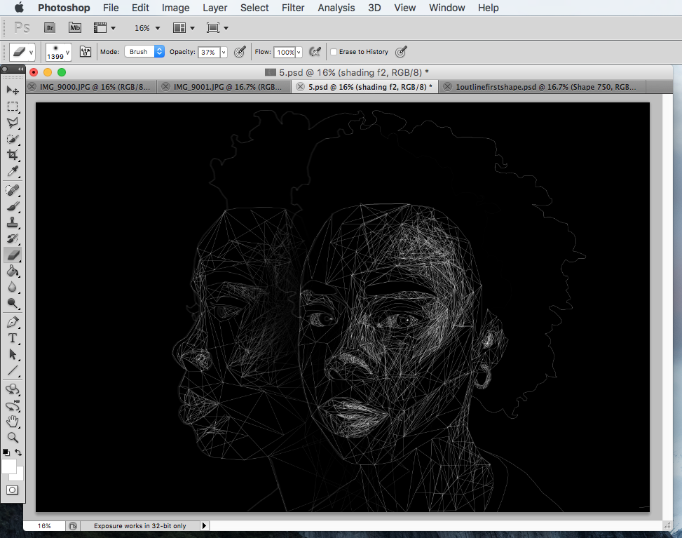
I decided to create a piece that would combine geometry, abstraction, structure and movement. I done thing by placing two photos that I took next to each other; one was of the model facing the camera and the other was a side shot. I hoped to create the same illusion of movement as if I took a photo with a long exposure time, which would capture the movement as smudged lines.
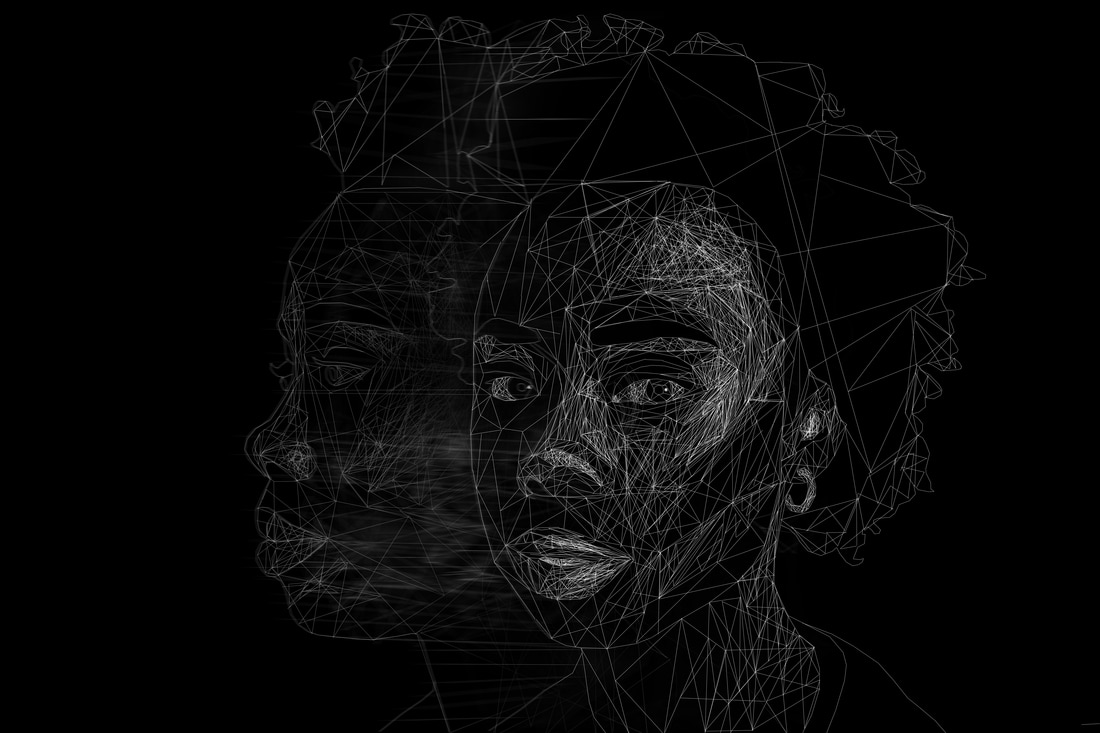
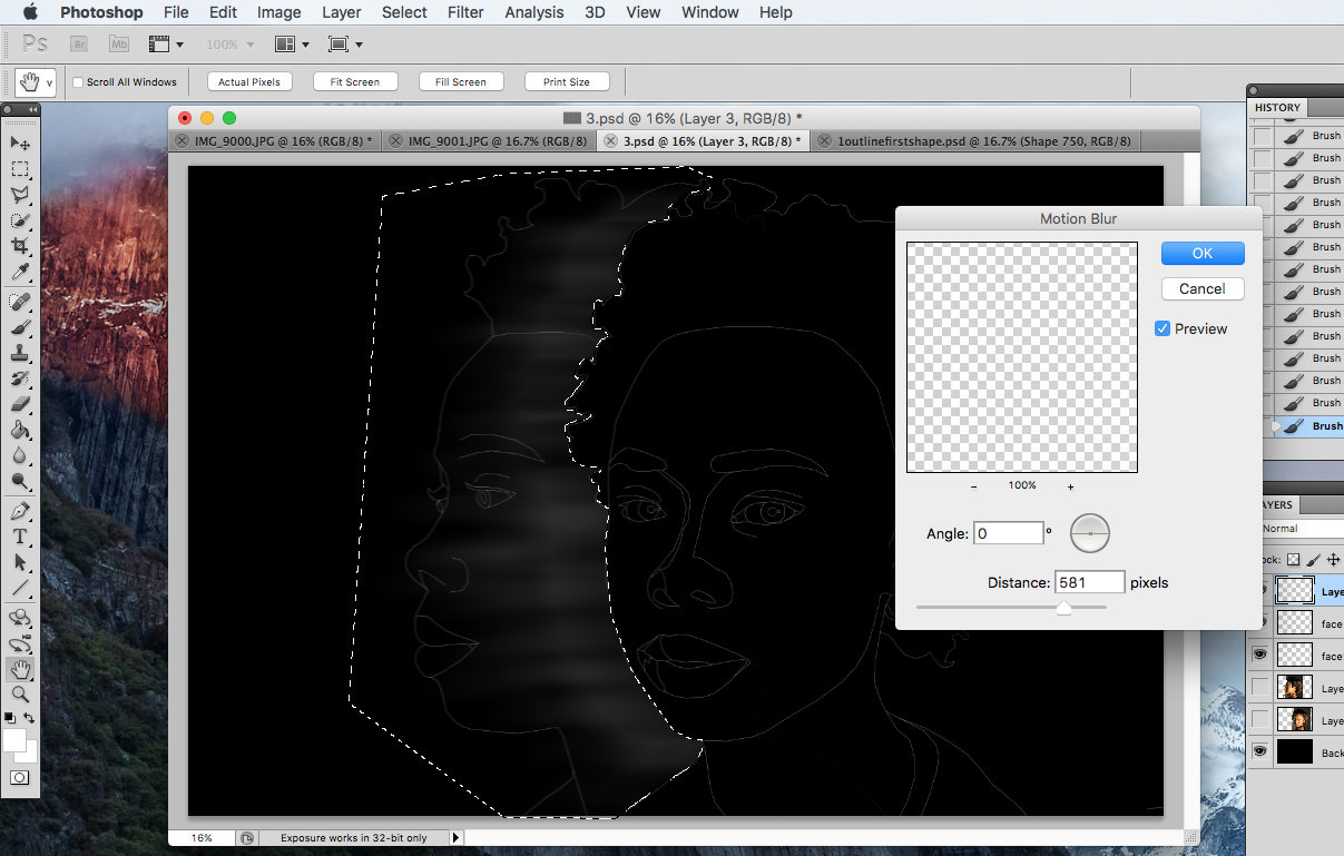
EDITING: My final piece required a long editing process. I started off with opening a new file and filling it in black. I added transparent layers of the two photos and decreased the opacity. Then I started drawing over the edges using the line tool. I had to repeat this for both layers and then shade them in using the same geometric style I used for my previous developments. The next step was to add a layer that would give the photo a moving effect, to do this I drew horizontal thick lines and then used the motion blur tool to smudge it. Finally, I pieces all of the layers together by merging visible.
EVALUATION/CONCLUSION
I enjoyed planning, creating and editing for this theme of structure and overall I am pleased with the way my final piece turned out. Coming up with ideas was easy as the theme was very broad, and I was able to incorporate portraiture, landscape and still life into my work. I mostly enjoyed the process of editing throughout this exam unit, because it was the most challenging. The technique I used throughout the whole unit was inspired by low poly graphic portraiture, and it involved creating/drawing geometric shapes, and I feel like I have developed it effectively.
All of the photographers I researched for this unit, I found inspiring in a way. However the artist that influenced my work the most was Giselle Manzano Ramirez as her photos provoked many of my own ideas. I think that the most successful part of my project is my final piece because it combined all the techniques that I have used throughout the whole exam unit.
The biggest problem I've faced during this unit occurred when I was creating my first response to Diana Lange, as I didn't know how to approach it at first; I used lines that were too thick and didn't know how to create an effect that would shade the portrait naturalistically, I solved this problem in my second attempt at the response and done this by adding more lines to the areas with the lightest highlights, and leaving darkest areas (like the hair and eyebrows) black.
