Abstraction can be described as freedom in art. It involves creating a composition out of shape, form, colour and line. Abstract is a form of art that does not resembling reality, it focuses mostly on light, texture and composition. Throughout this this unit I will be exploring and creating abstract photography.
PAPER ABSTRACTION
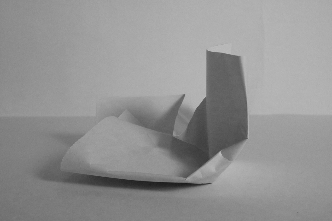
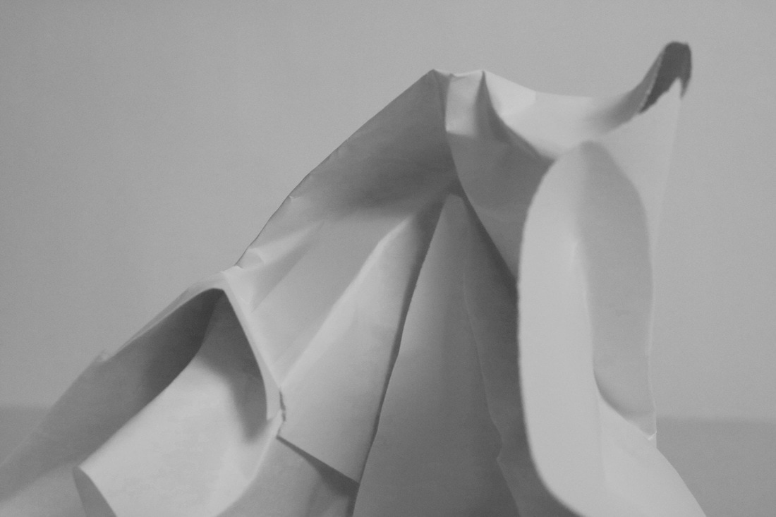
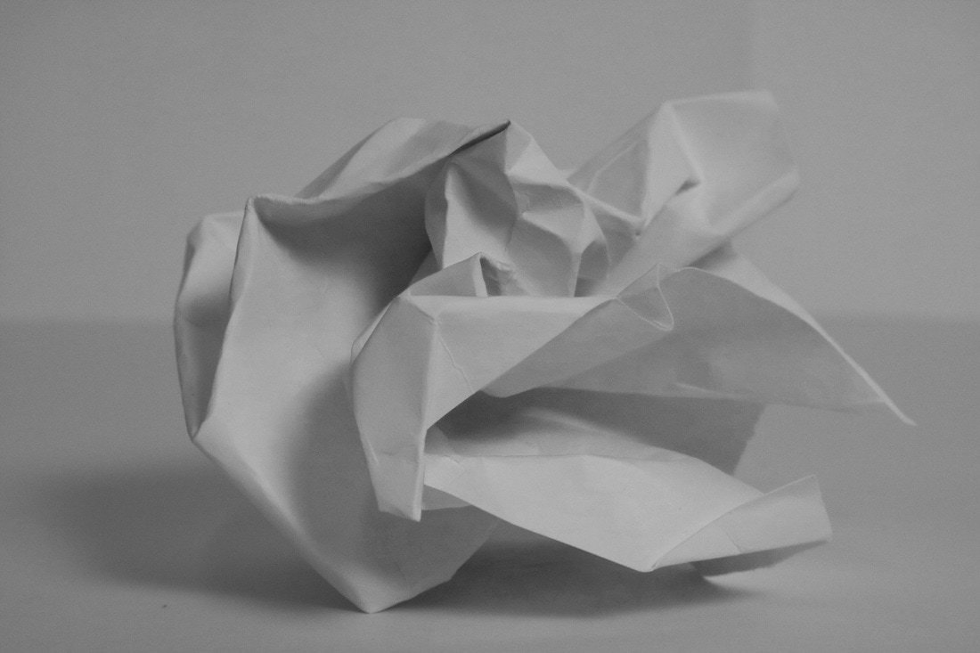
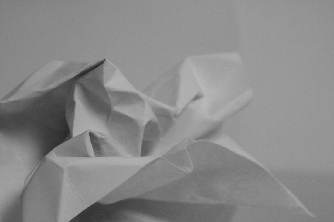
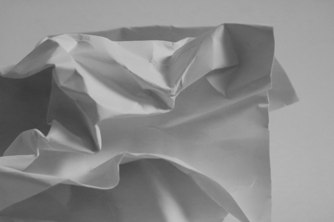
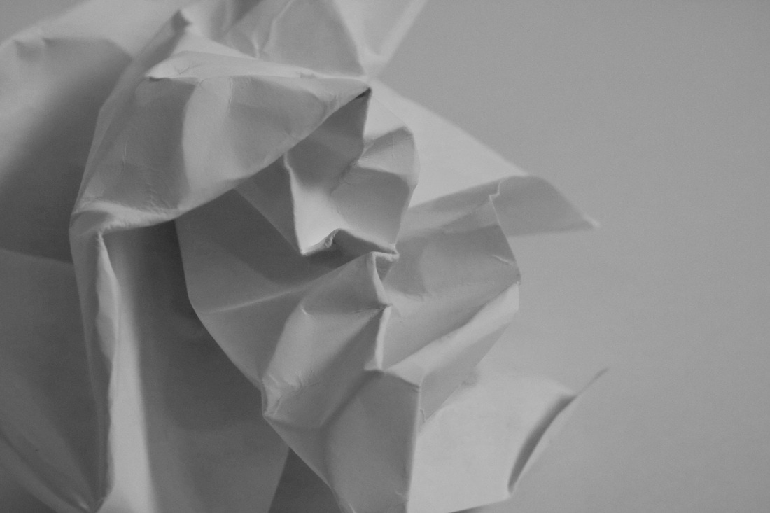
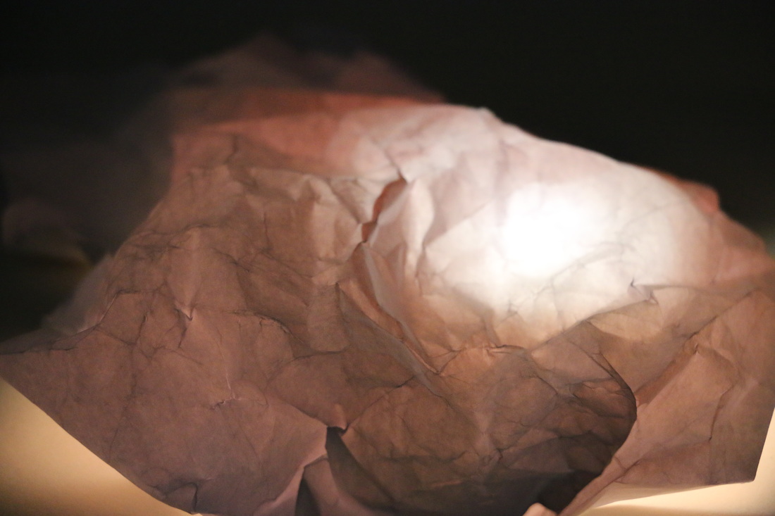
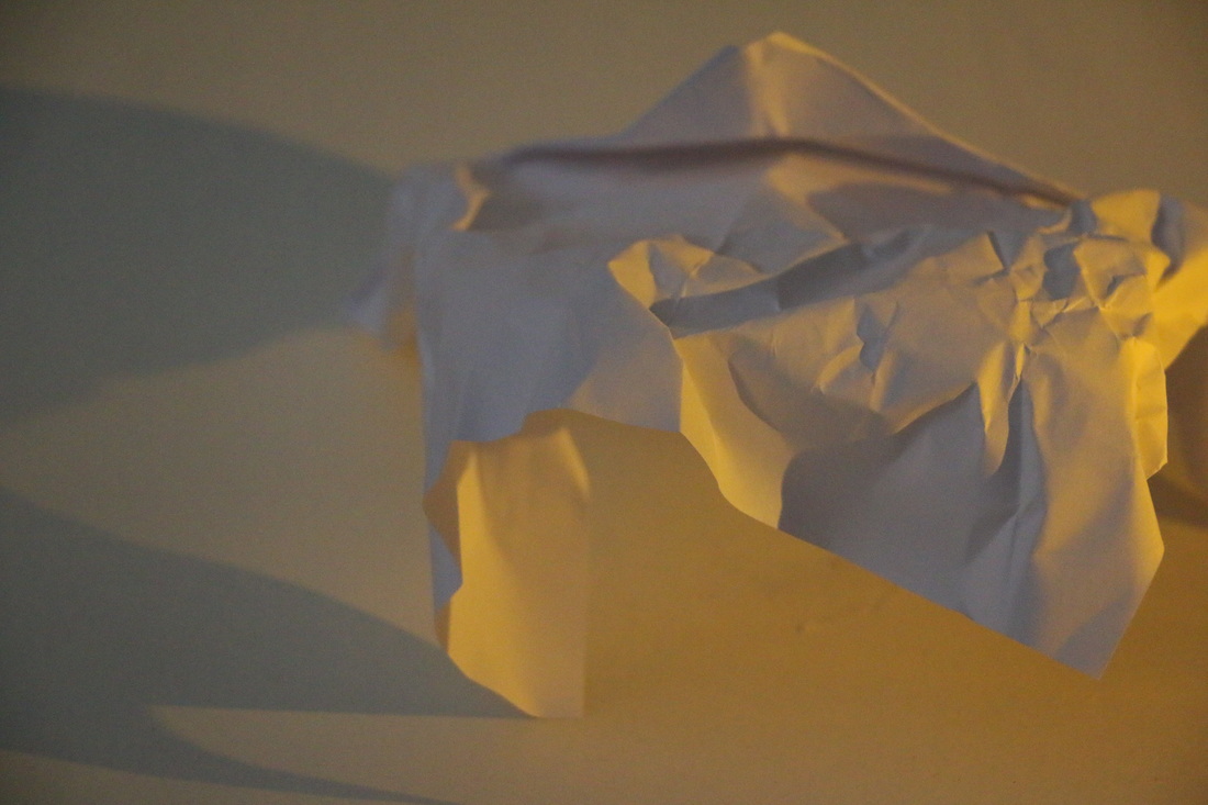
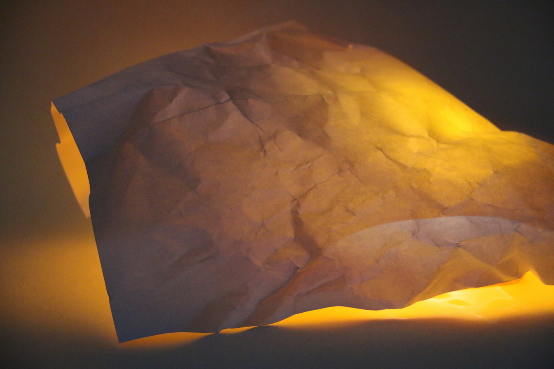
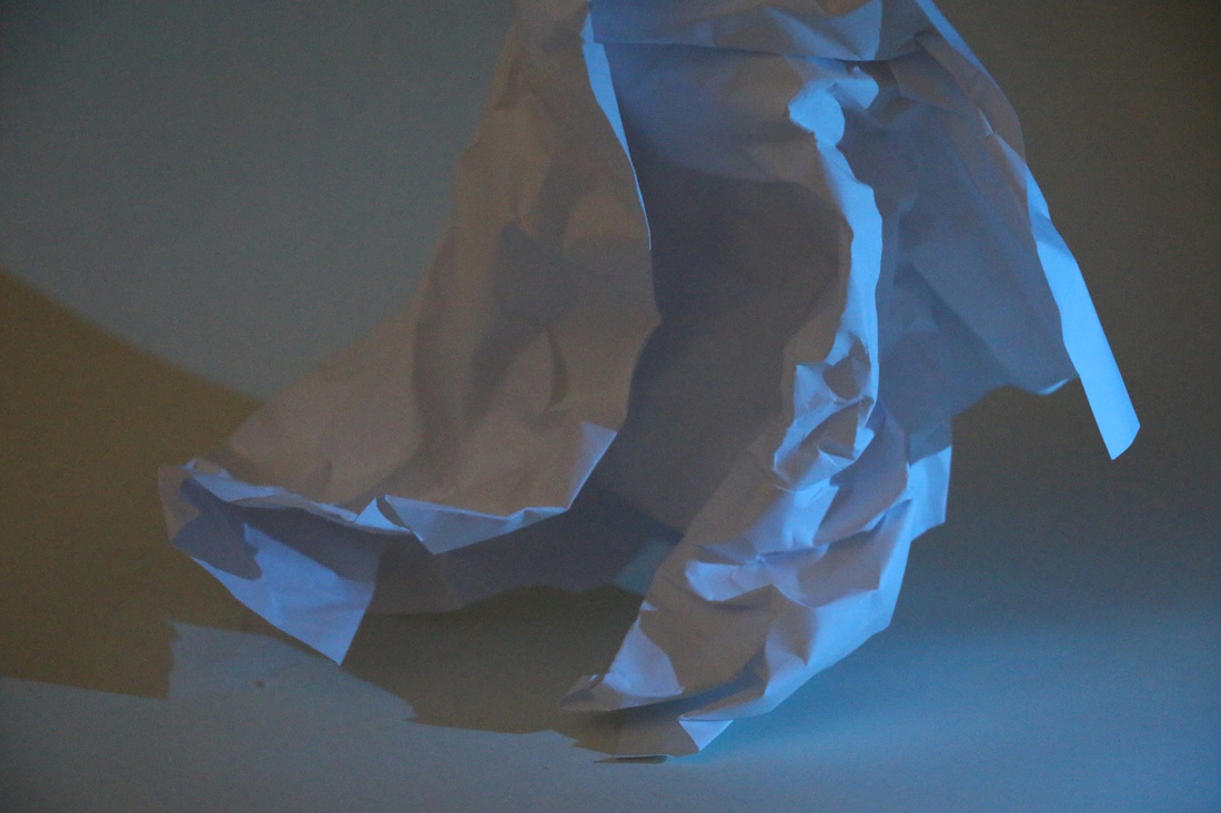
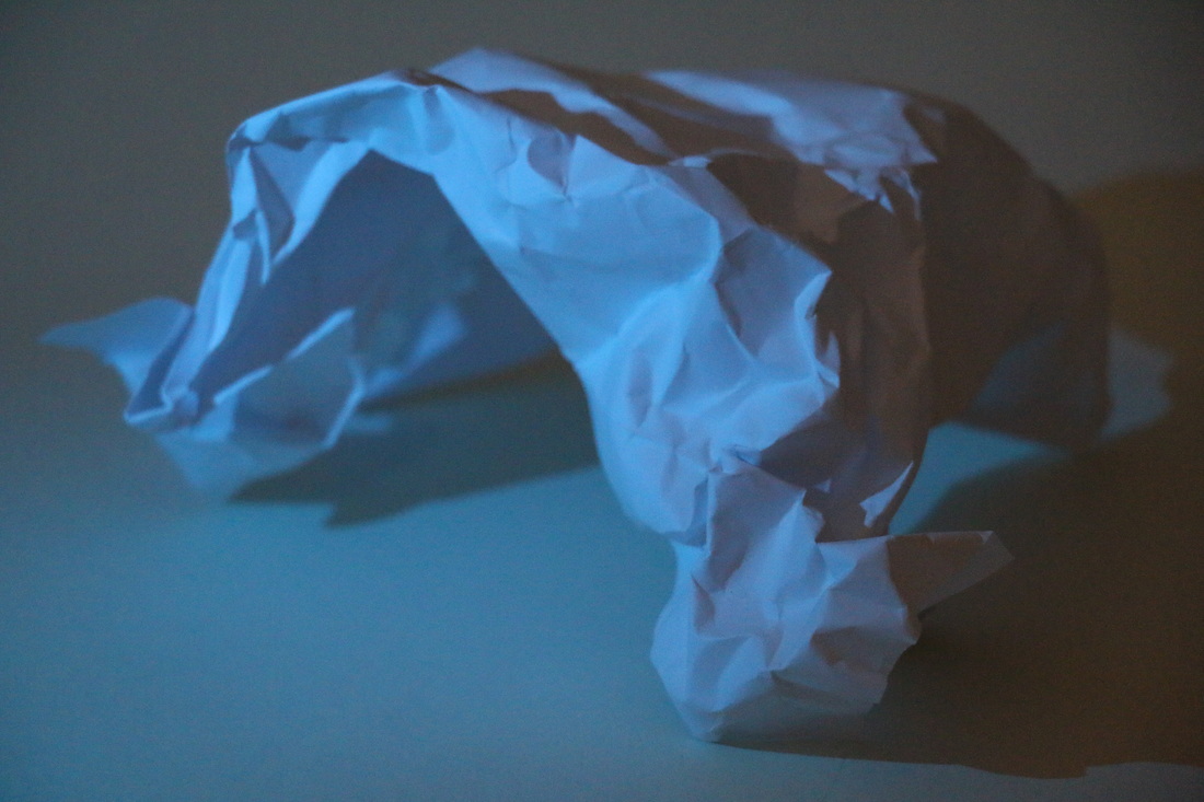
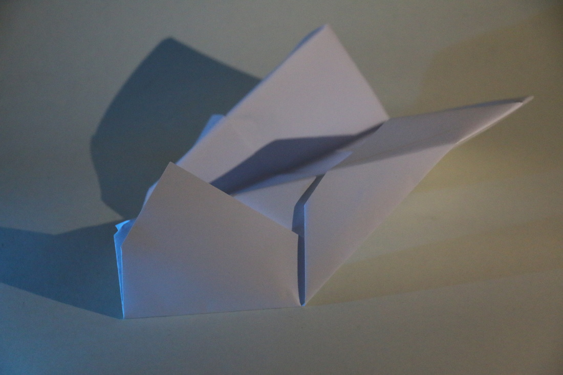
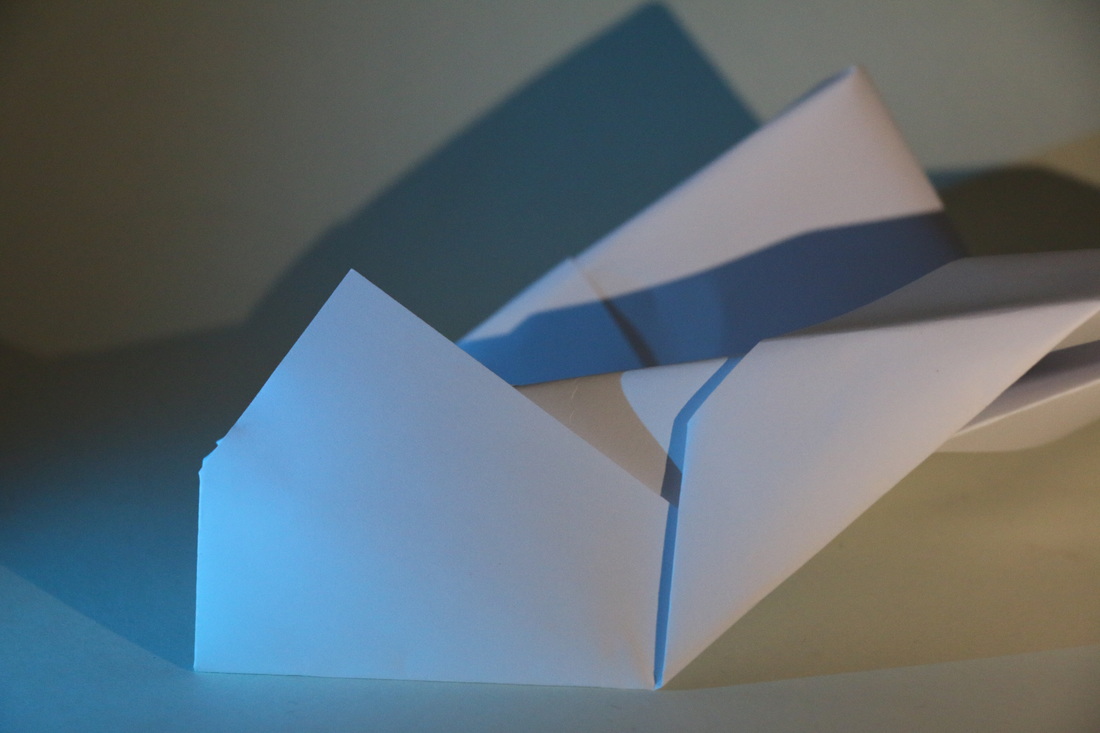
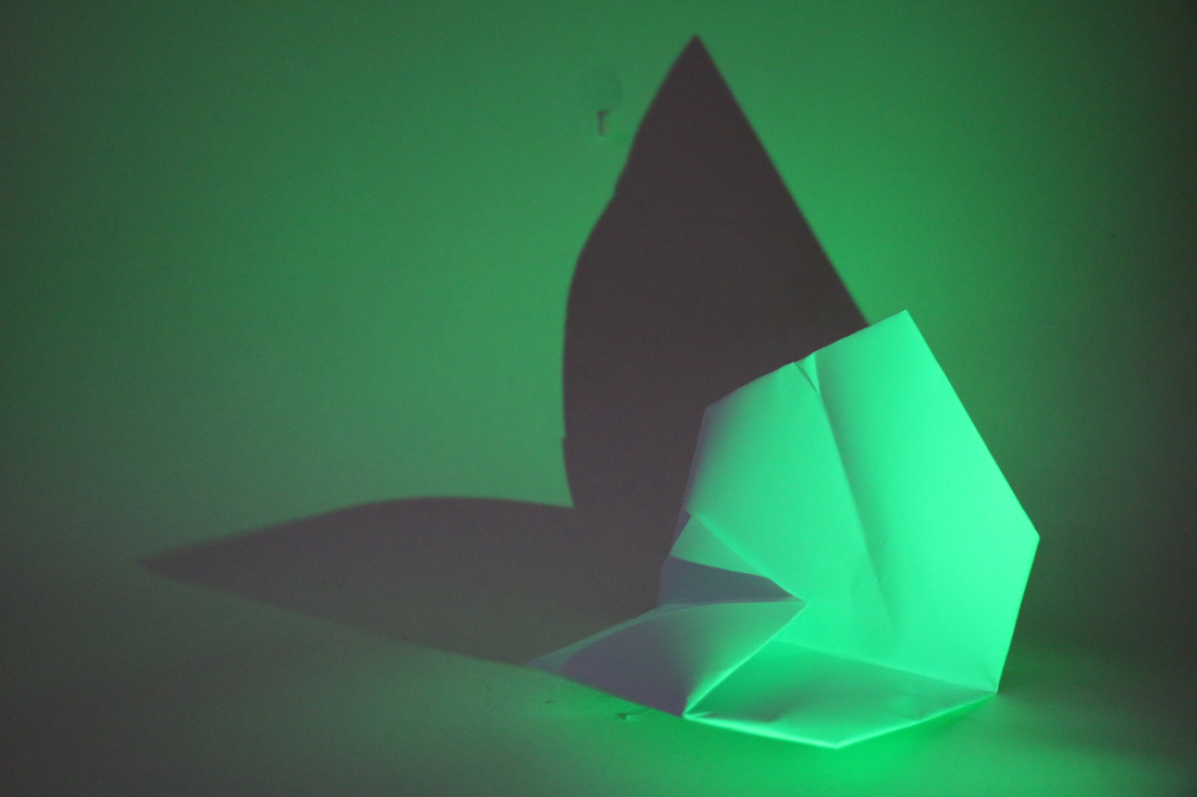
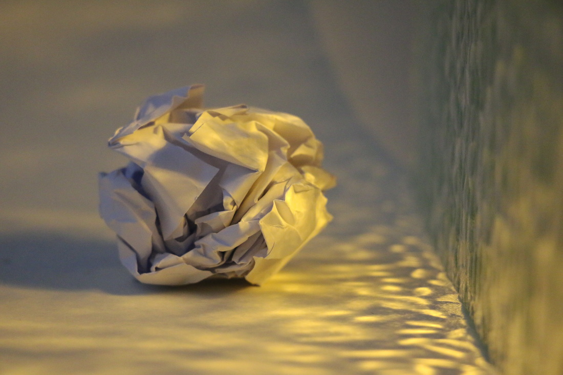
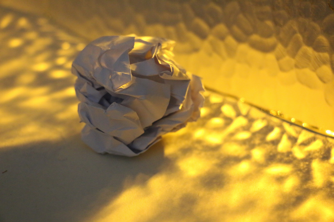
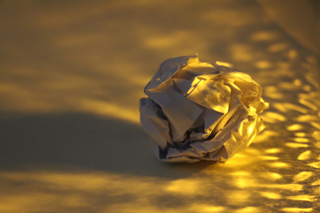
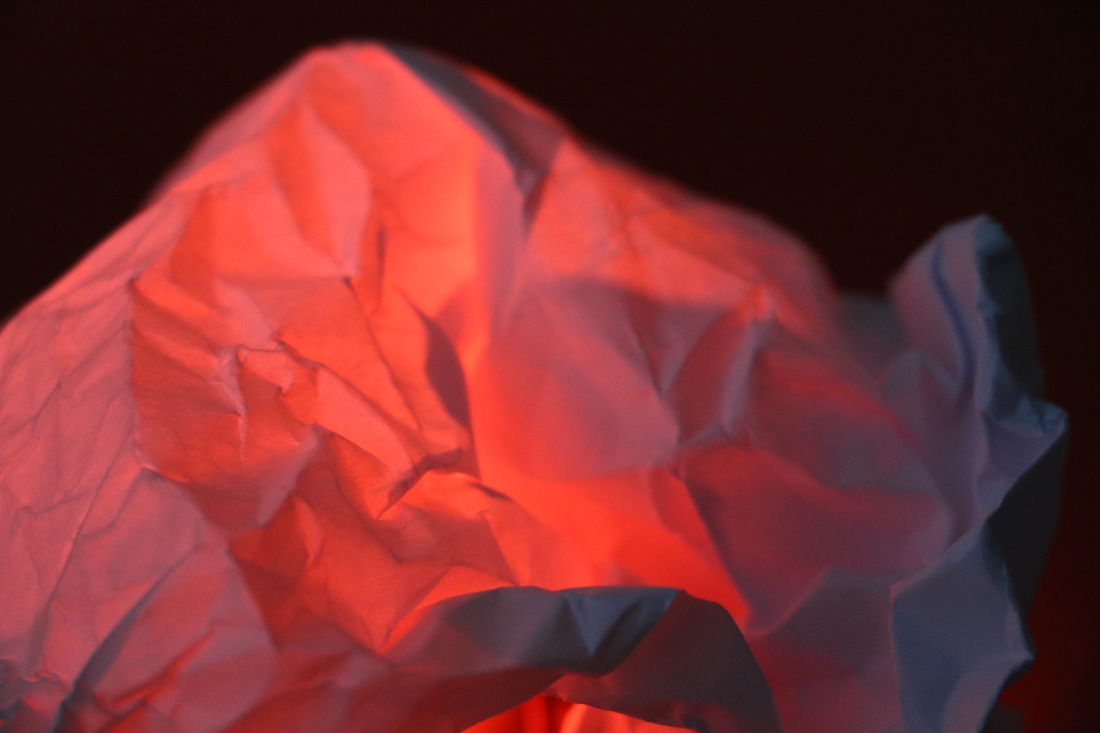
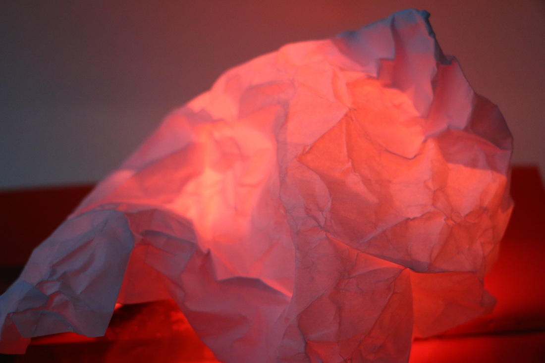
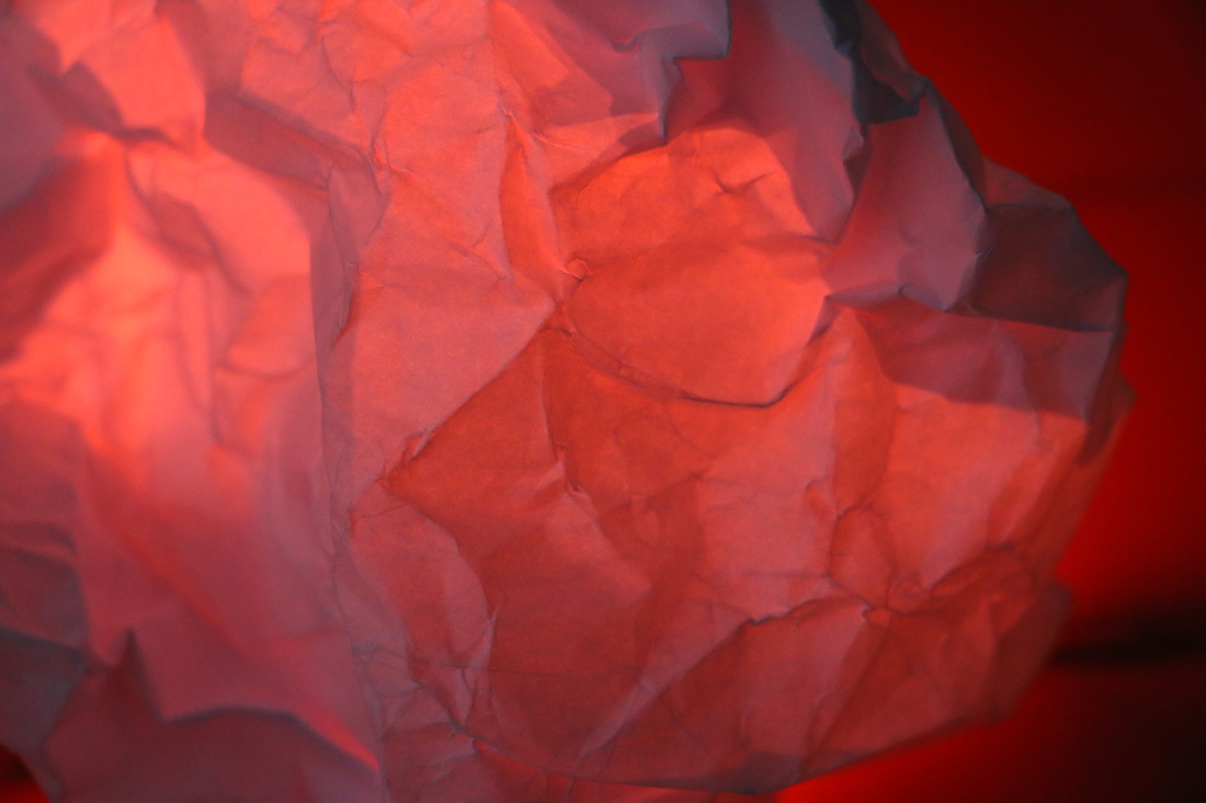
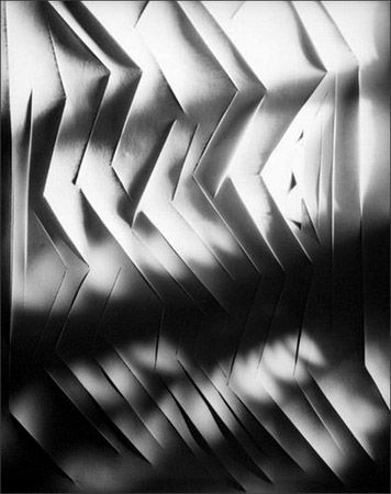
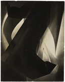
Our first task that involved abstraction was to create a series of photographs of a white piece of paper. We had to create something interesting by folding or scrunching the paper and experimenting with light as well as colour. I took a series of unique photos. I started this task by taking photos only using white light and focus mostly on the contrast between the light and the shadows but then I started to experiment with different coloured filters to make the photos more interesting.
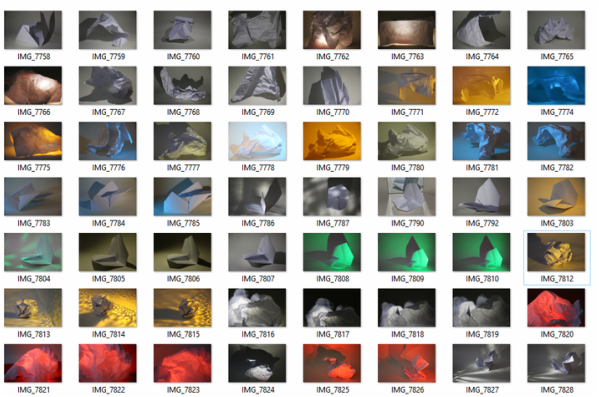
CONTACT SHEET:
WHITE LIGHT:
CONTACT SHEET:
COLOUR:

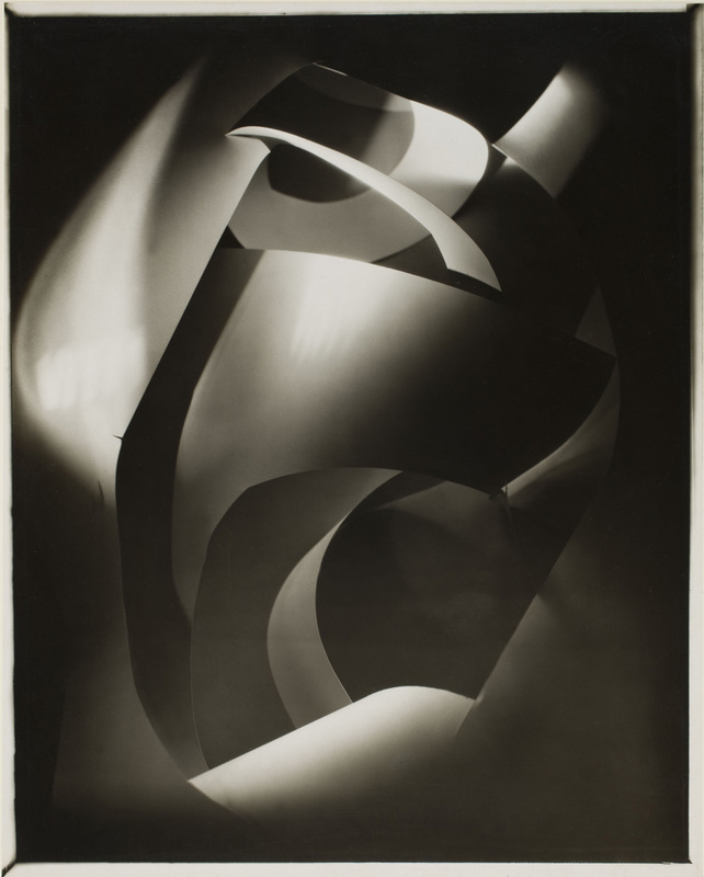
FRANCIS BRUGUIÉRE
|
TAMARA LORENZ
|
|
Francis Bruguière was an American photographer that experimented with non representational photography. When he was experimenting with this form of art he created some abstract photographs of paper. His aim was to create something beautiful and complex out of the paper by constantly changing the light and the patterns of texture he created from the paper. I think my work has some similarities with this artist's work because I also focused on the light and texture in my photographs. I wanted to create interesting compositions and shapes out of the paper, and changing the light, as well as colour, helped me to make each of them unique and interesting.
|
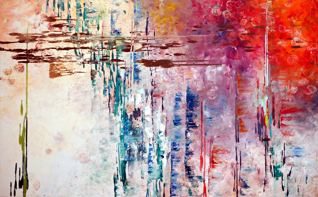
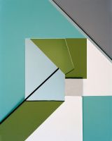
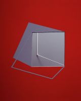
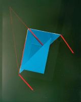
Tamara Lorenz is an artist that creates unique compositions of colour, shapes and sharp lines. The colours that she includes are strong planes of colours that contrast well with each other, through this Tamara Lorenz is able to construct very abstract artwork that each create their own sense of reality; even though they all have similarities, every individual composition has it's own uniqueness. I like Lorenz's work because it's very colourful and all of the colours work well together even though there is a big contrast between them. I can use this artists work as further development to my work because in my photos there is only one colour, and Lorenz combined several colours in one photo.
|
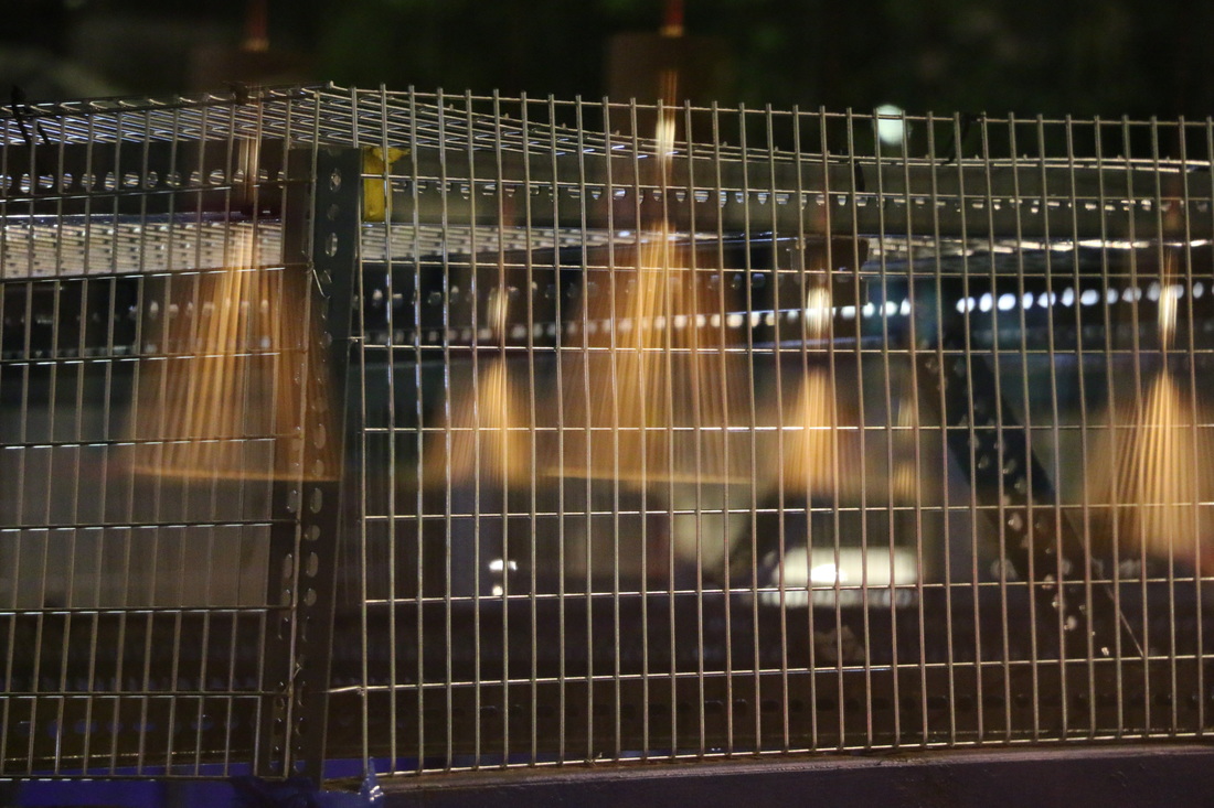
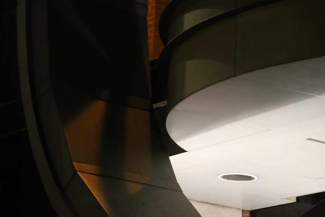
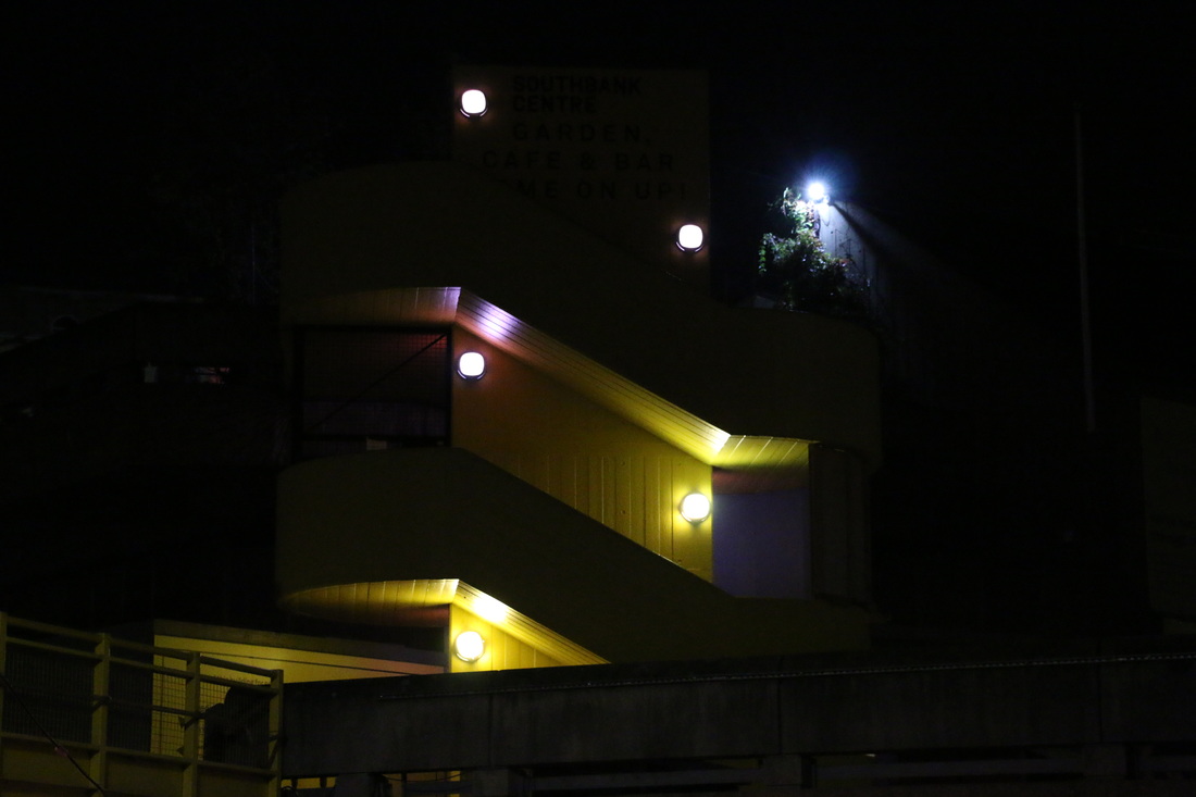
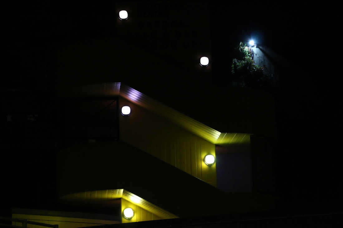
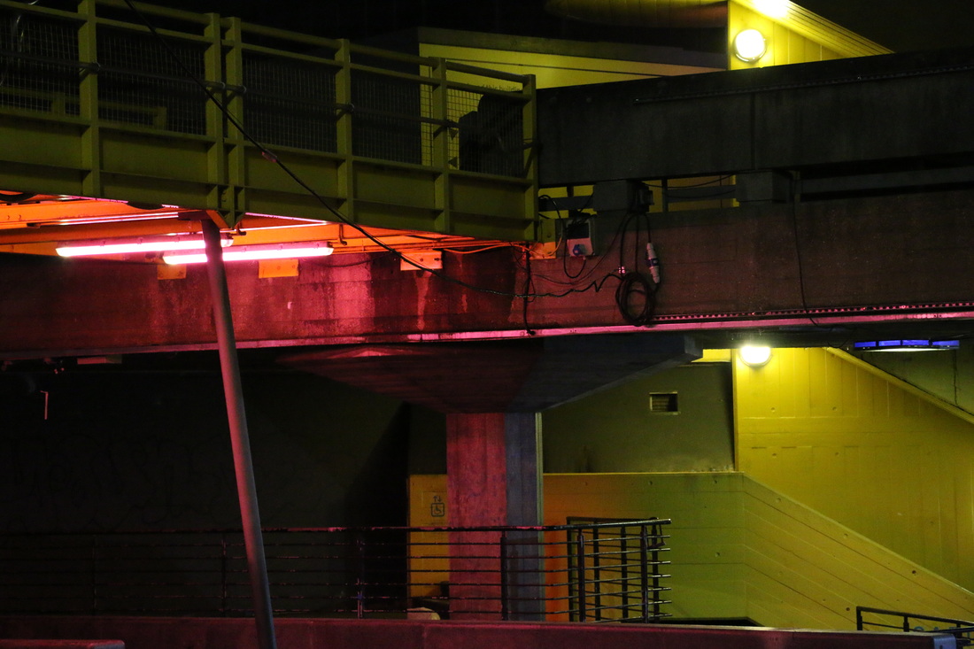
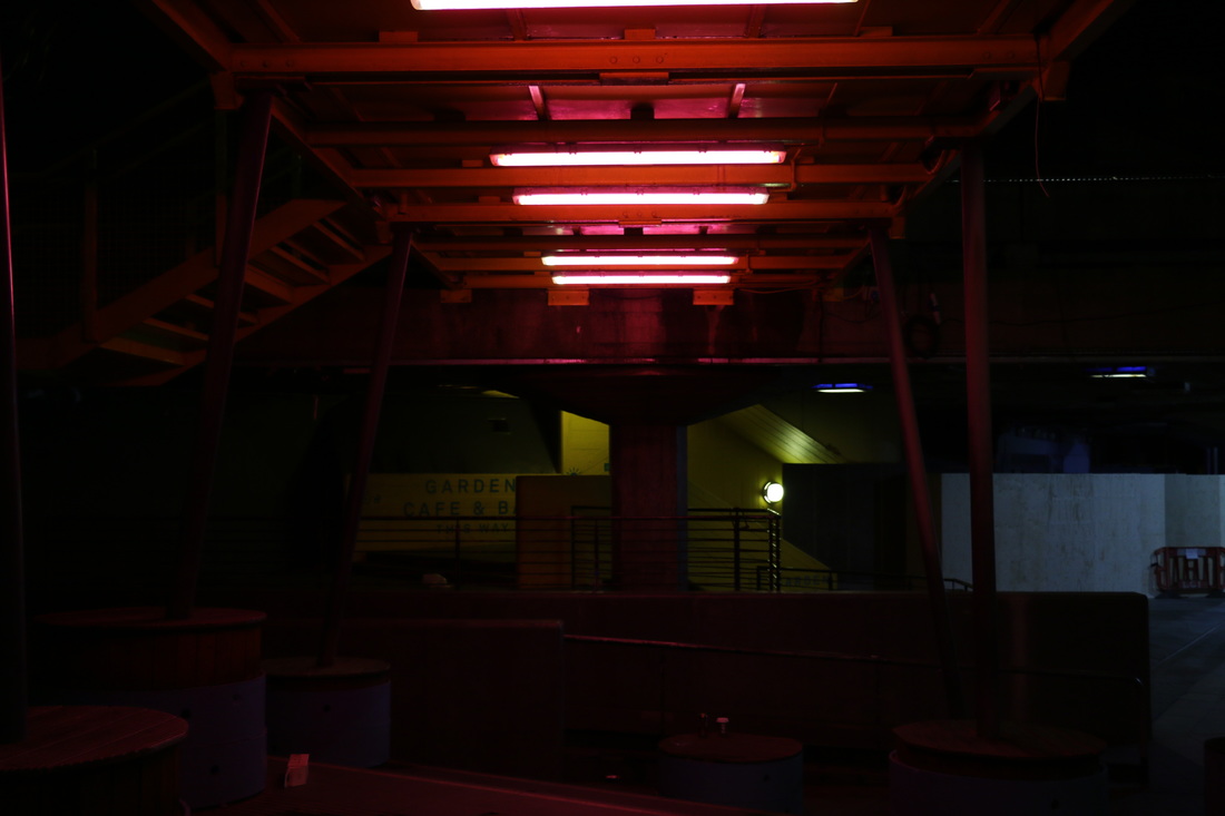
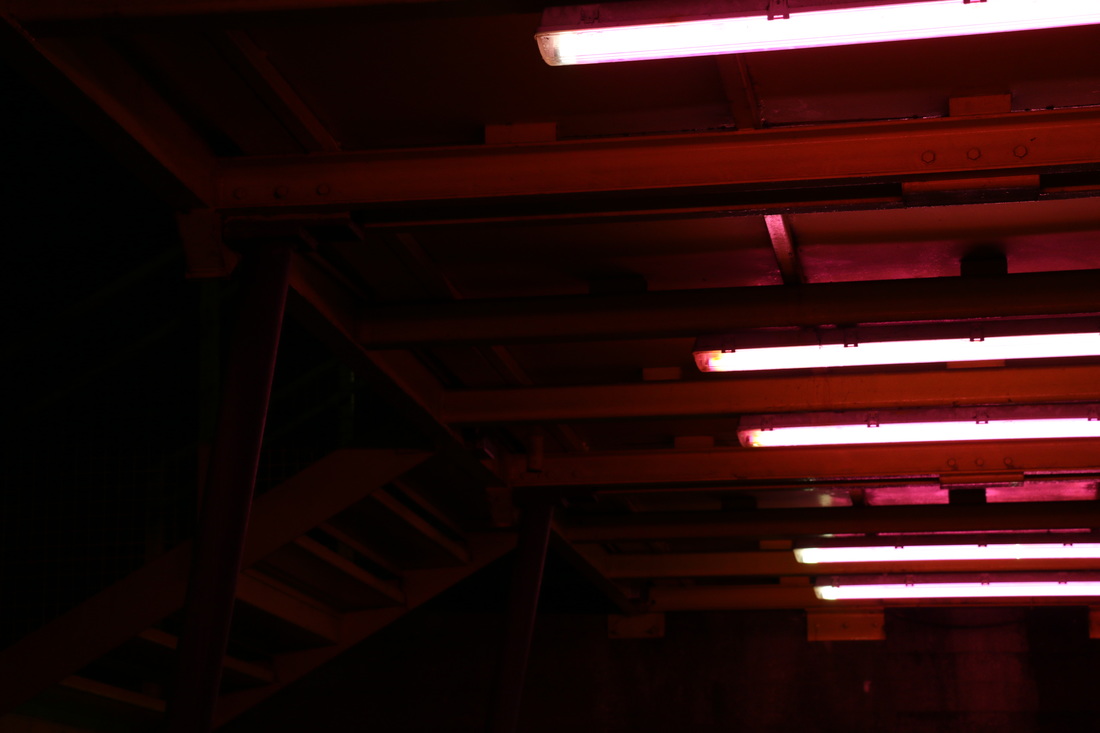
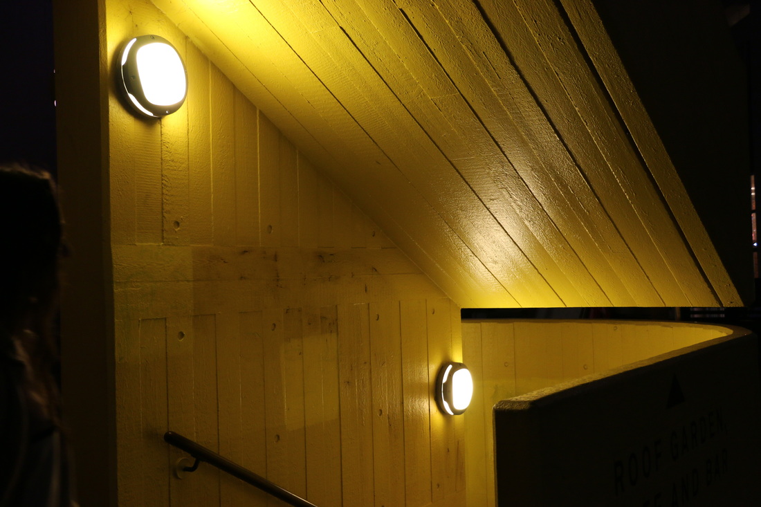
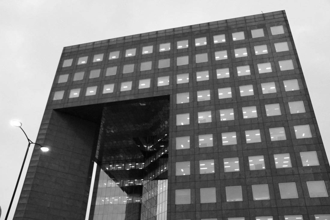
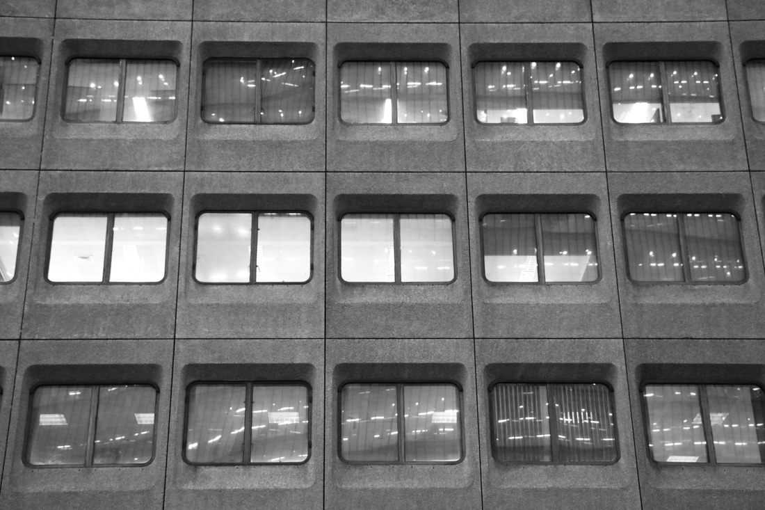
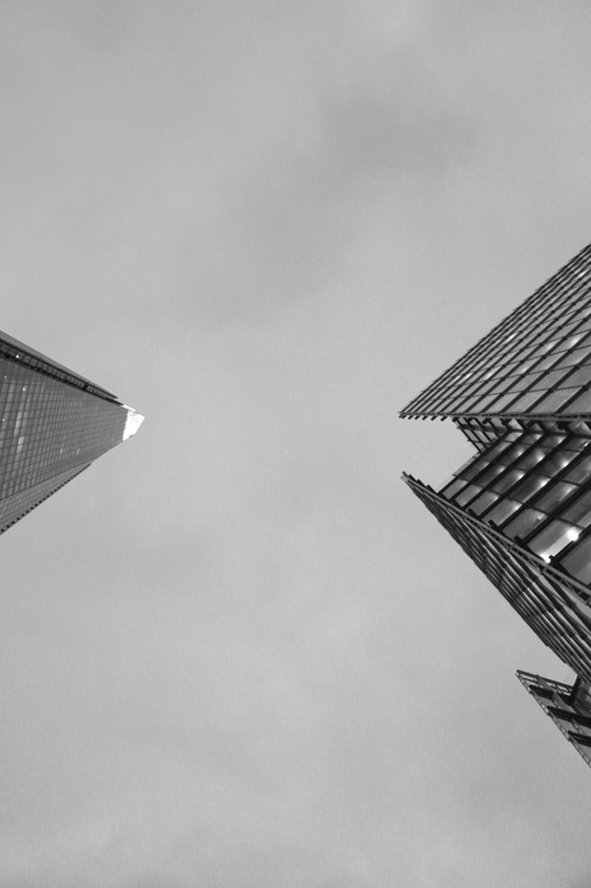
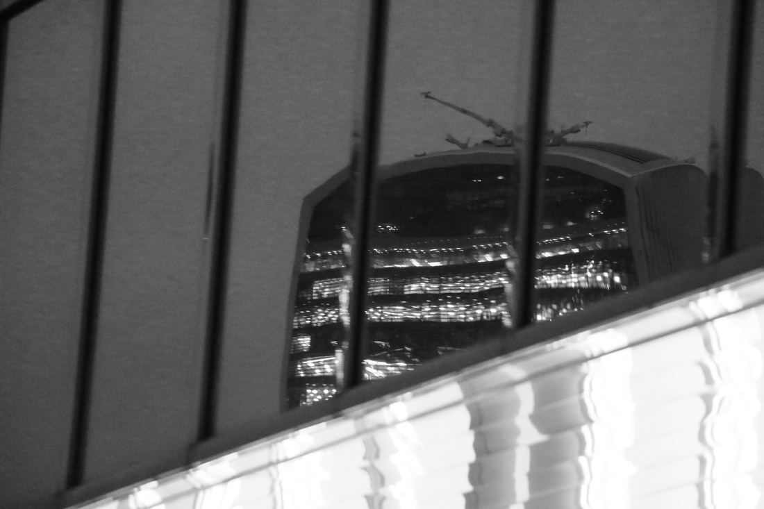
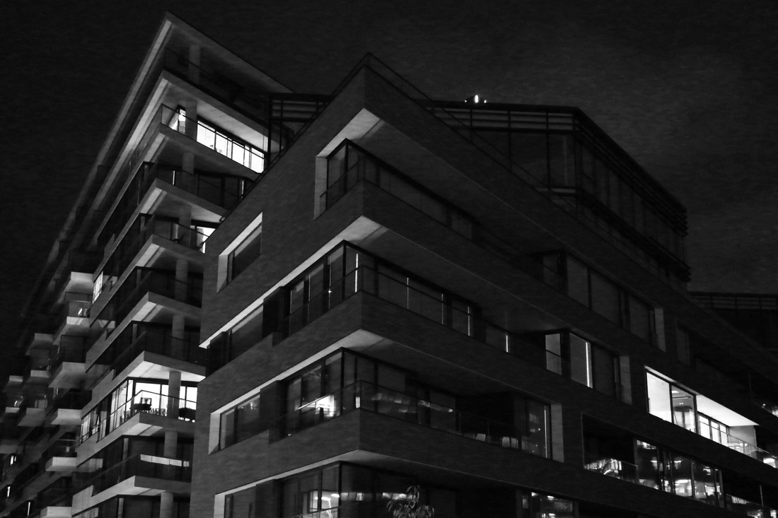
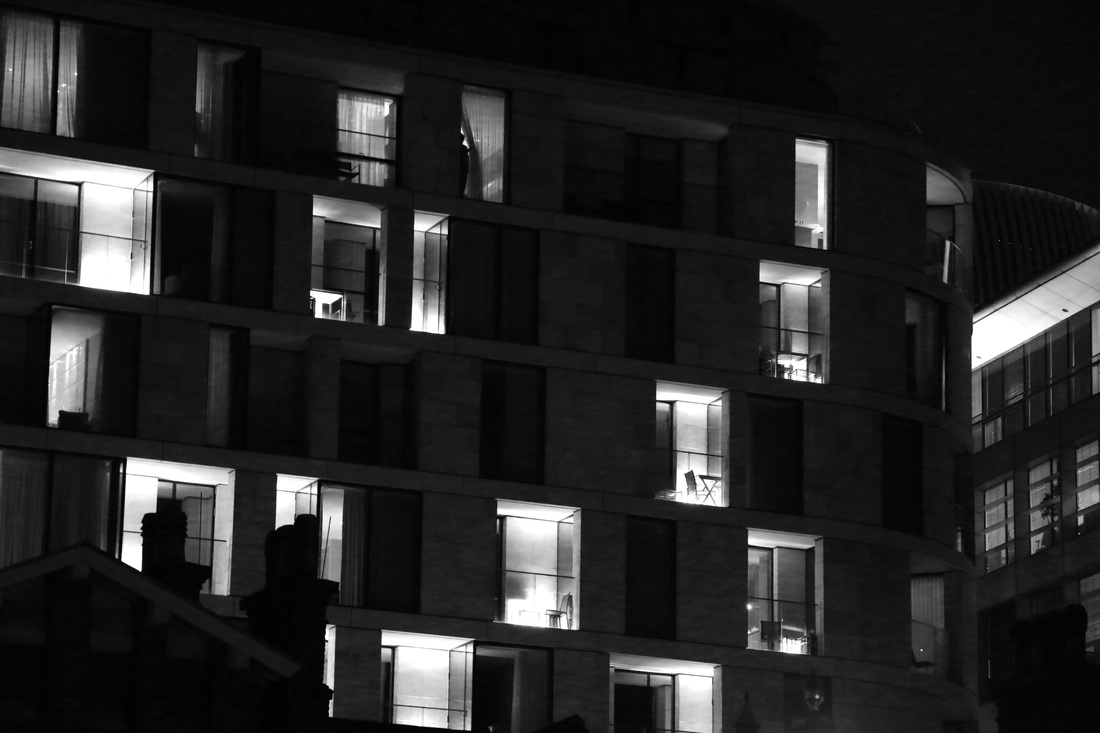
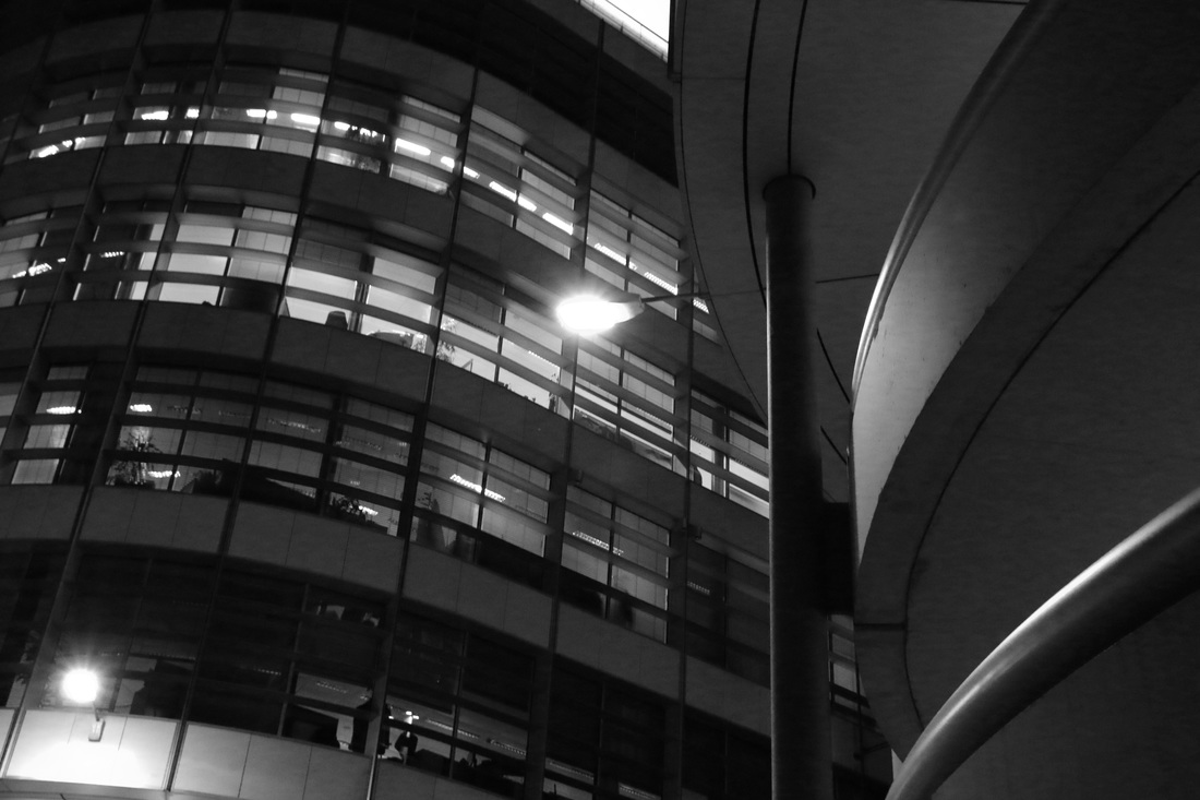
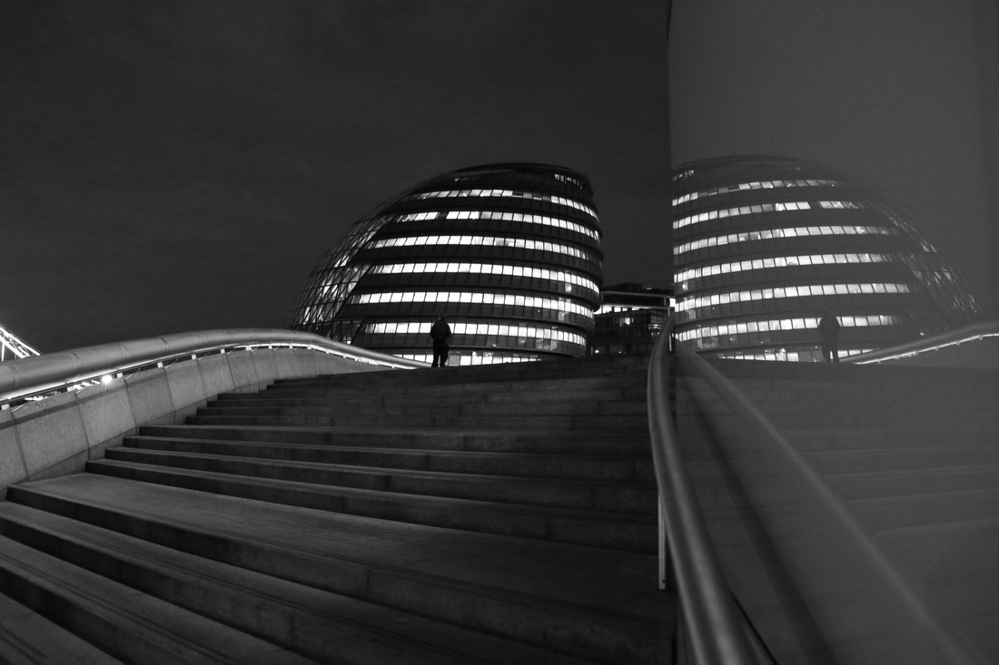
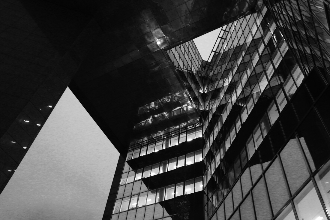
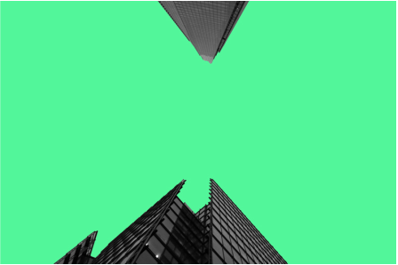
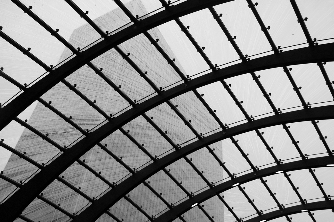
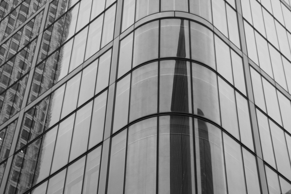
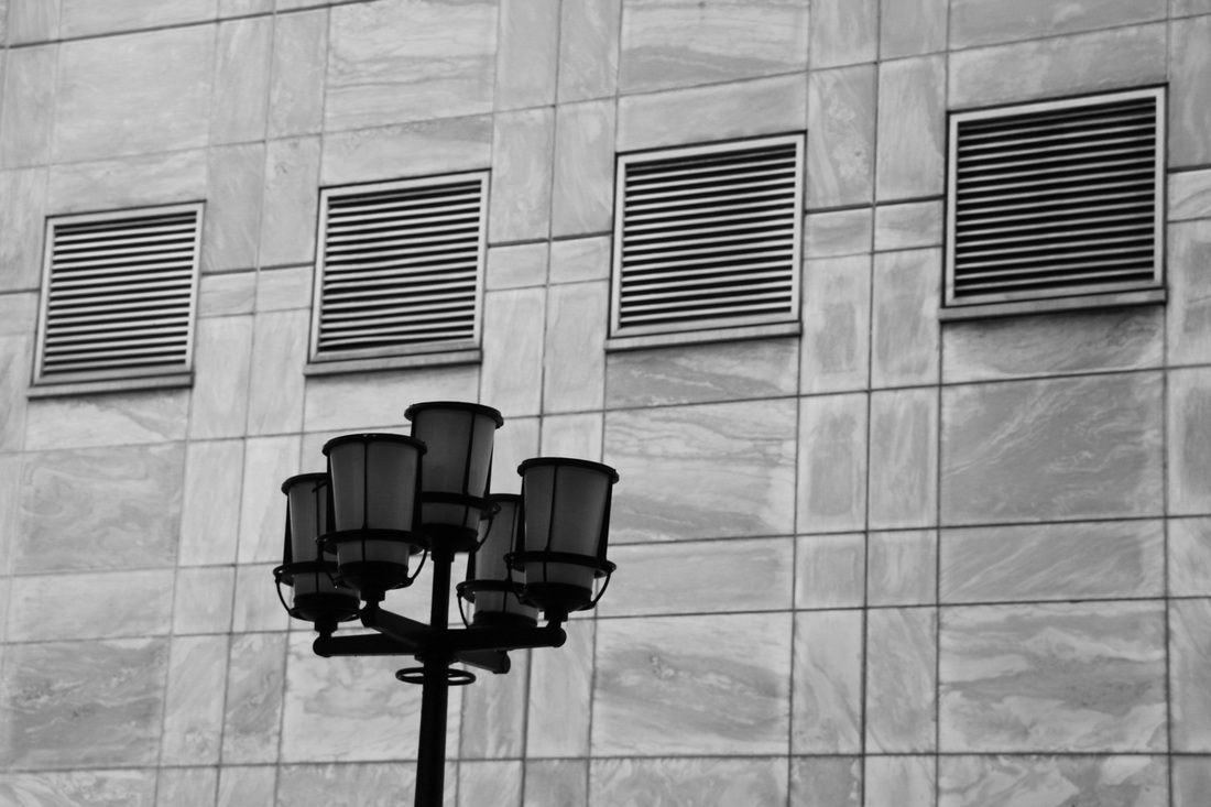
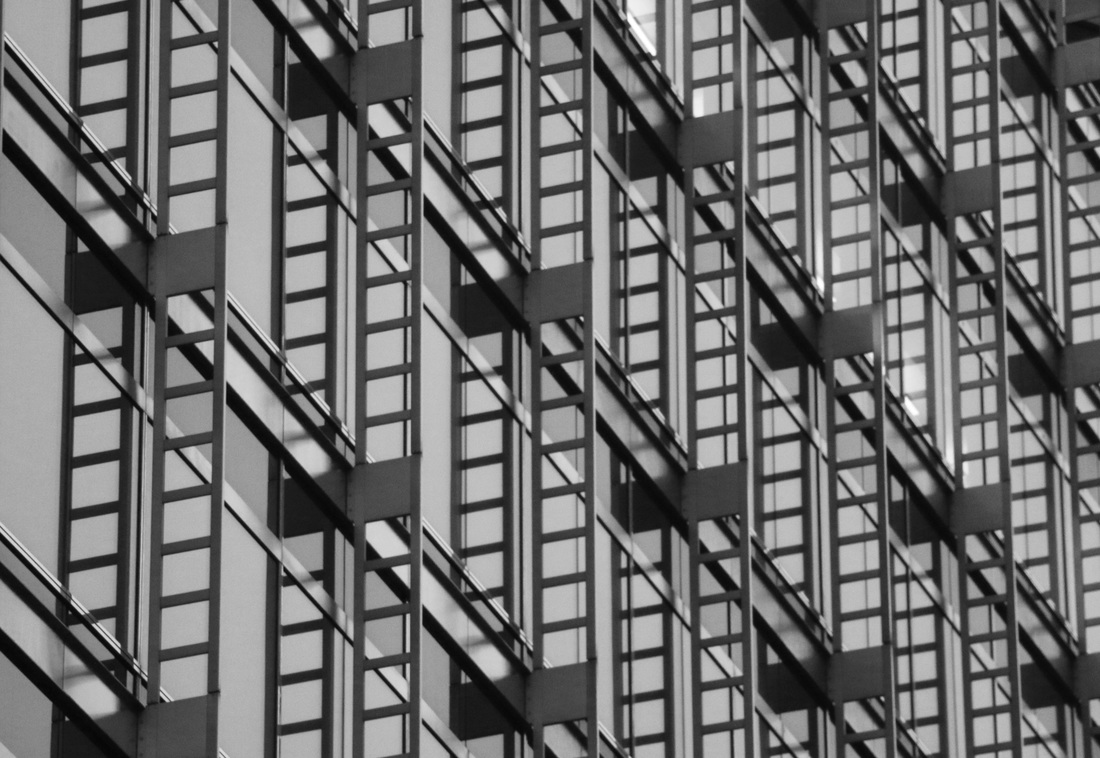
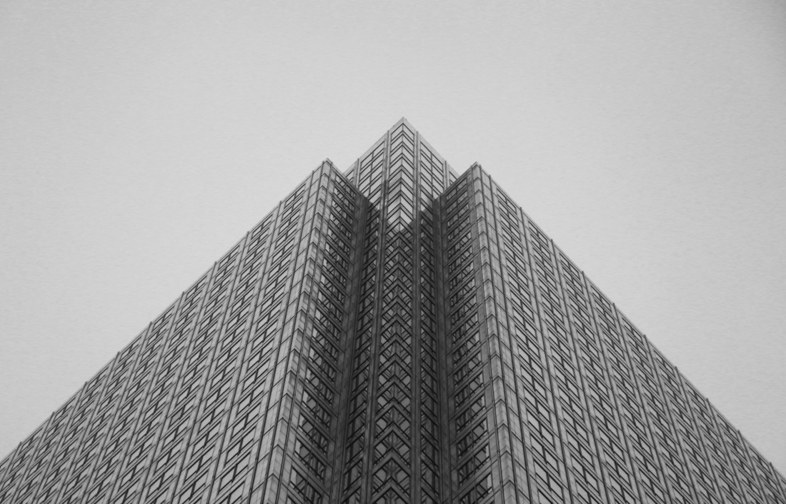
ABSTRACTION IN REAL LIFE
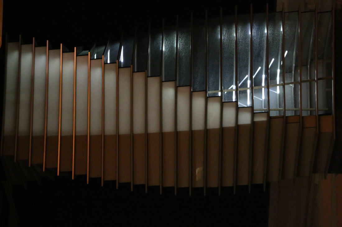
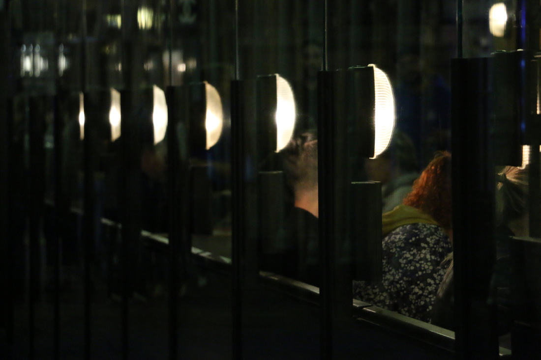
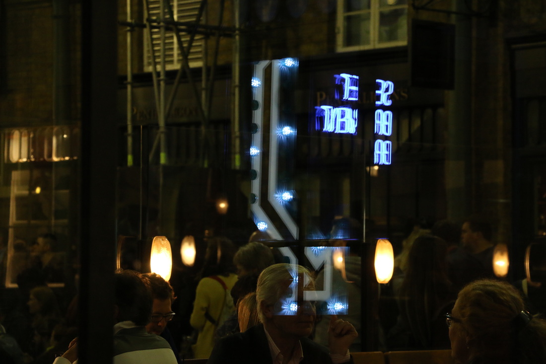
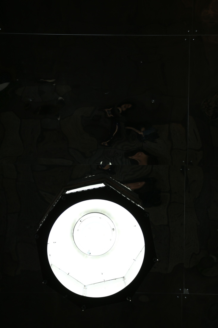
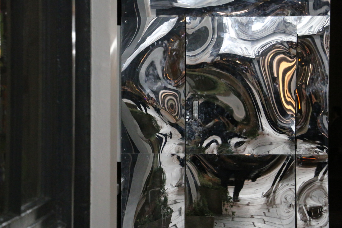
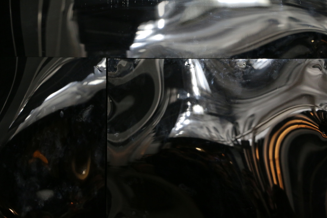
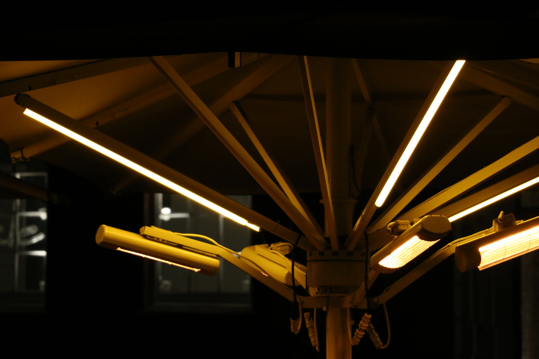
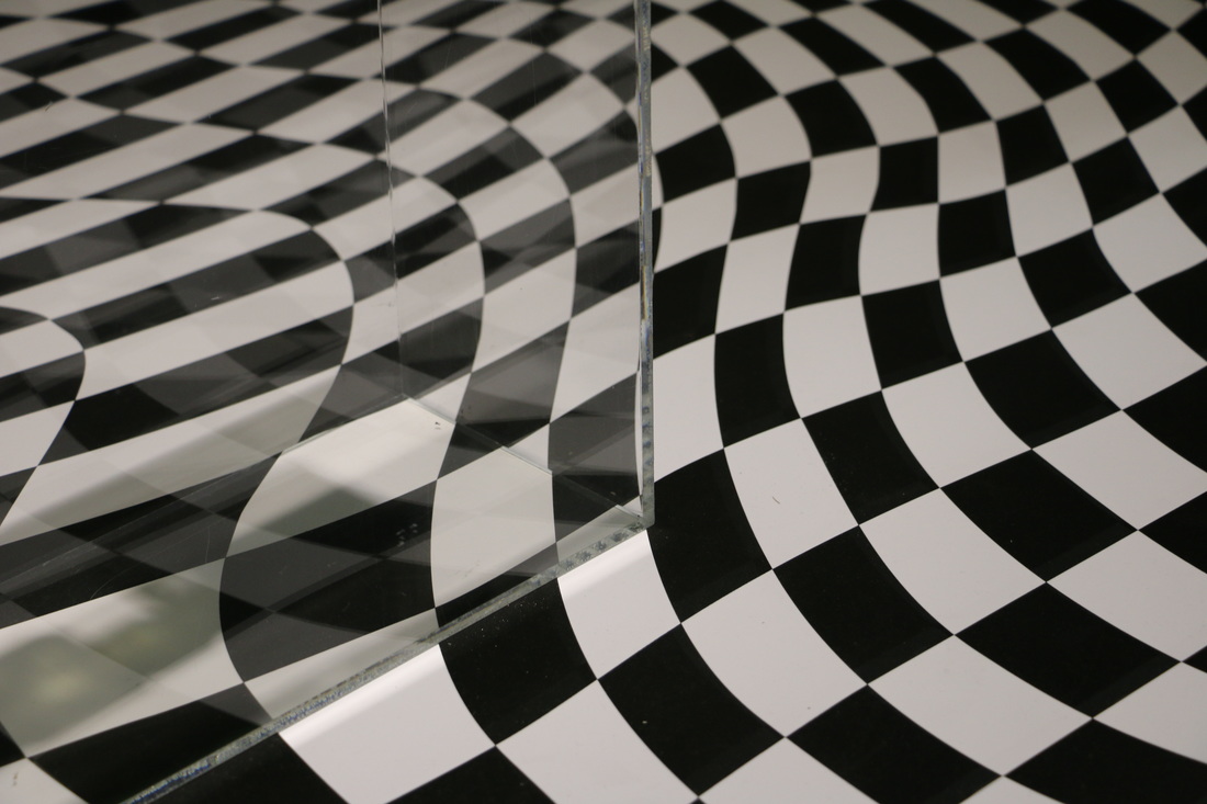
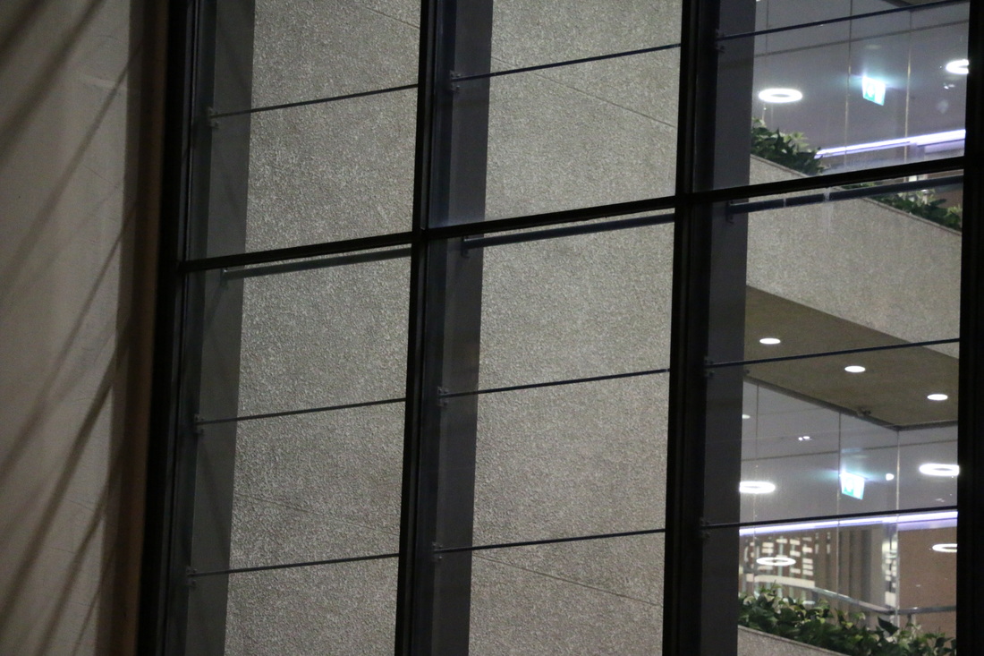
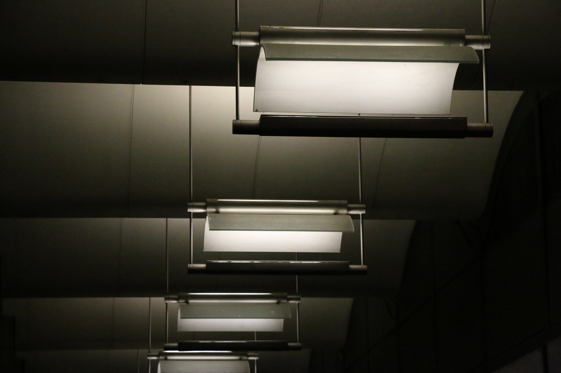
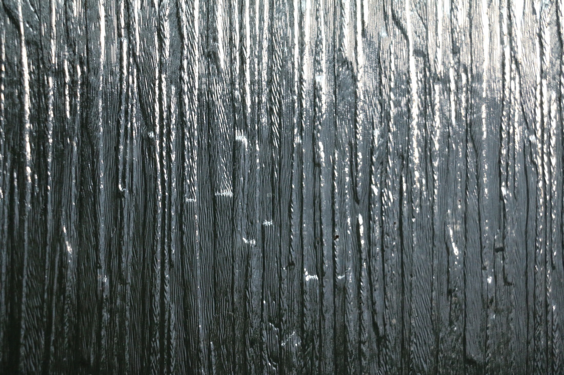
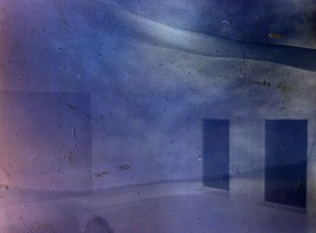
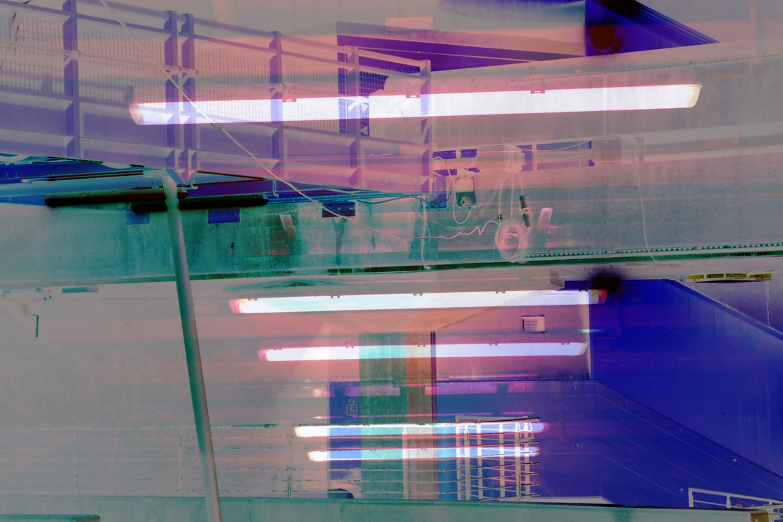
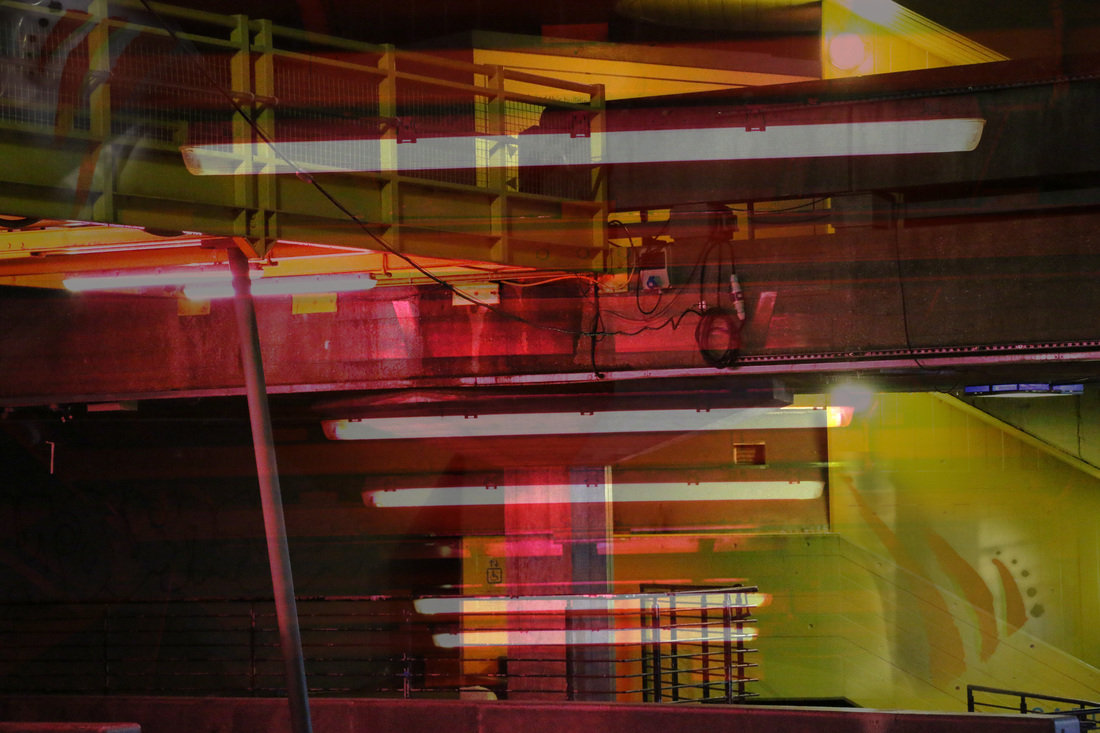
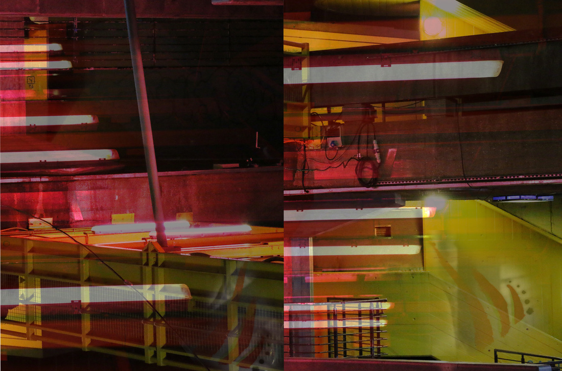
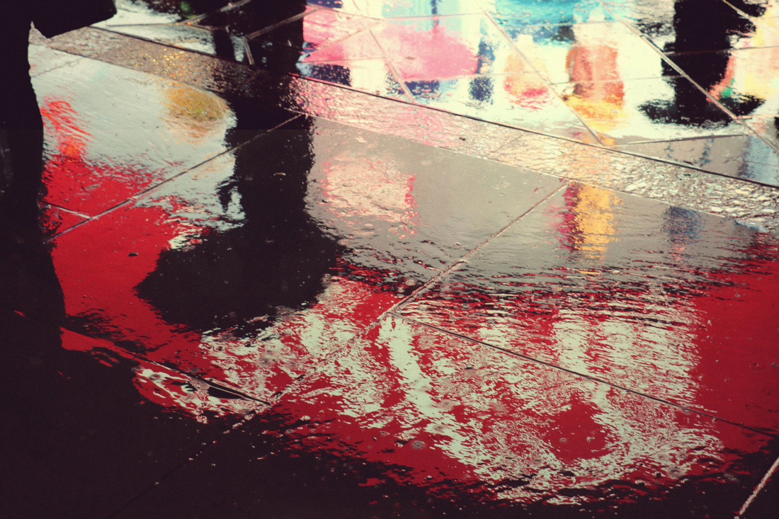
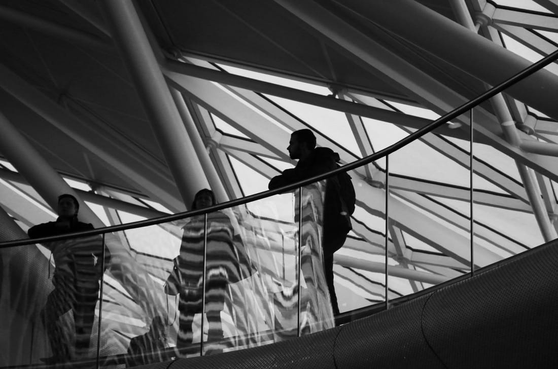
Our homework task was to photograph abstract compositions in the real world. The task was easier than I thought it would be because it just required an eye to detail and a camera that you could zoom in with. When I was walking with my camera trying to find the perfect compositions I realised that a lot of abstraction can be found in architecture because there are a lot of sharp lines and shapes. I had a few attempts at capturing reflection as abstraction, because it was a way of layering different shapes and colours with different light, which made the photos look interesting.

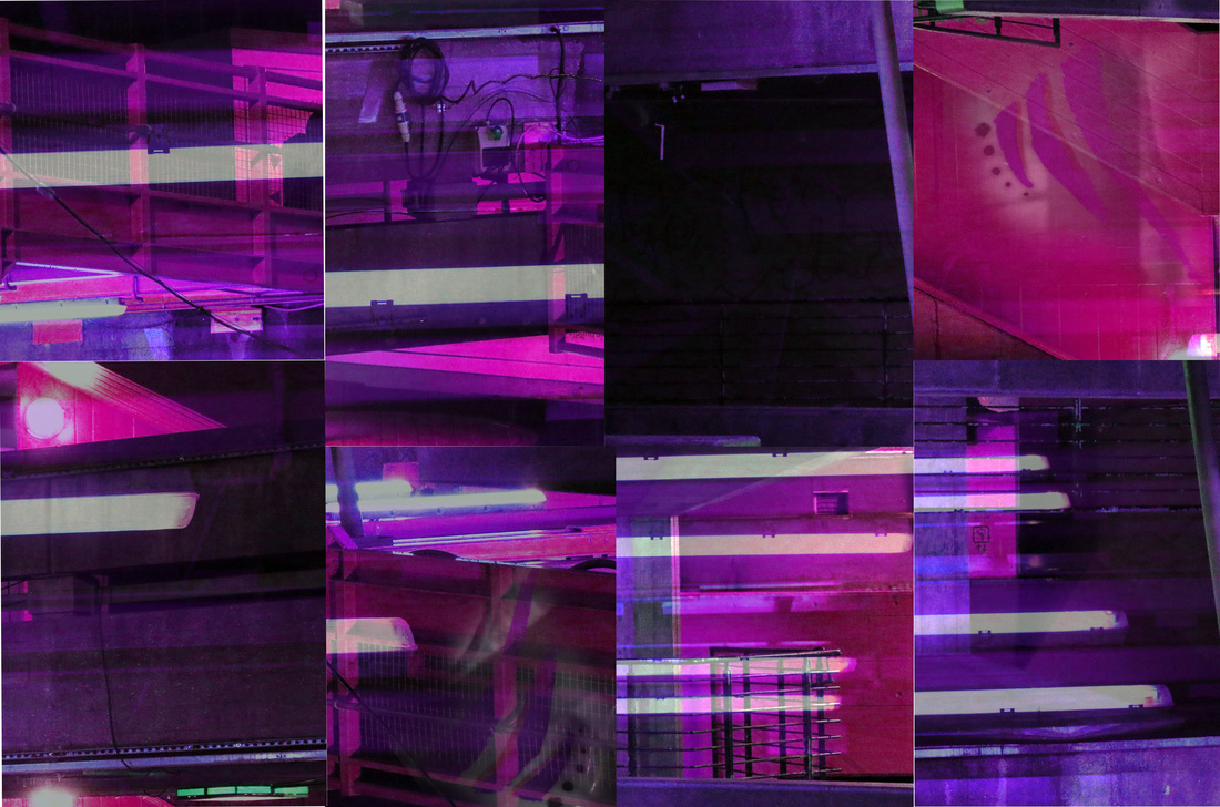
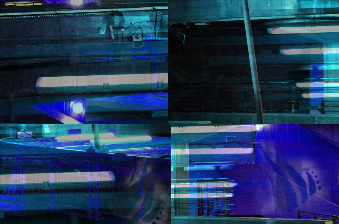
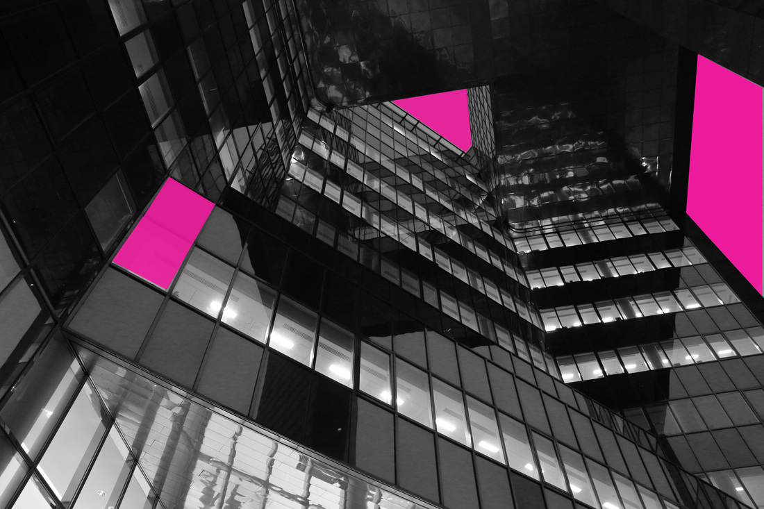
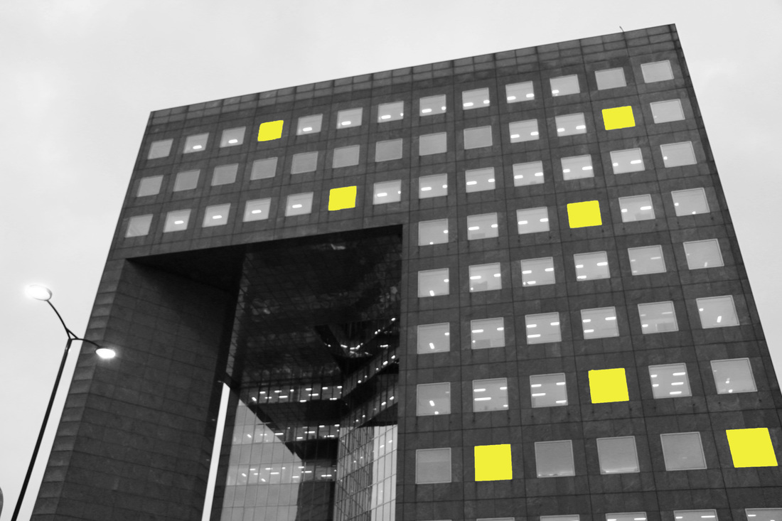
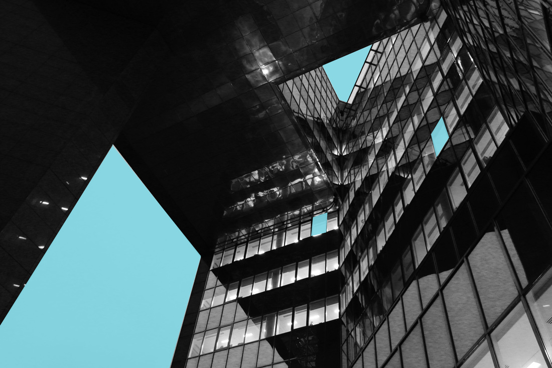
EXPERIMENTATION
|
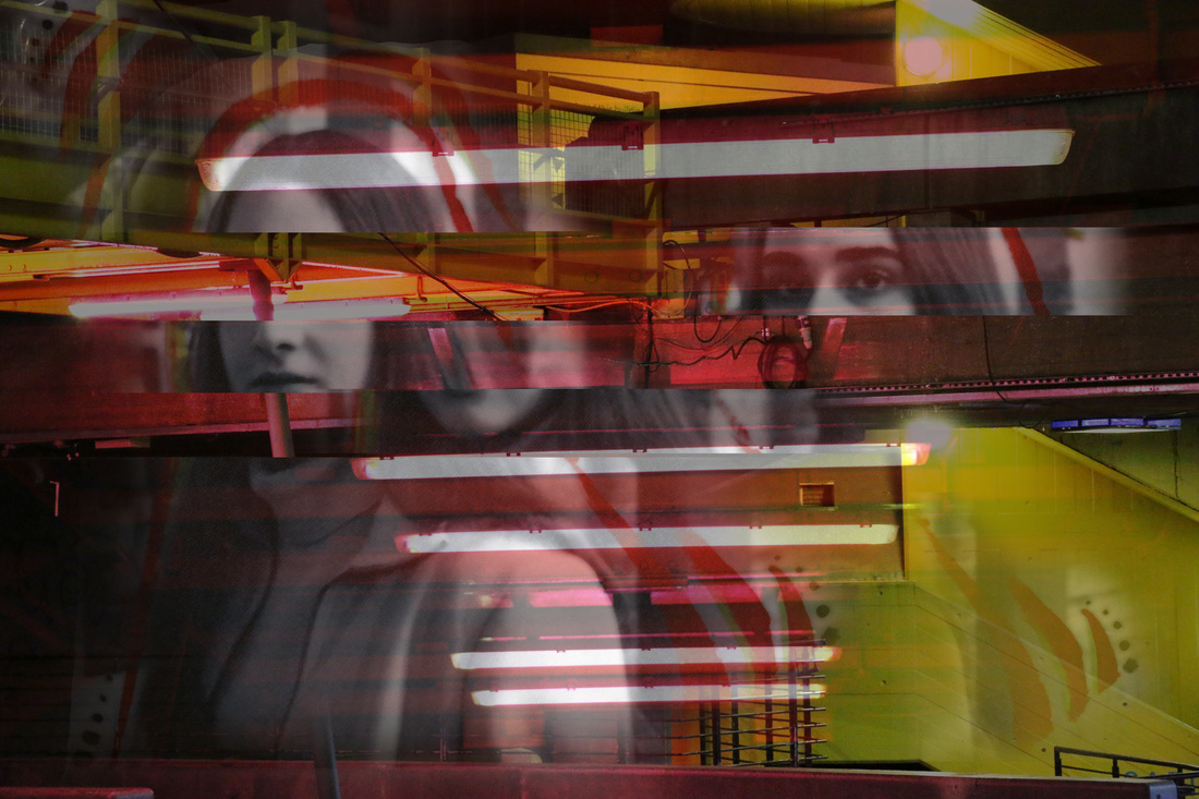
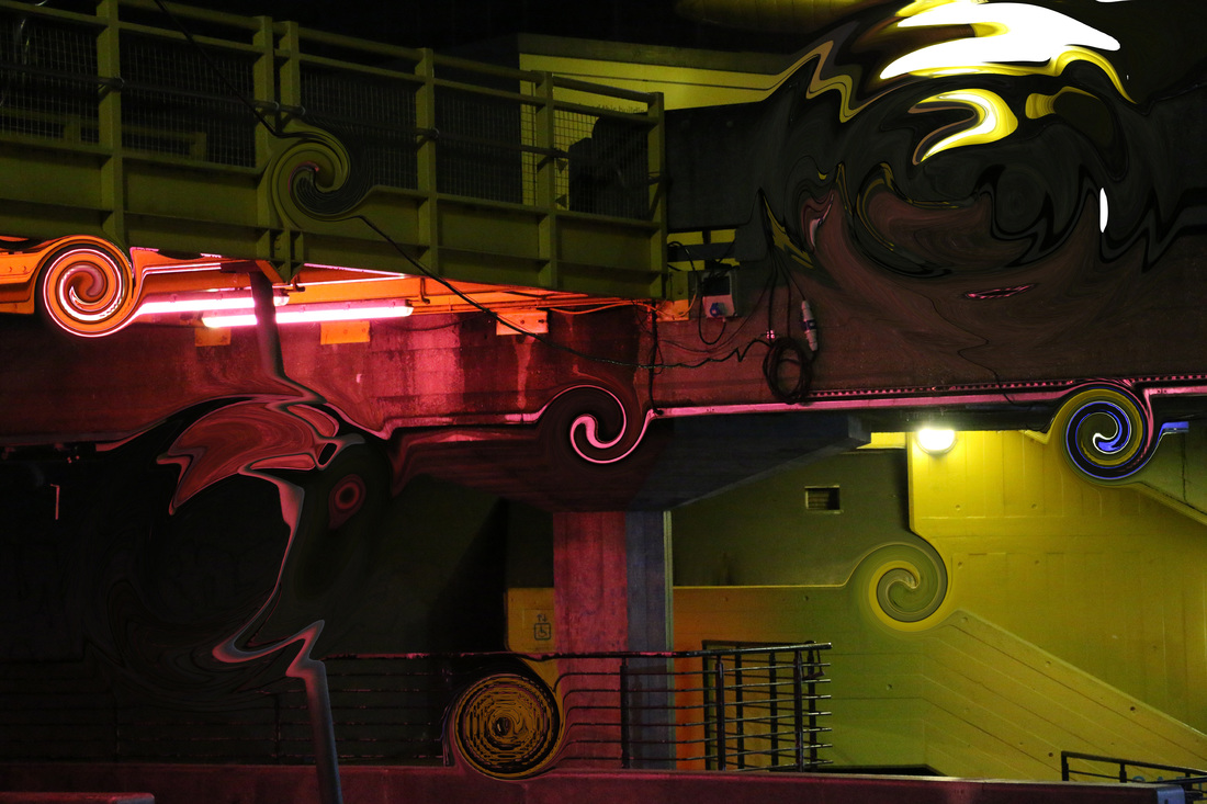
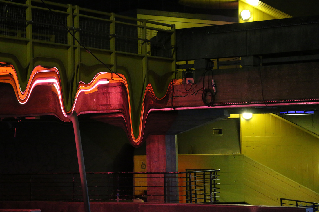
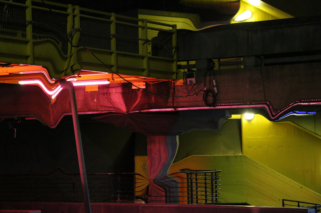
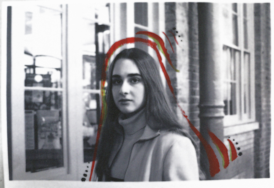
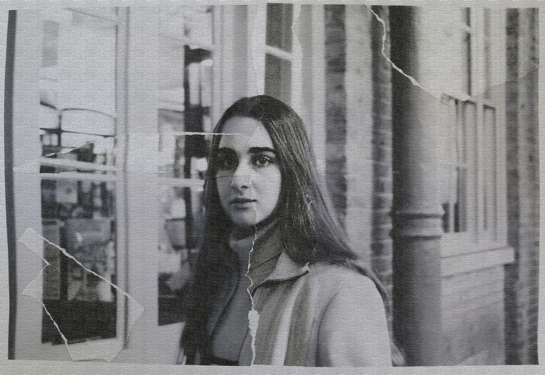
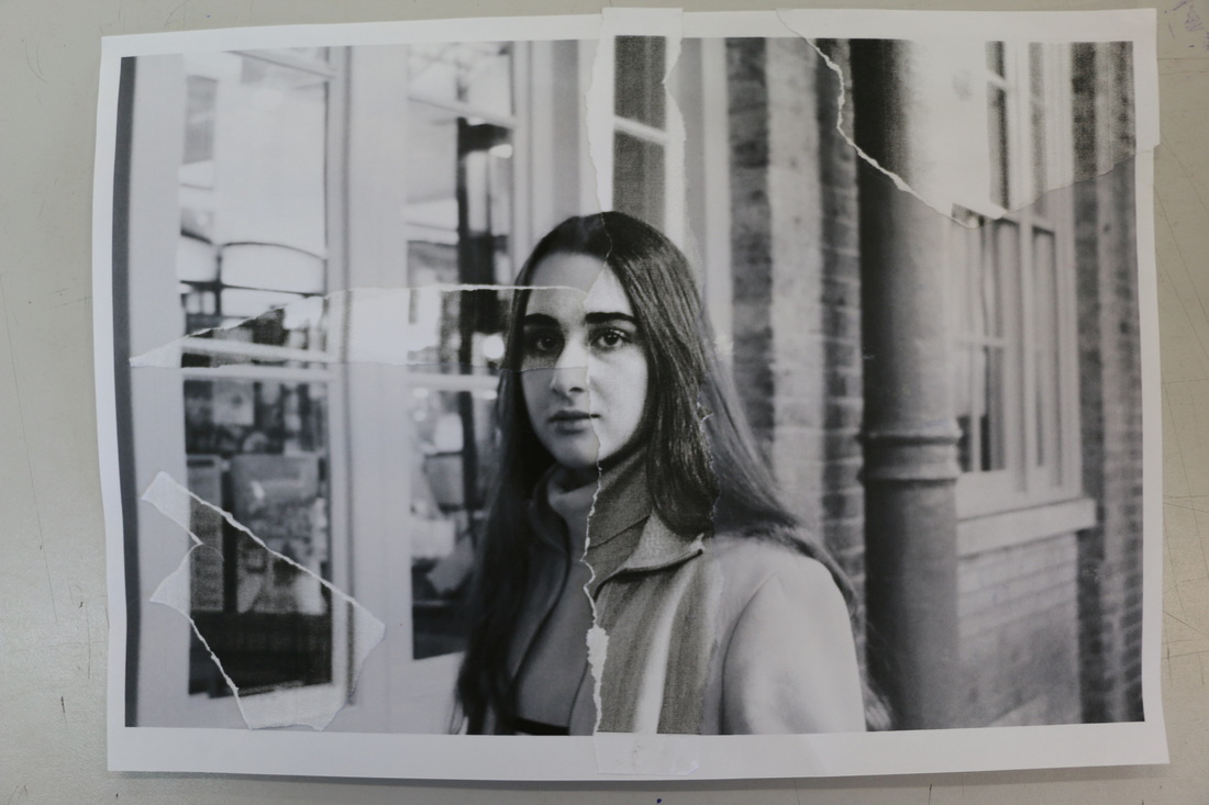
To create a truely unique abstract photo, an artist needs to experiment with a whole variety of different techniques. I chose one photo from the series of the photographs that I took of abstraction in real life and created several edits of it using Photoshop. I experimented with the colours, layers and light. I also chose a separate portrait photo to work with, I developed it and then found ways of making it abstract, for example I painted it, put in bleach and ripped it.
I was inspired by Toransupearento Daisuke Yokoto's photos which use multiple layers and different exposures to create abstract photo. His art work has a lot of texture and vibrancy, and that is what makes his work unique and beautiful. All of the colours in his photos blend in really nicely because he had a specific method of film developing. I however, used Photoshop to edit my photos. |
|
PORTRAIT ABSTRACTION
Bill Jacobson
|
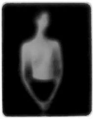
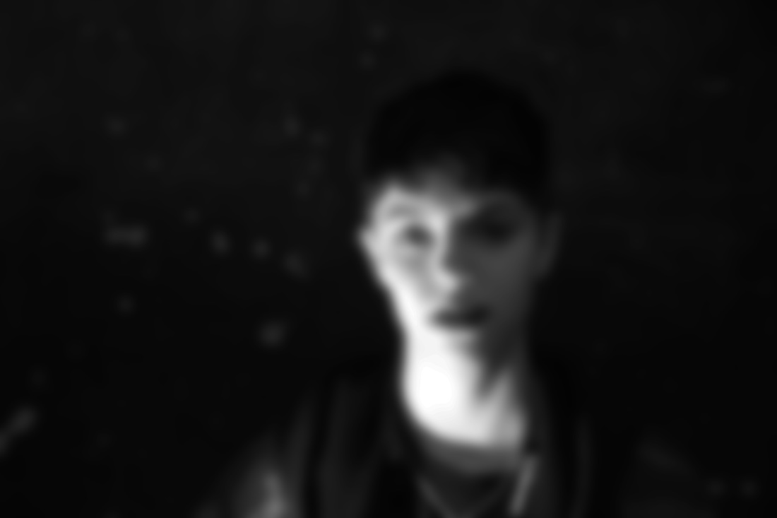
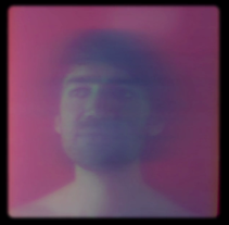
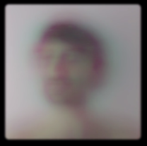
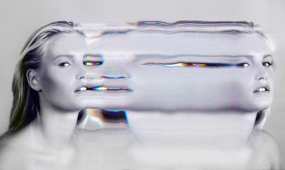
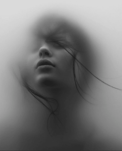
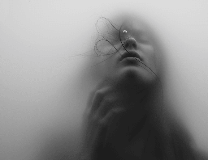
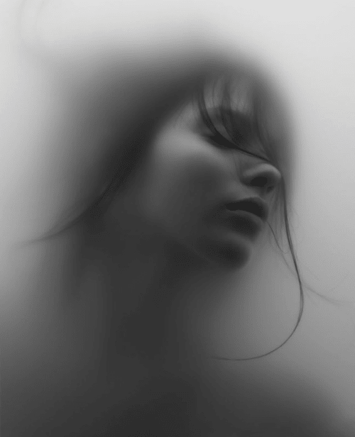
Jacobson started off by taking a lot of out of focus photos, specifically portraits. The pale shadowy figures in the photographs represent loss, that was experienced by many during the AIDS epidemic. This artist not only took blurry and out of focused portraits that represent the individual victims but also he took some out of focus landscapes and street photography, that were meant to represent the memories of those people. Jacobson experimented with different backgrounds and textures he could include. For example, in his work you can see that some of the photos have white backgrounds that almost fade with the skin tone of the model, but in some of his photos the background is black which gives a strong contrast.
|
|
|
|
|
Erwin Blumenfeld
Erwin Blumenfeld was a German photographer that was mostly known for his fashion photography. He is often described as "one of the most innovative and influential photographers of the 20th century." This artist often shot for fashion magazines such as Vogue. His photos were very unique with a hint of abstraction in them. He created black and white portraits and nudes, celebrity portraiture, advertising campaigns and his renowned fashion photography. His work was very interesting because he included a lot of distortion in his photos as well as bright colour combinations.
|
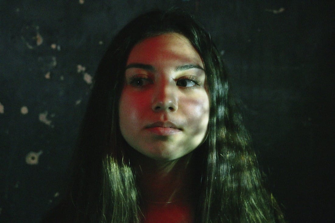
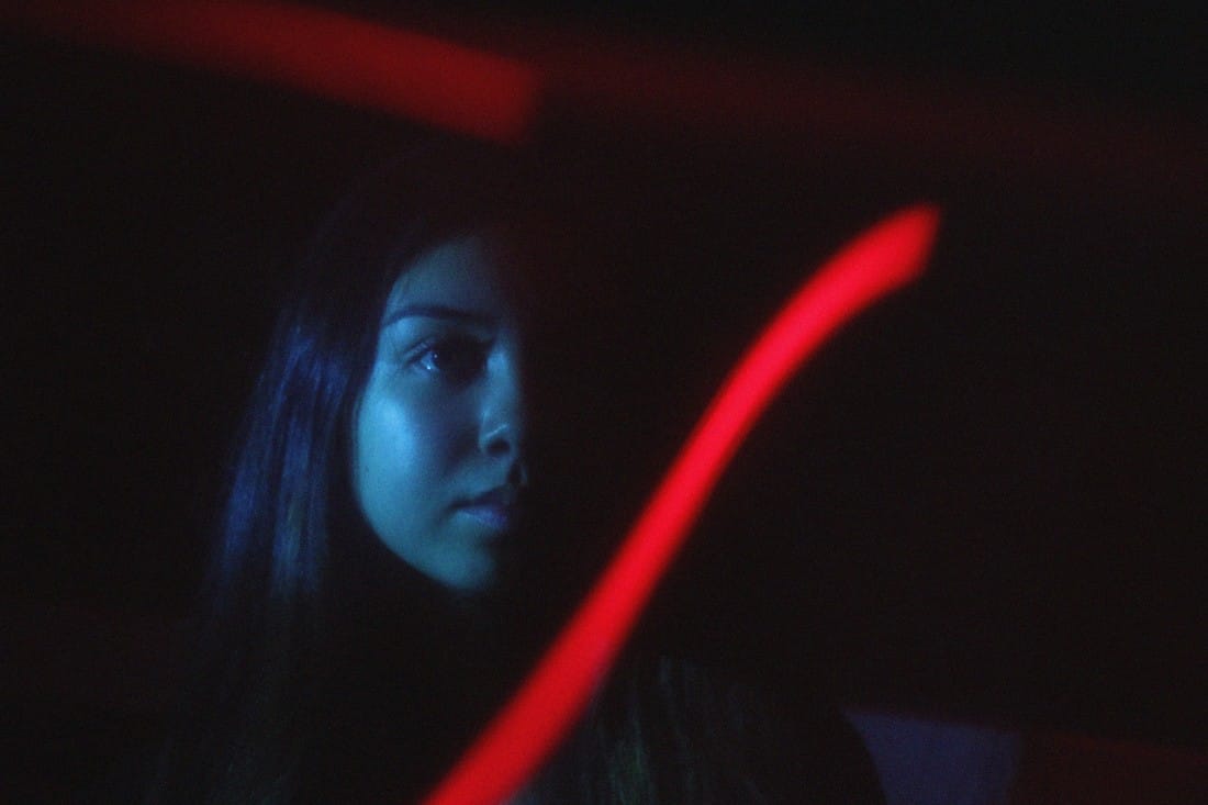
MY PHOTOS
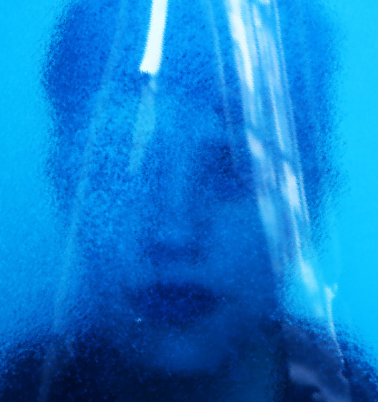
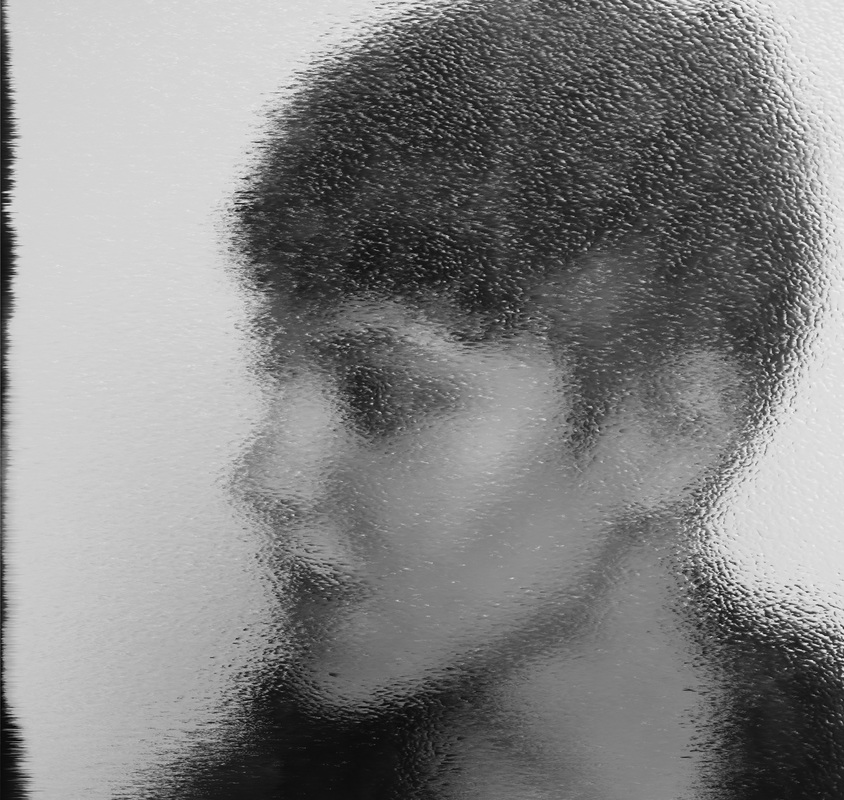
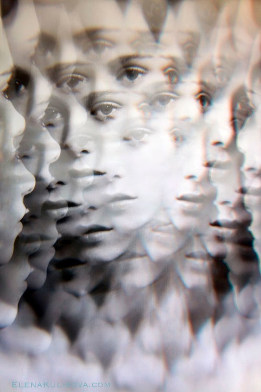
Our task was to create a series of photographs using Erwin Blumenfeld's and Bill Jacobson's work as inspiration. To create my abstract portraits I used glass to add more texture, and I experimented with different light, I took some photos only using natural light and some in the dark room.
Contact Sheet
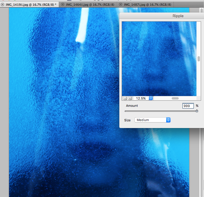
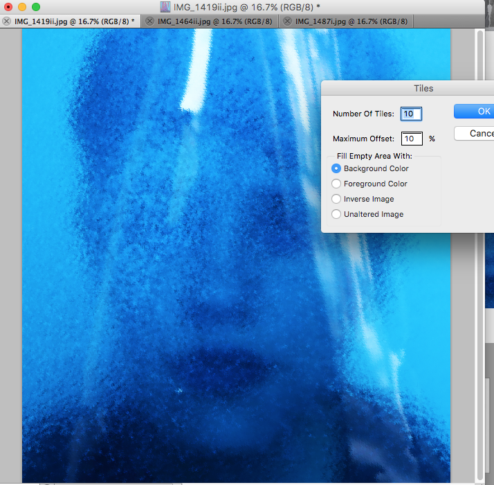
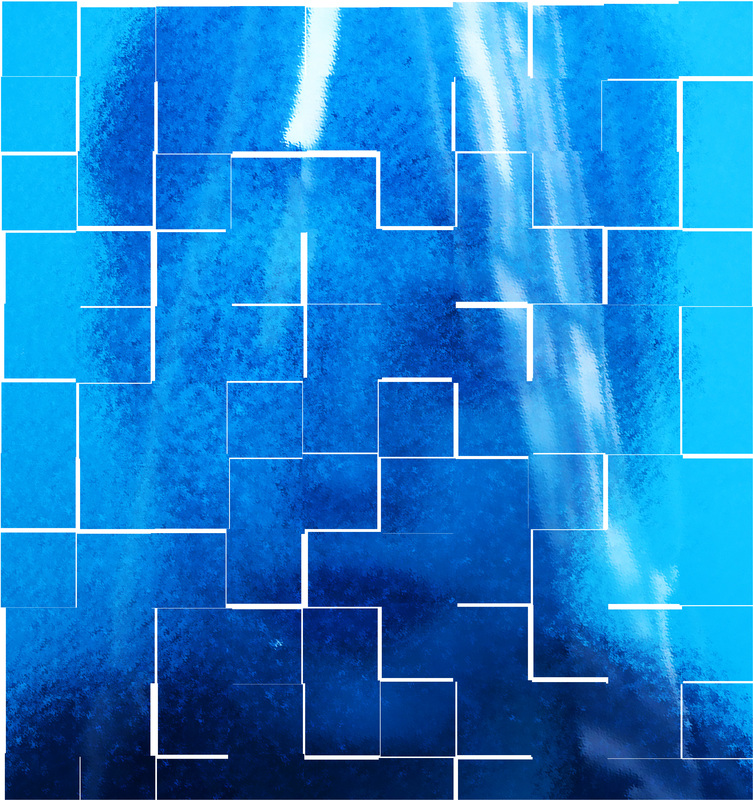
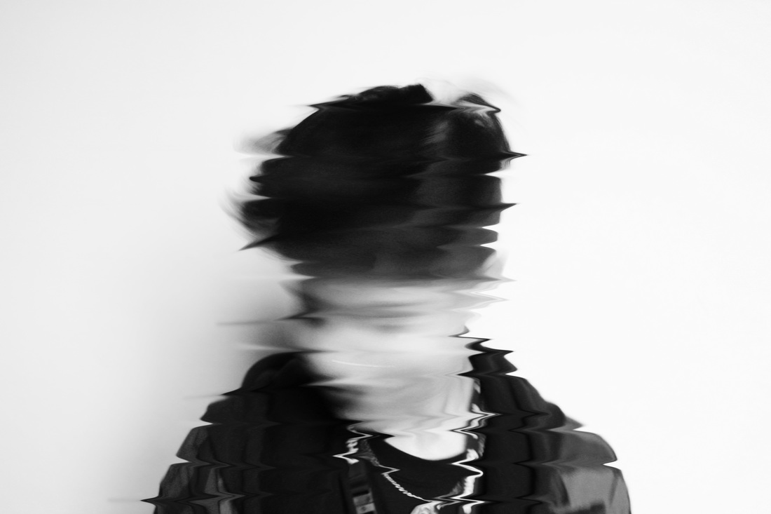
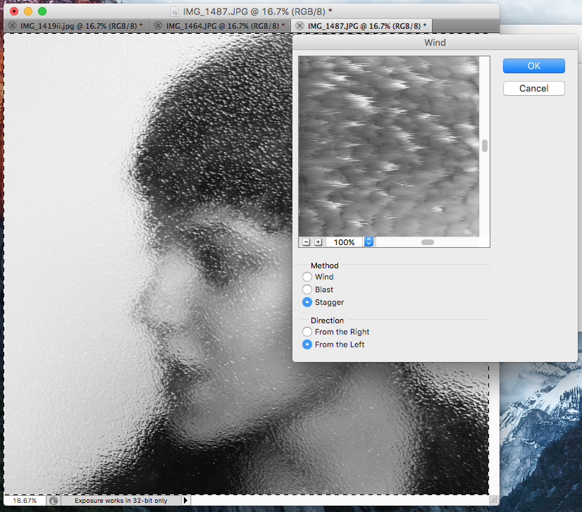
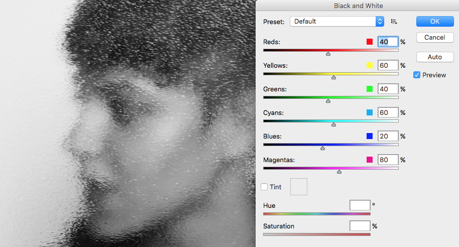
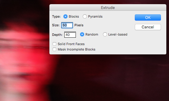
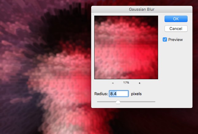
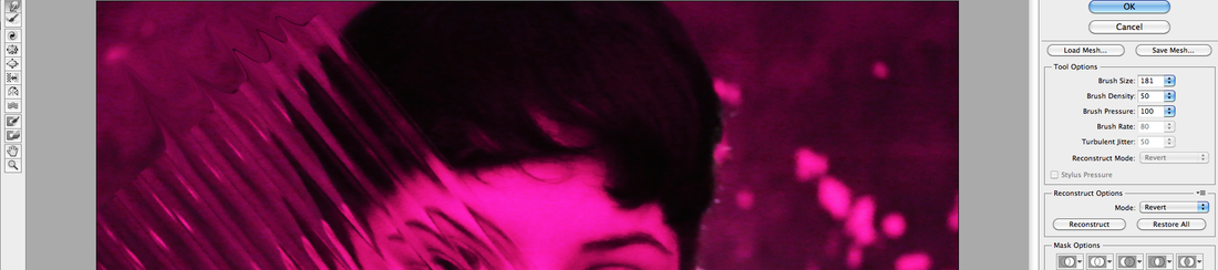
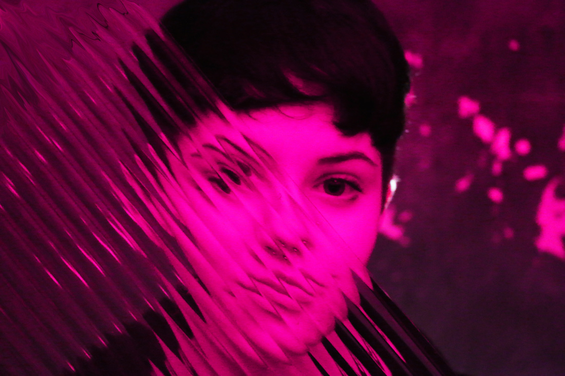
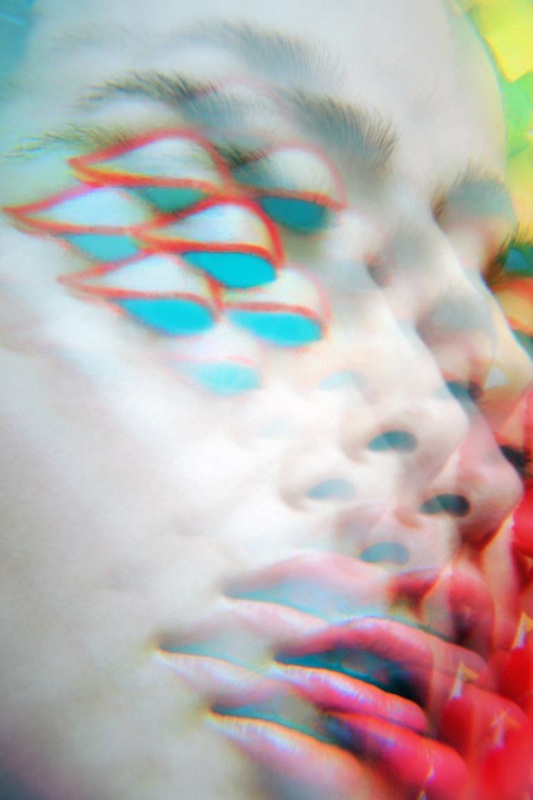
To create this photo I firstly, exaggerated the colours by putting the contrast higher. Then I added the ripple effect, and lastly I added the tile effect on photoshop which made the photograph even more abstract by creating a geometric effect.
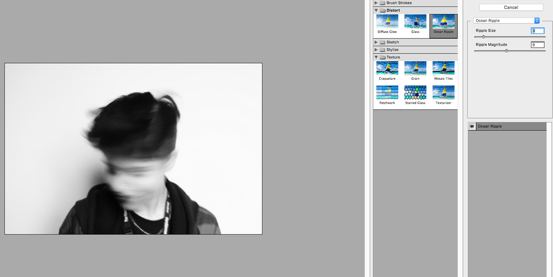
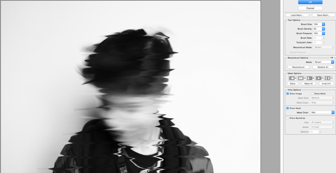
When editing this photo I decided to edit it black and white and then I added the ocean ripple effecr to make the photograph more blurry and abstract. Lastely I used the Liquify tool on Photoshop to 'drag' some parts of the photograph in straight lines in order to distort the photo more.
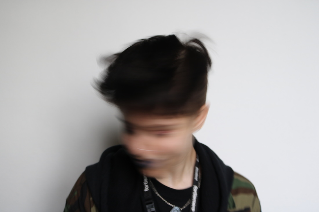
Moving Portrait
|
|
I also created a moving portrait by combining together a sequence of pictures that showed movement. I was inspired by James Watkins Portrait Study, to create this. Using the model's movement, colour and focus change the artist manage to create a very abstract concept and frame it as a video. I, however, will create something similar using a GIF. I will combine several photos taken in equal intervals that will capture movement. |
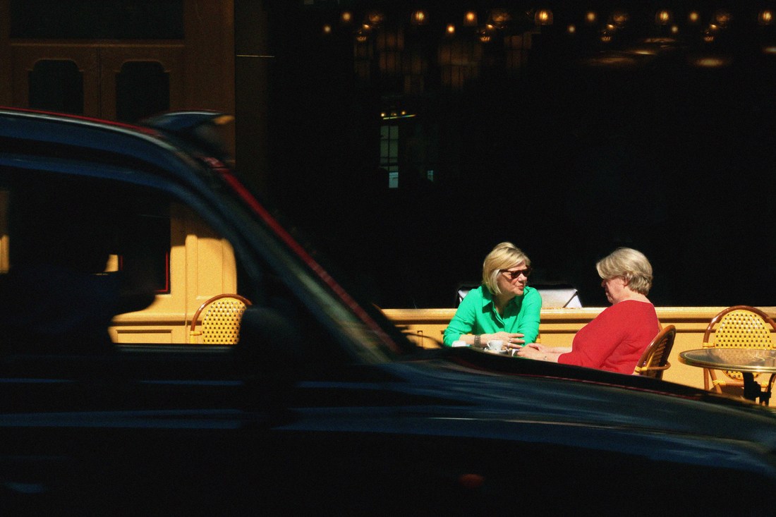
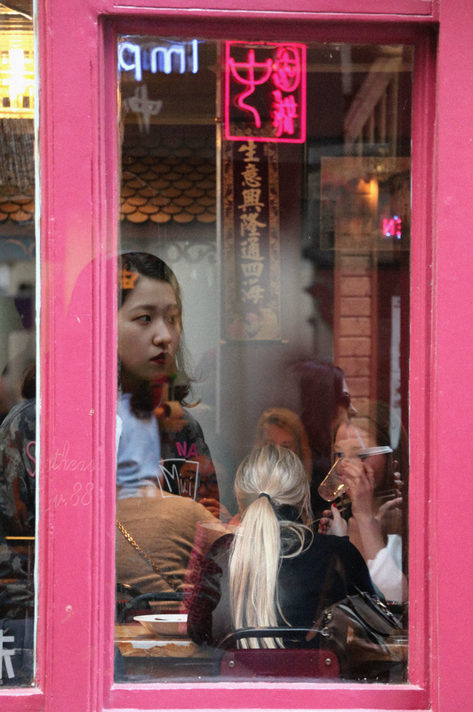
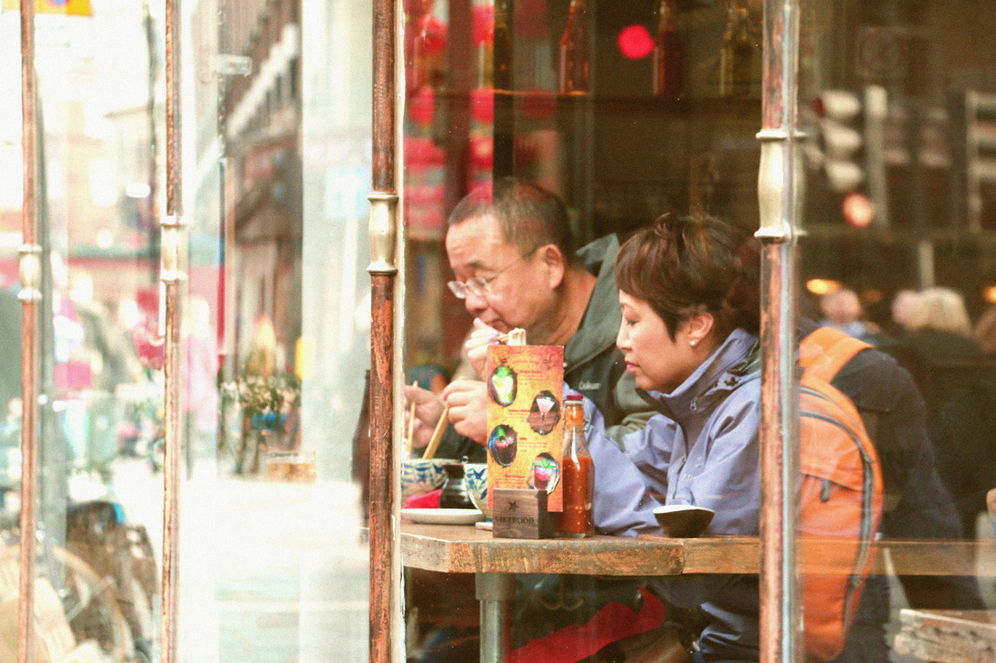
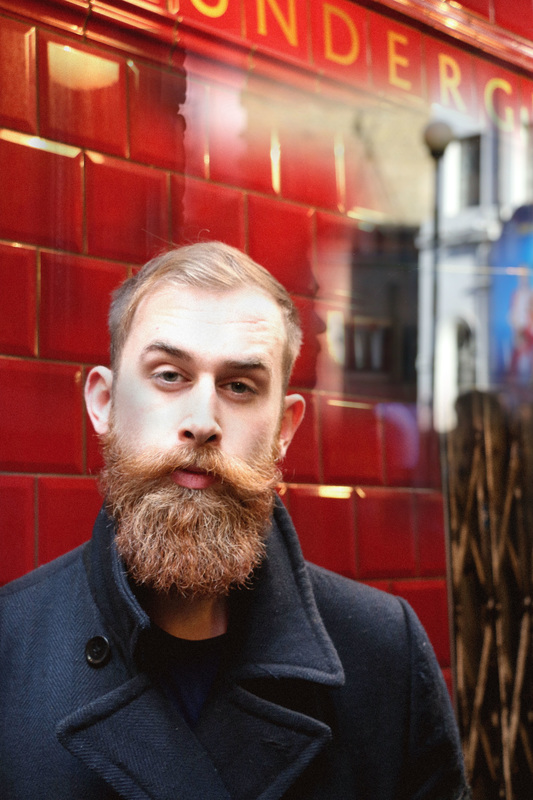
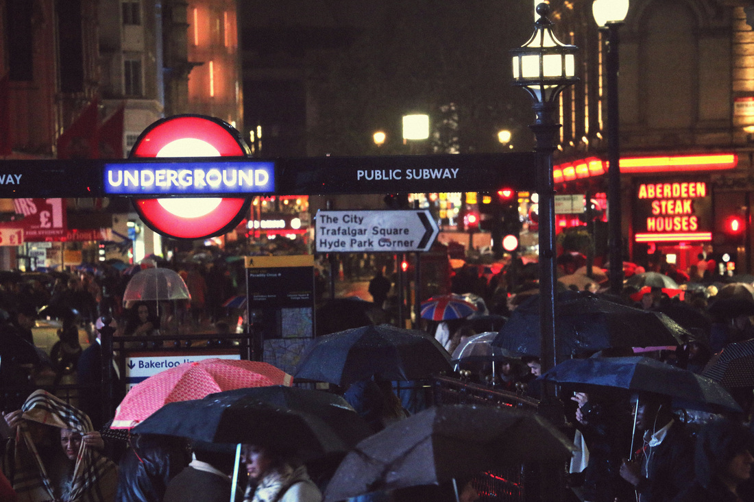
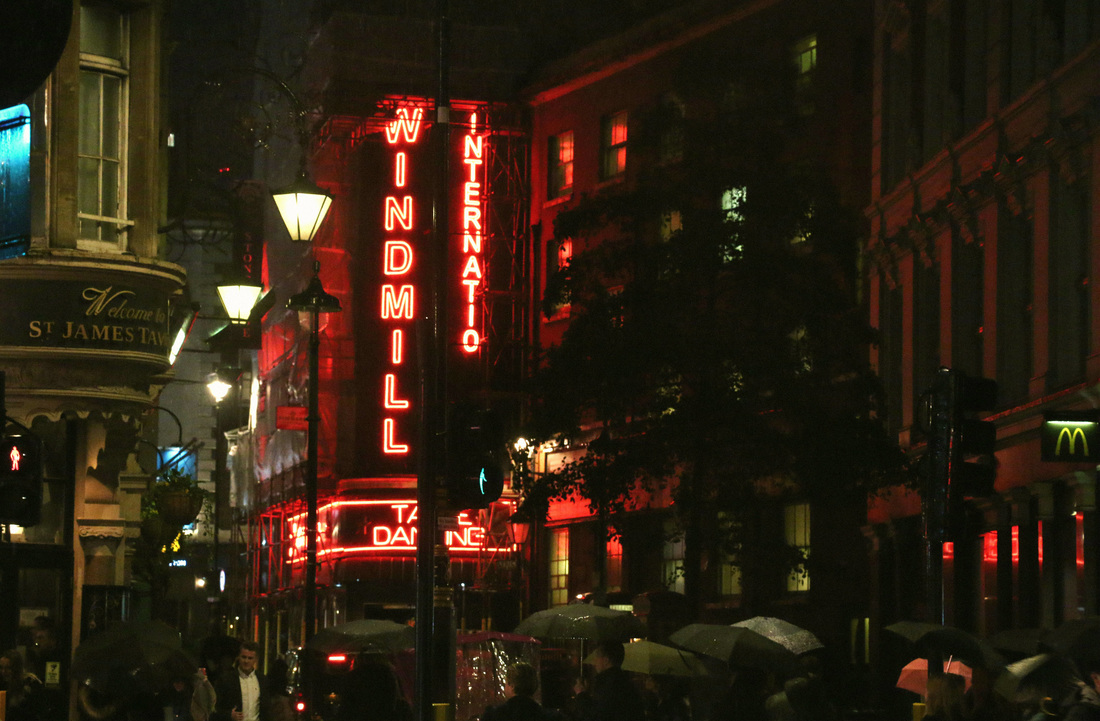
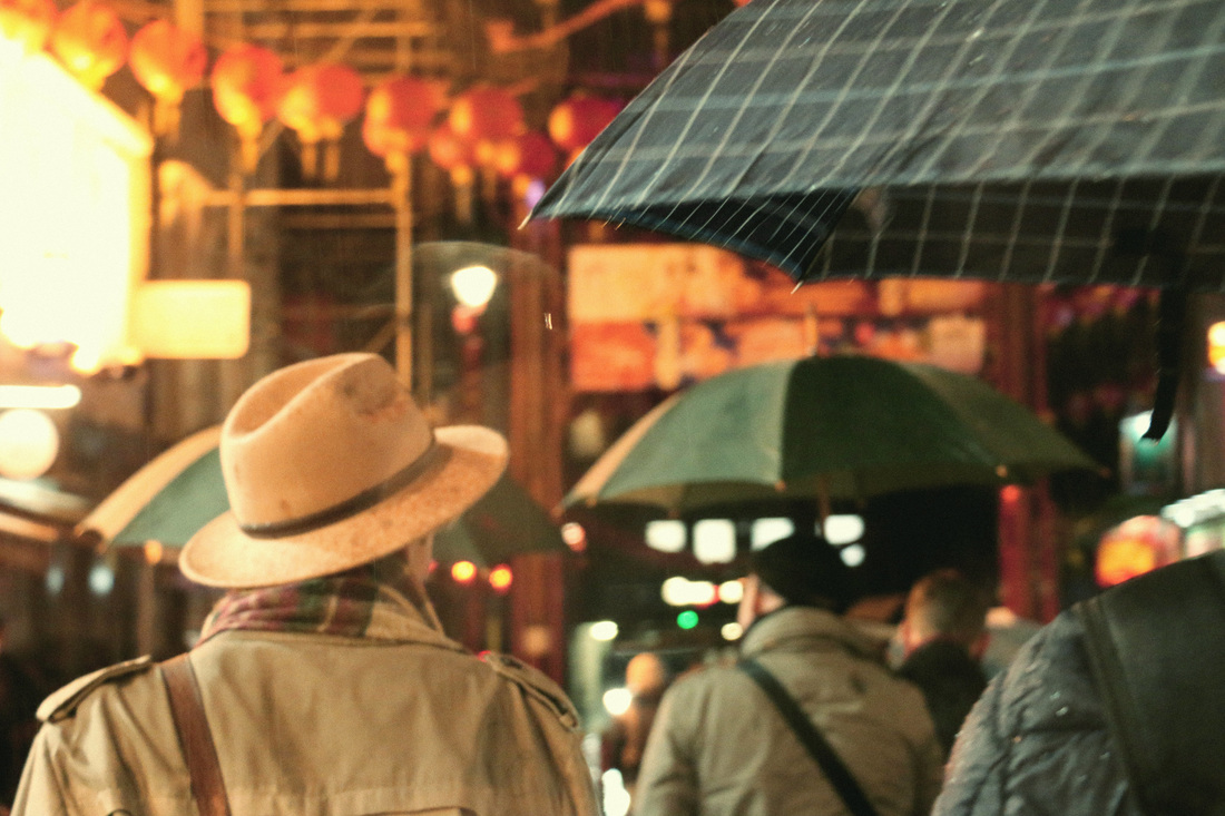
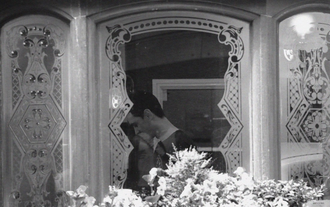
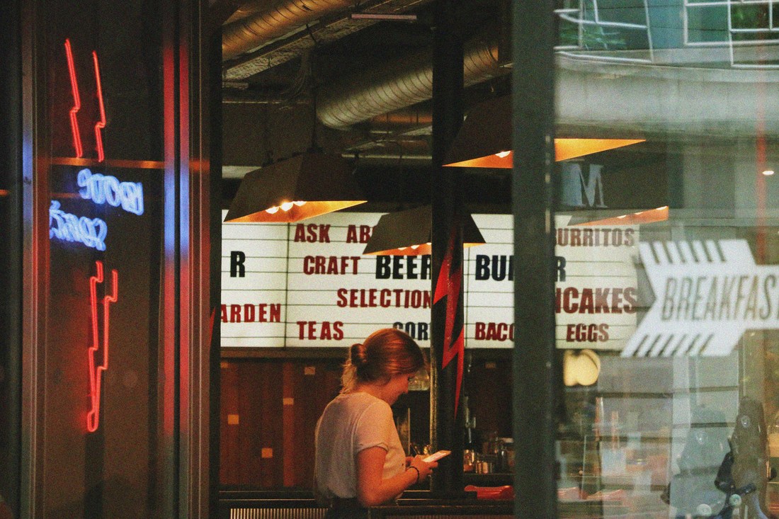
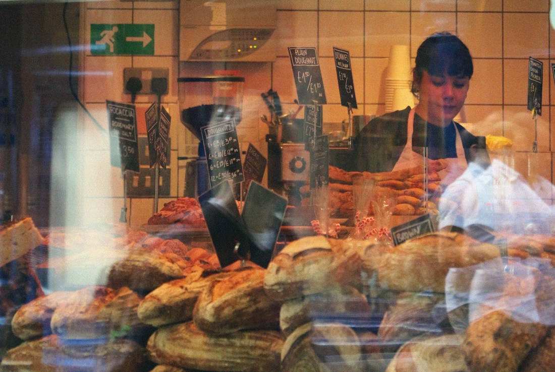
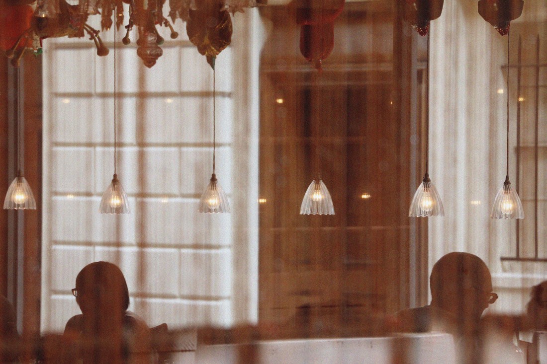
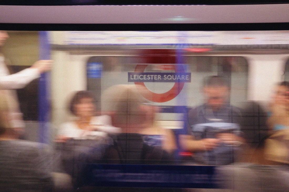
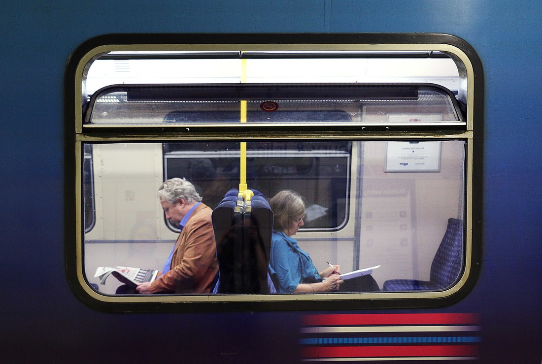
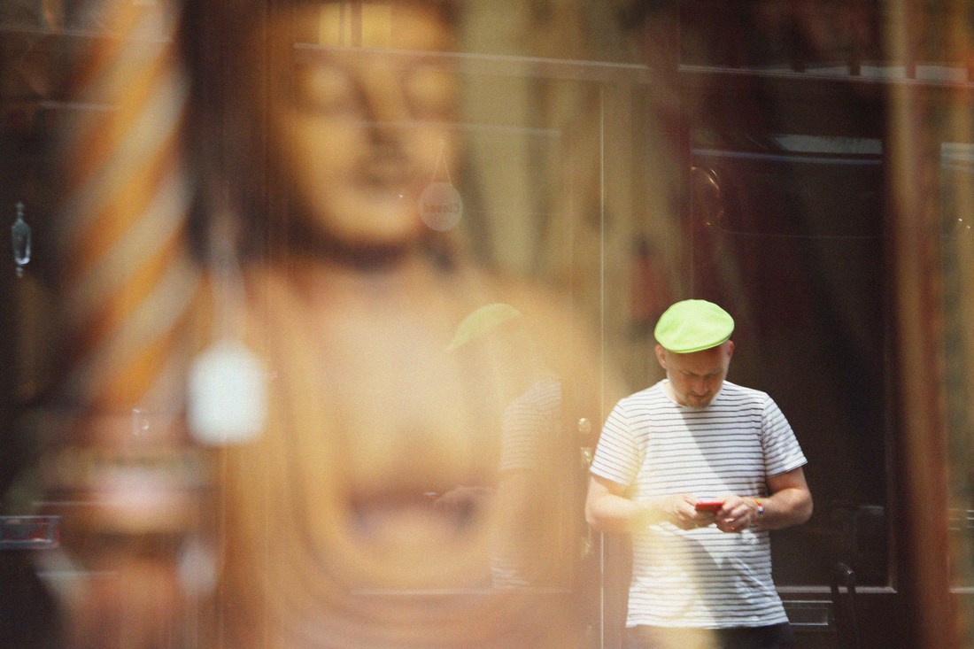
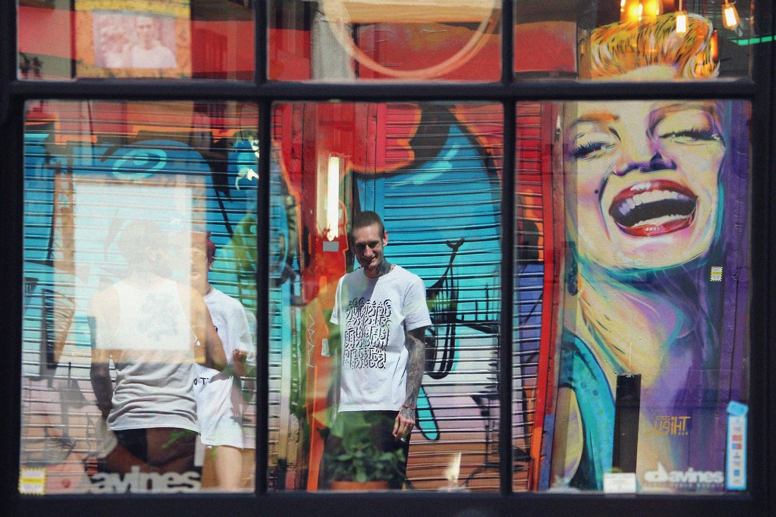
SAUL LEITER
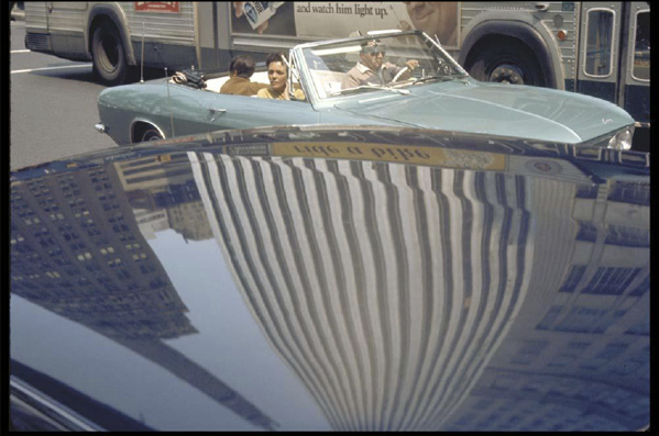
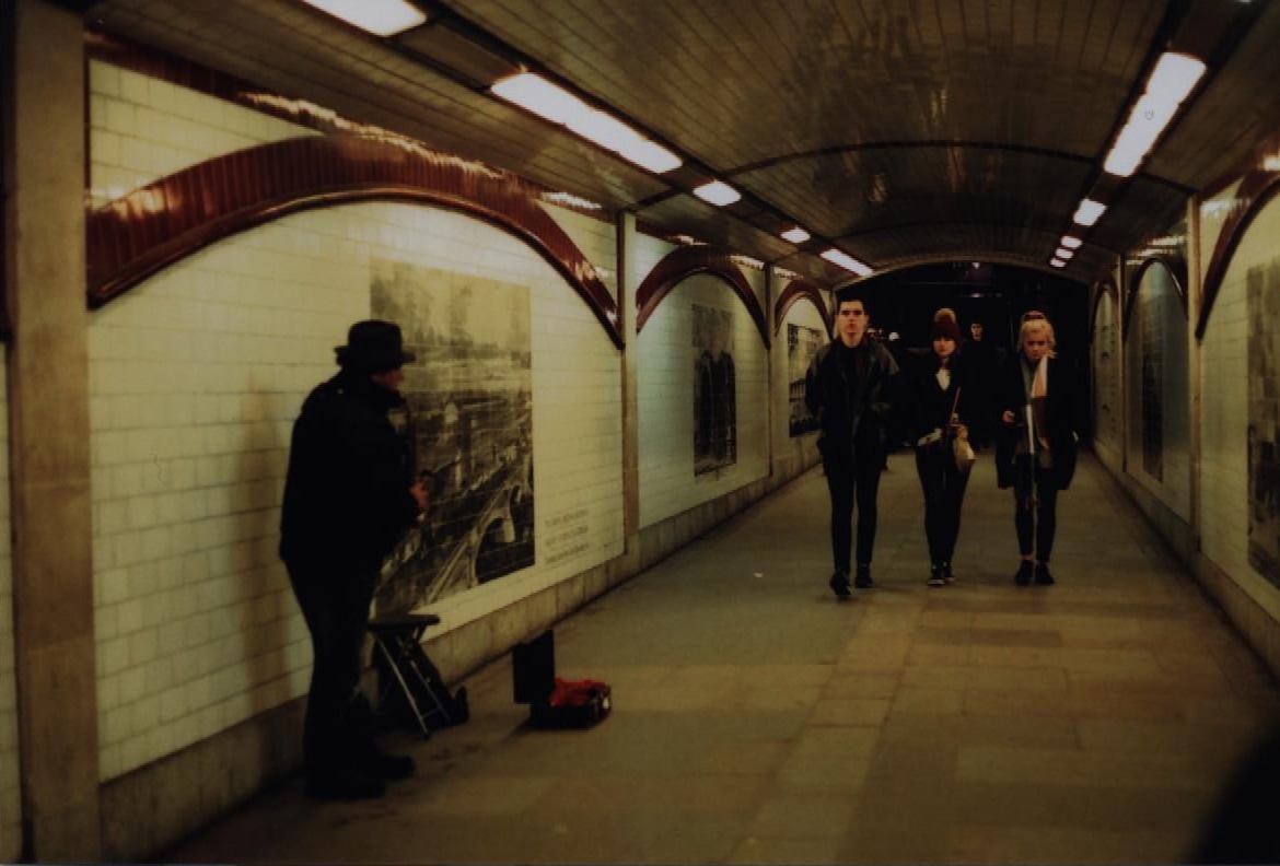
Saul Leiter was an American photographer and painter. He mostly photographed during 1930s to 1940s and worked with 35mm film. At first, he only took black photographs, but then Leiter began to use Kodachrome colour slide film for his shots, even though a lot of the other photographers during that era looked down on it. This shows Saul Leiter as a unique and creative artist, and this can be seen in his work, as his shots are always perfectly framed and the colours compliment eachother nicely. Throughout his carrier, he focused mostly on street and fahion photography. He worked for fashion companies and magazines such as Elle and Vogue.
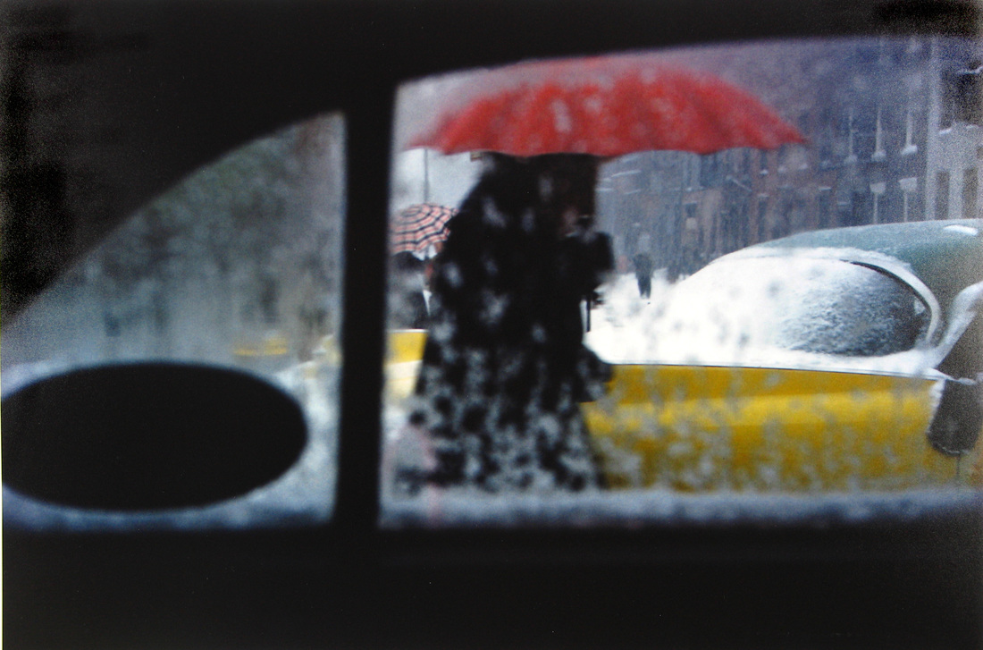
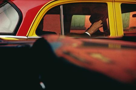
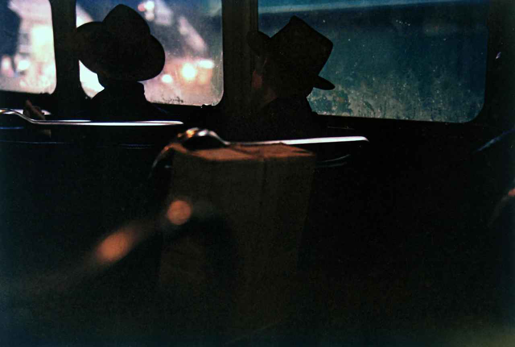
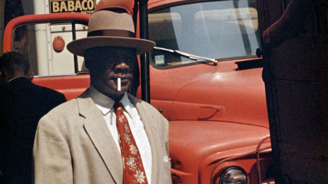
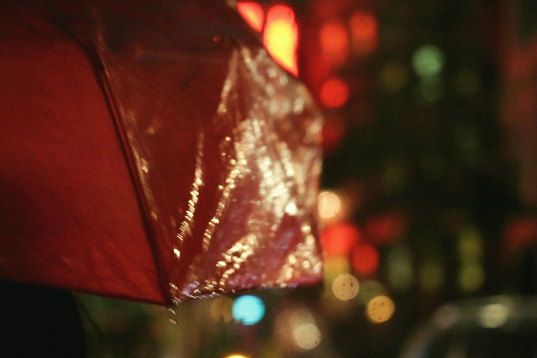
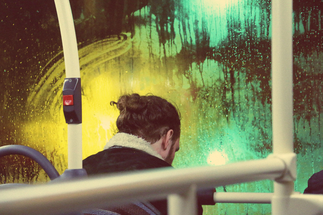
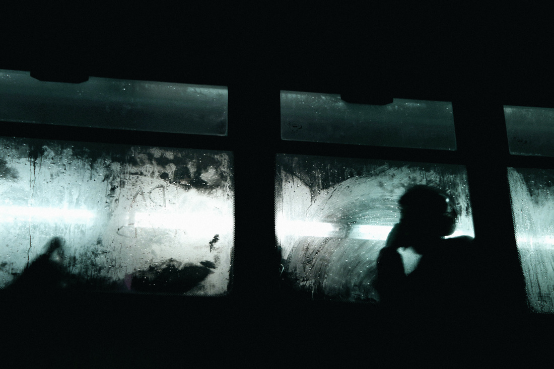
Saul Leiter's photos captured street life through reflections, windows and different forms of transport. For example some of his photos were taken from, in and of vehicles (like the photos I included above). Some of Leiter's work would be very plain if it wasn't for the contrasting bright splashes of colour, he mostly captures the colours red and yellow which always stand out from the whites, greys and blues of street life.
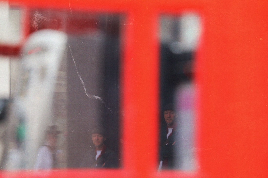
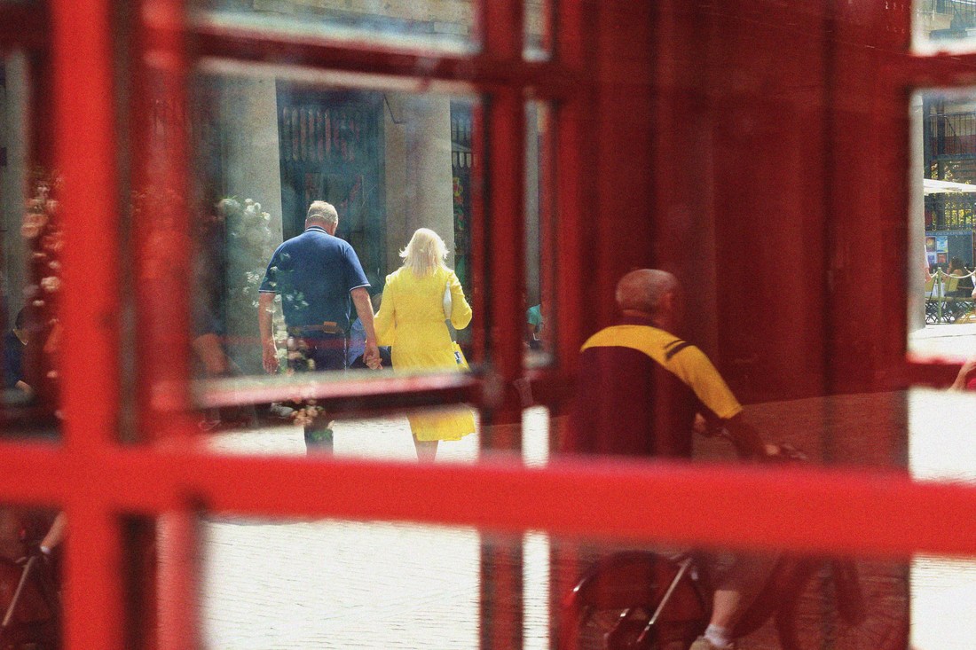
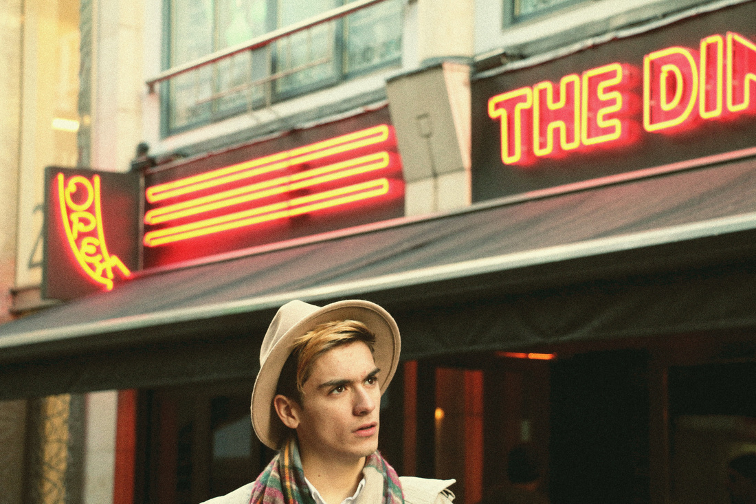
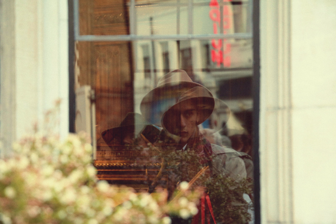
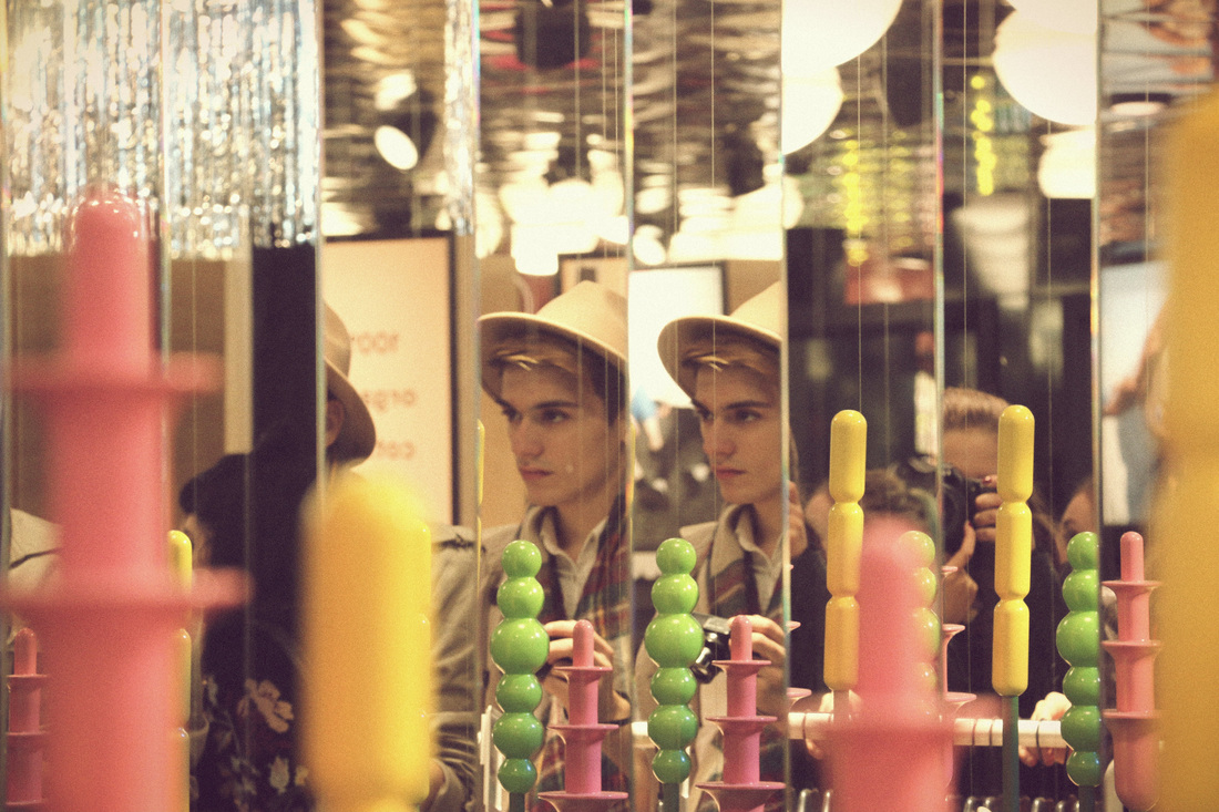
Contact Sheet
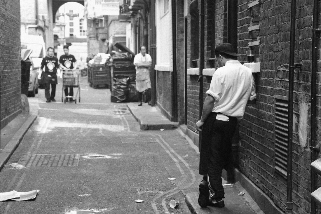
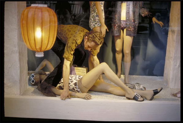
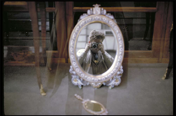
As a response to Saul Leiter's work I took a series of photographs in a documentary style, with a friend as a model and central London as the location. While walking around London I was focusing on trying to find interesting places to shoot with a range of colours and reflections. I took most of my photos directly from the street but I also took some from inside of a bus when the windows were foggy and then when editing exaggerated the colours.
My Response
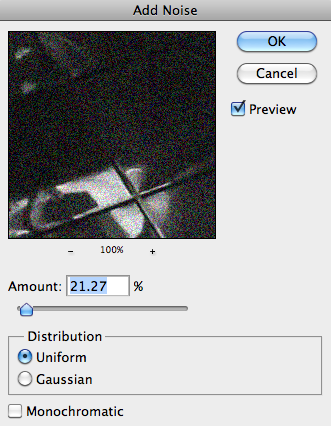
After I selected my photos, I edited them so that they would give off an old film effect; I added noise and experimented with the colours by exaggerating the reds.
THREE STRANDS
Strand 1
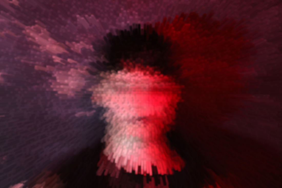
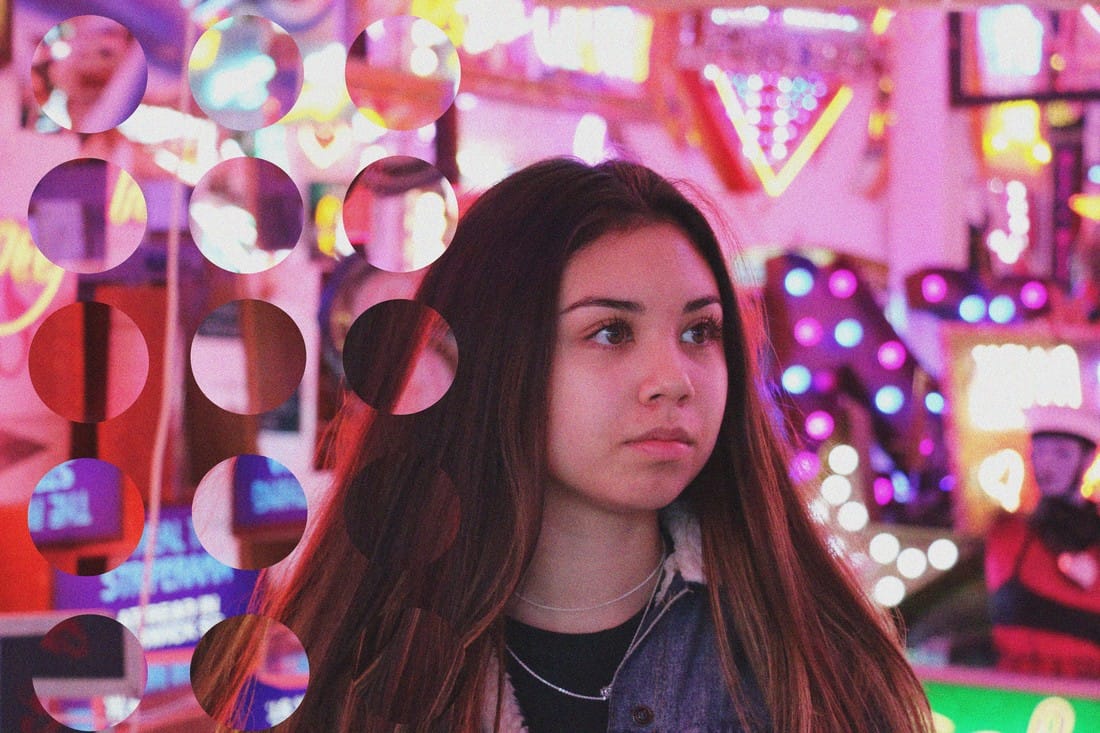
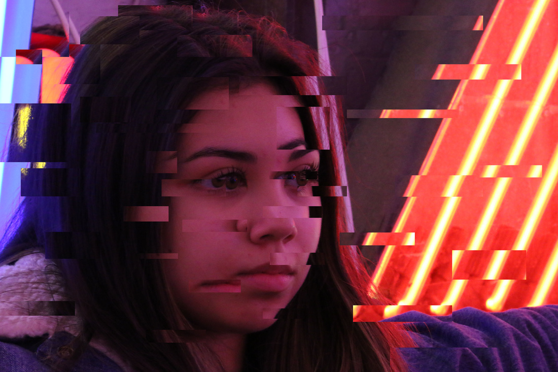
Concept - For this strand I will be investigating how I can abstract a portrait using a glitch technique. I will use photoshop to duplicate and reposition layers of the photographs to distort the image in areas.
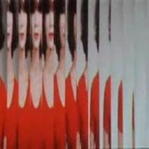
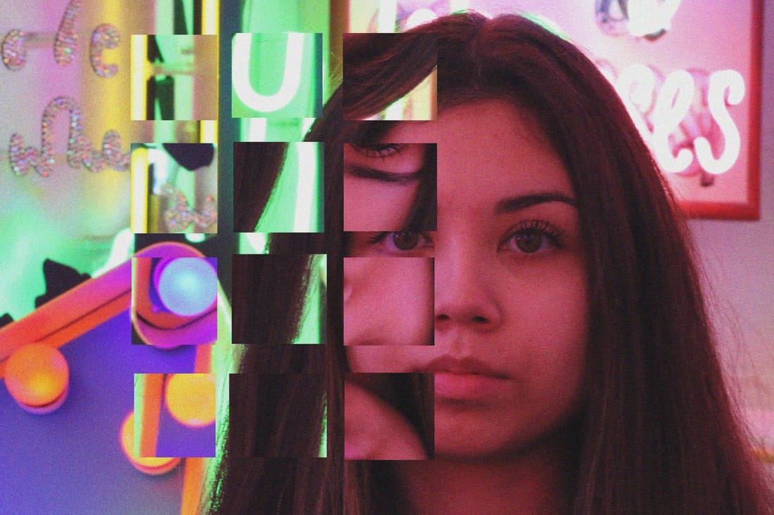
Elena Kulikova is a self taught photographer currently living in Los Angeles. Using her unique style of capturing she photographs fashion shots and portraits of musicians, dancers, artists and yogis. Her photographs are filled with vibrant colours and uncommon editing styles that give her work a hint of abstraction to it.
|
|
|
Contact Sheet
Selected Images
The images I selected for this strands have very bright and colourful because of the neon lights in the background. All the photos are close up portraits, the reason for this is that I wanted to focus on distorting not only 'spaces' but also people's faces.
My Photos
Process of editing
For the second photo I created a lot of layers with copies of some parts of the photo and displaced them to create the glitch effect.
Strand 2
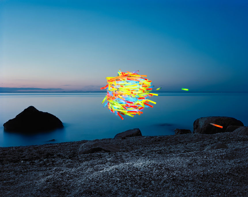
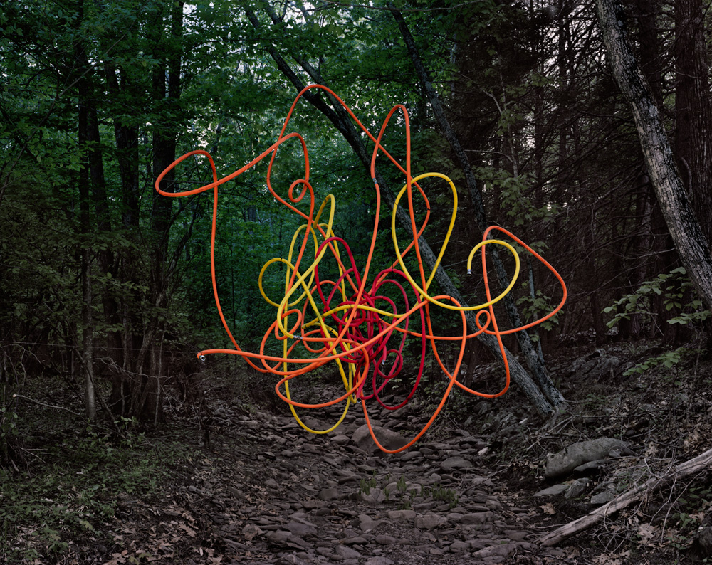
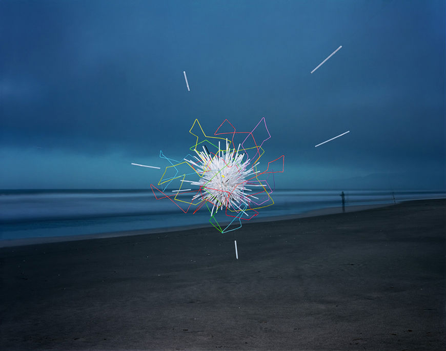
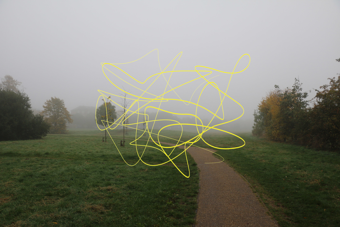
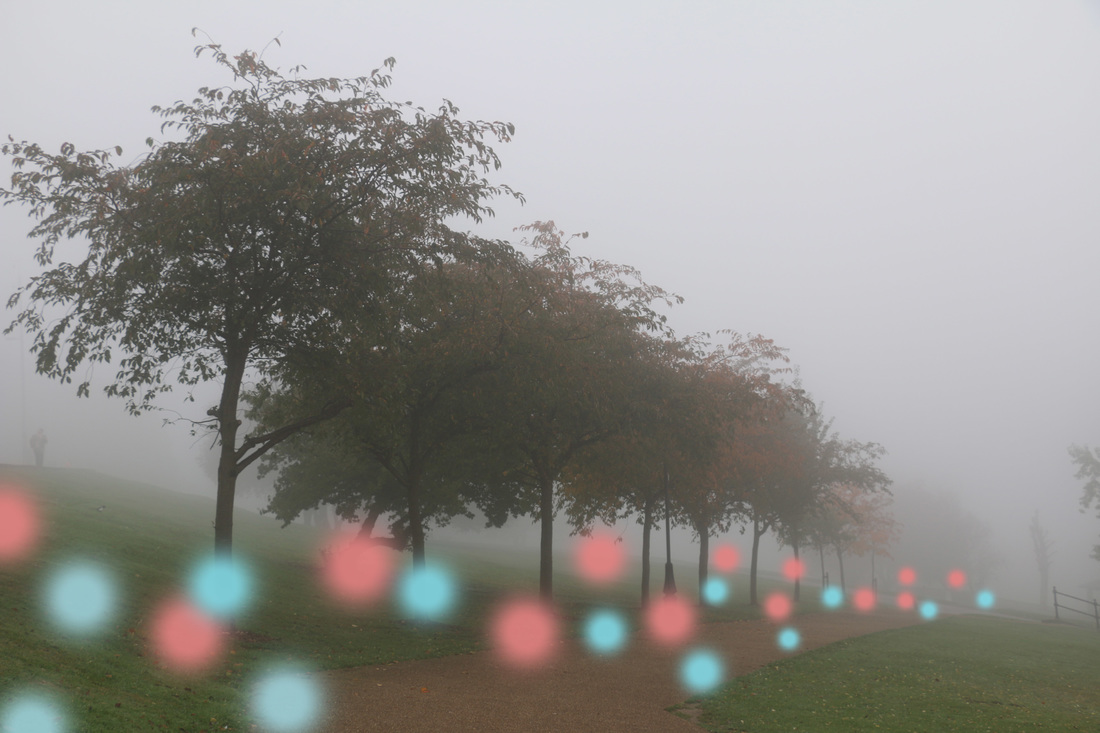
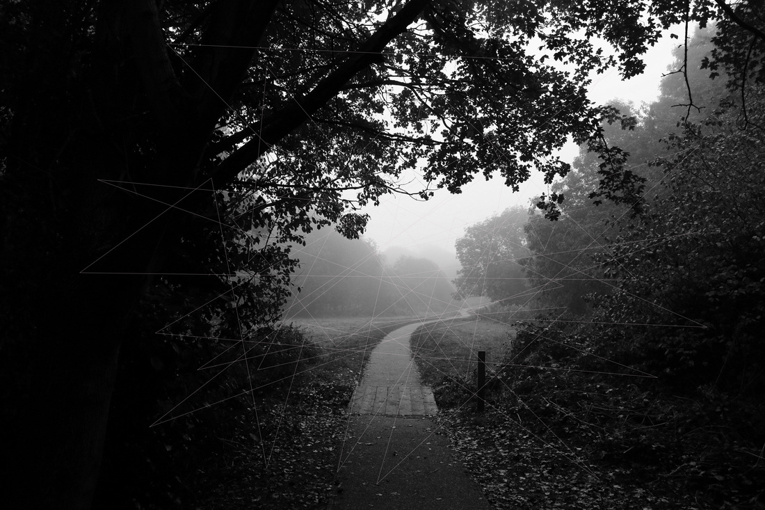
Concept - In this strand I will be looking at landscapes of nature and trying to show that a bit of colour and sharp lines will make them abstract and create an odd combination.
Thomas Jackson is a photographer that creates hovering installations and captures them in natural environments. His aim is to create an uneasy combination of the natural and manufactured, and show how they don't belong together. Jackson's work is abstract because it does not reflect reality.
Thomas Jackson is a photographer that creates hovering installations and captures them in natural environments. His aim is to create an uneasy combination of the natural and manufactured, and show how they don't belong together. Jackson's work is abstract because it does not reflect reality.
|
|
|
Contact Sheet
Selected Images
The photos I selected to use for this strand have a lot of open space. I decided to choose these photos in particular because it would mean that there would be a lot of space to edit something into that. I selected photos that were really foggy just to show the abstraction in real life because the fog made everything look like the backgrounds faded away.
My Photos
Process of editing
To edit these photos I used different techniques. For the first photo, I created a path and then filled it with yellow paint to create a similar abstract effect to the artist, Thomas Jackson. For the second I created new layers and simply used the brush to paint the photos to add dots. For the third photo I created an abstract, geometric, sharp shape using lines and added it as a layer to a black and white landscape.
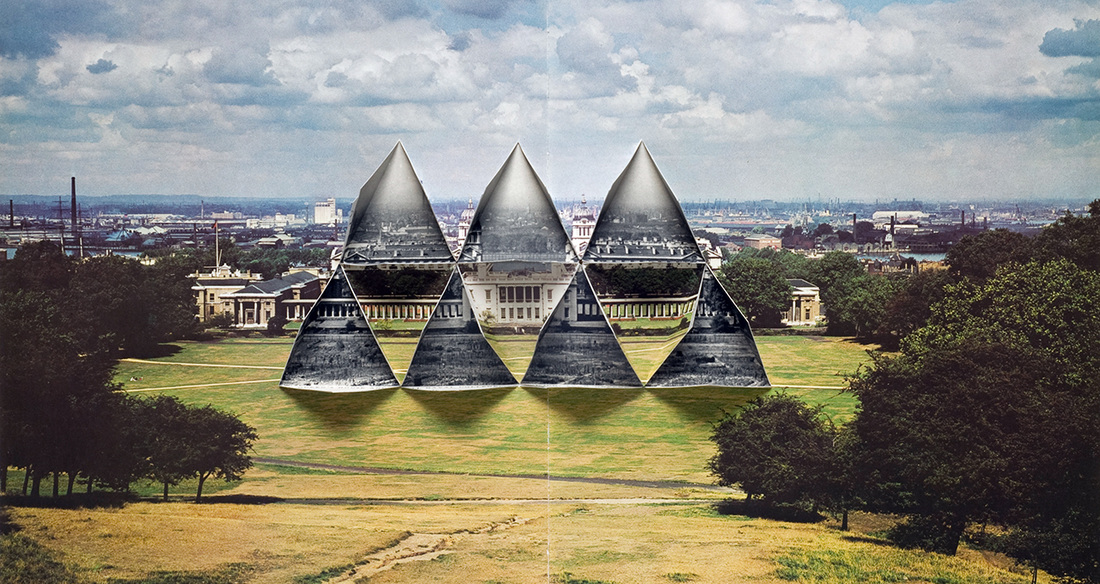
Strand 3
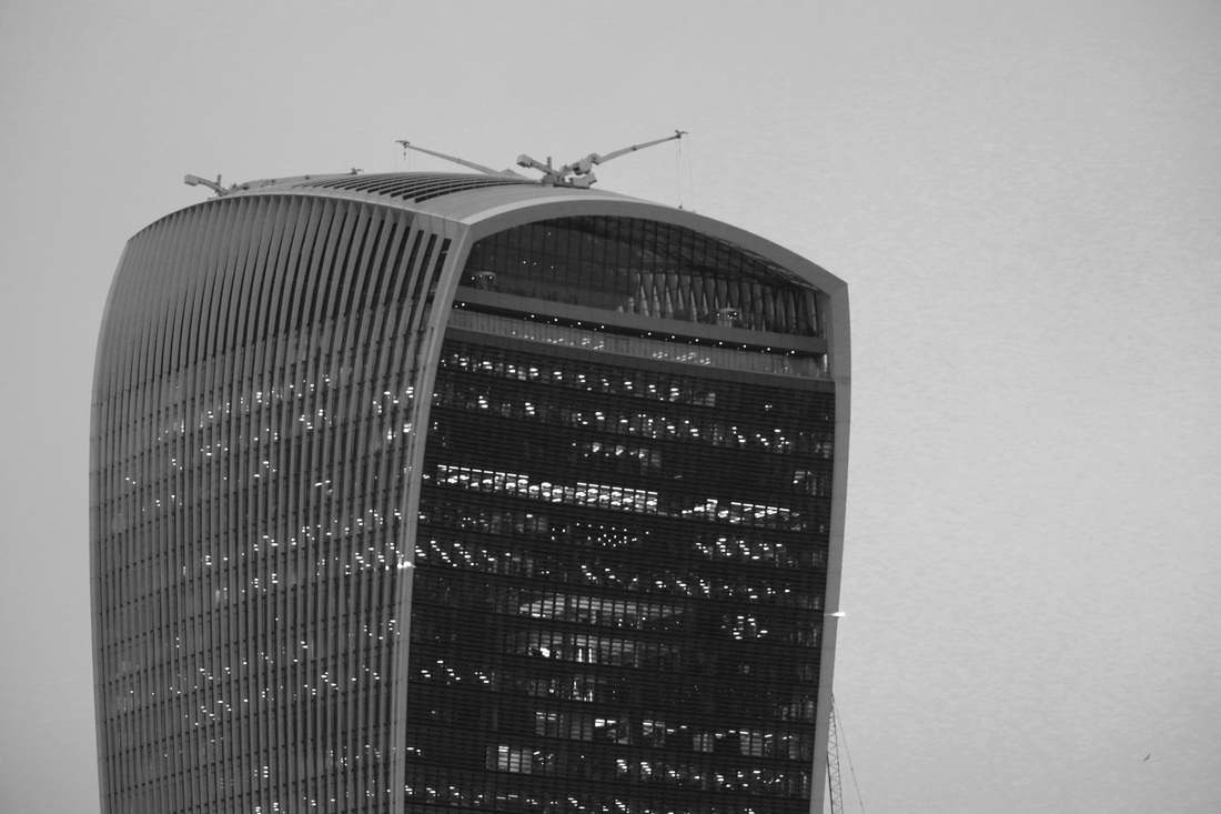
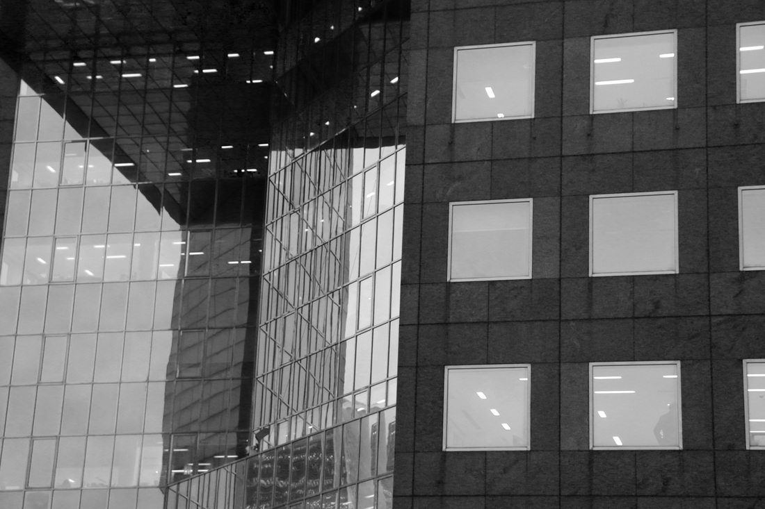
Concept - In the third strand, I will be exploring a creative montage and distortion of modern architecture, by taking some parts (for example sharp shapes of the windows) and replacing them with something else, like colour or photos of other location such as nature.
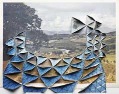
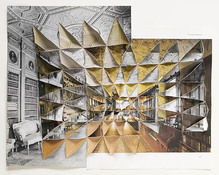
Abigail Reynolds is an artist that currently lives in Cornwall. She creates collages using pages from old books, atlases, encyclopedias etc. She combines photographs of rural and urban places in a very creative way; Reynolds folds layers of photographs, that are taken of the same thing but from different angles, to form a three dimensional final piece
|
|
|
Contact Sheet
Selected Images
I chose these images because there were a lot of sharp lines and edges that I thought would be good to work with in further editing. The sharpness and strictness of the city would contrast well with any other landscapes that I would decide to incorporate into those images.

My Photos
|
|
Process of editing
In the first set of images I selected some shapes that were visible in the architecture and then filled them with bright coloured paint to create an abstract effect. The reason this is abstract is because the bright colours look like look out of place; like they don't belong next to a grey, sharp buildings that represent the city life.
Development
Contact Sheet
Selected Photos

FIRST DEVELOPMENT (of strand 1)
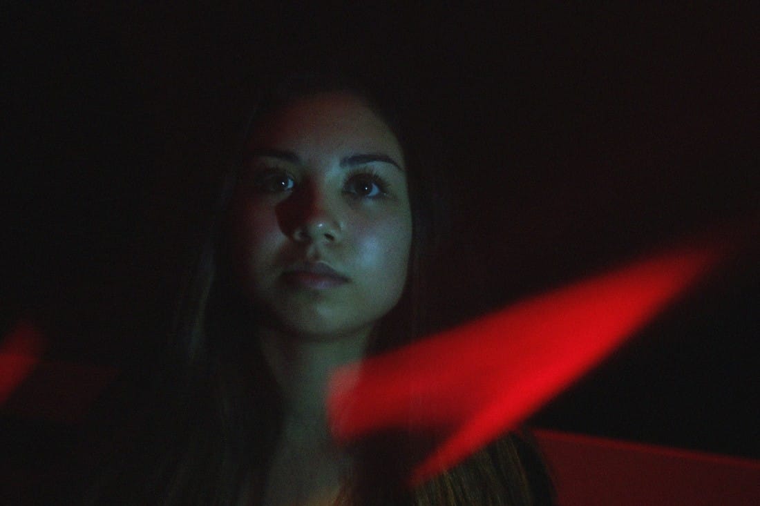
I decided to continue with my first strand and take portrait photos. To make them abstract I was focusing on the light, I took all of the photos in the dark room and used coloured acetate plastic sheets and placed them infront of my lens to add light leaks as well as more colour to the photos.
CONTACT SHEET
MY RESPONSE
DEVELOPMENT
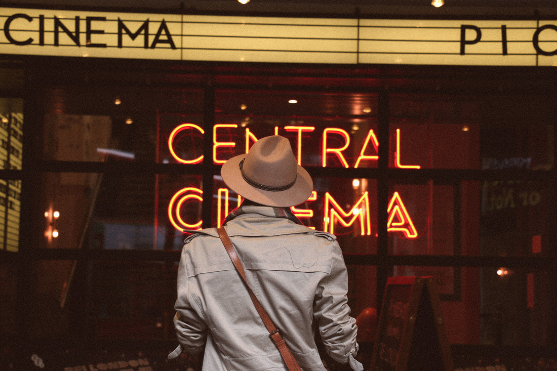
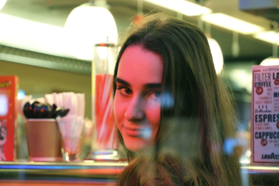
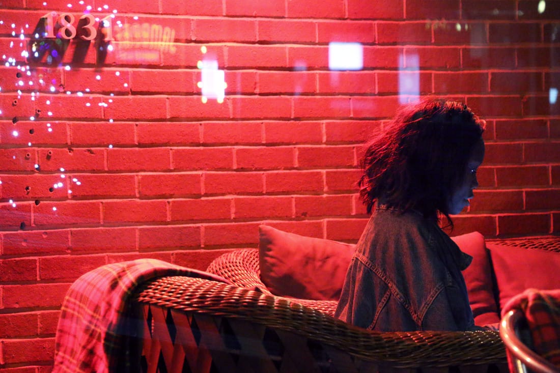
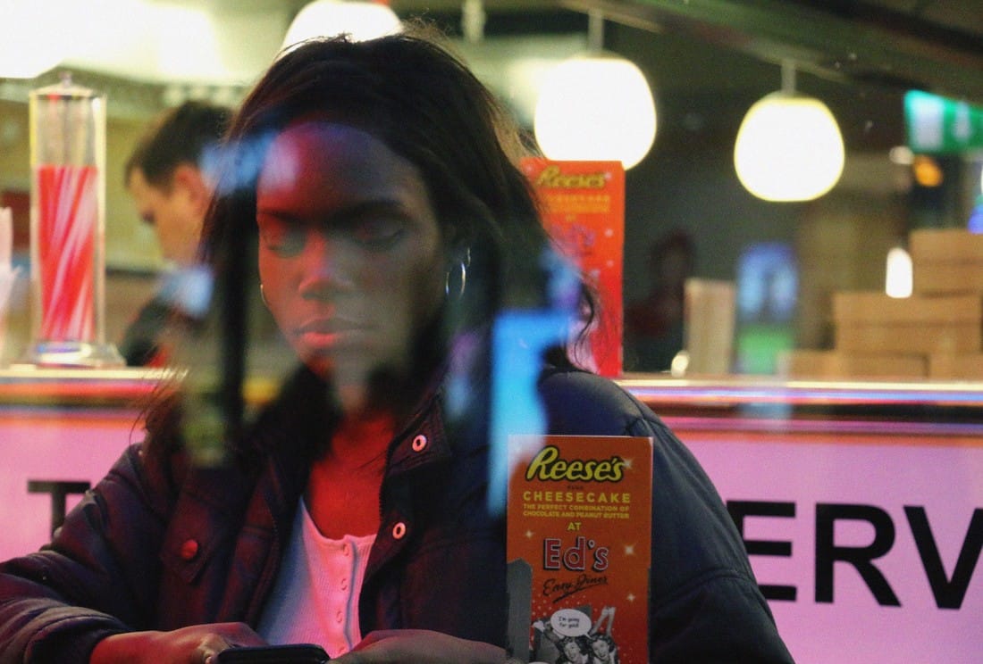
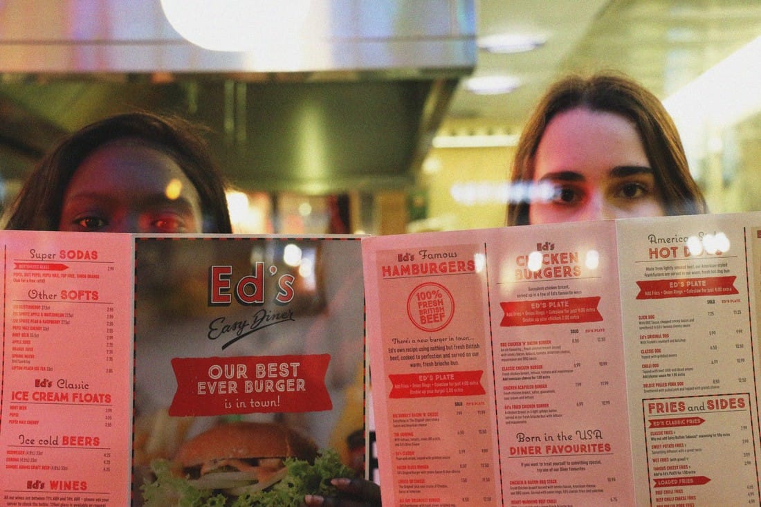
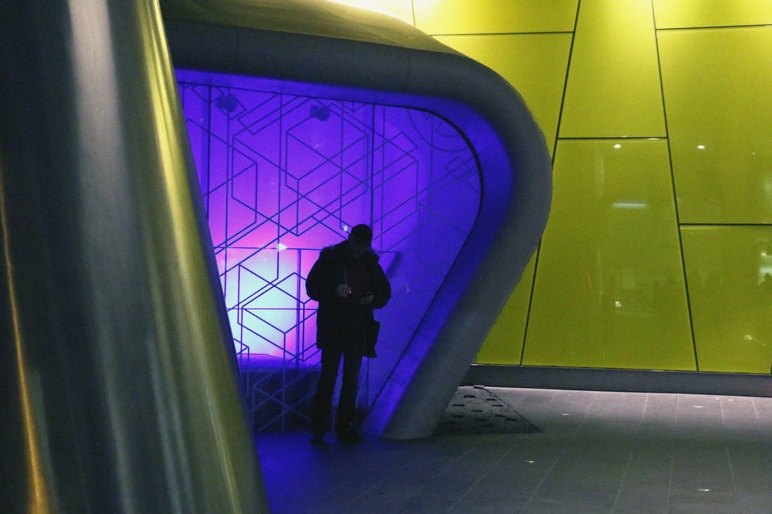
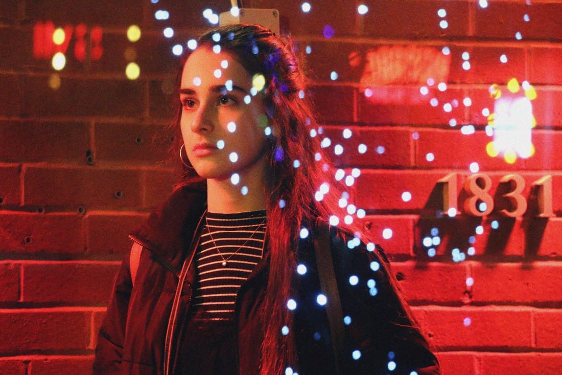
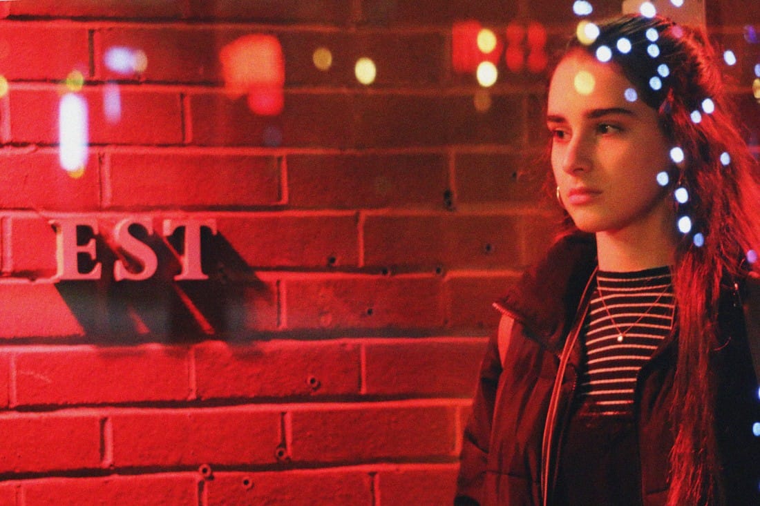
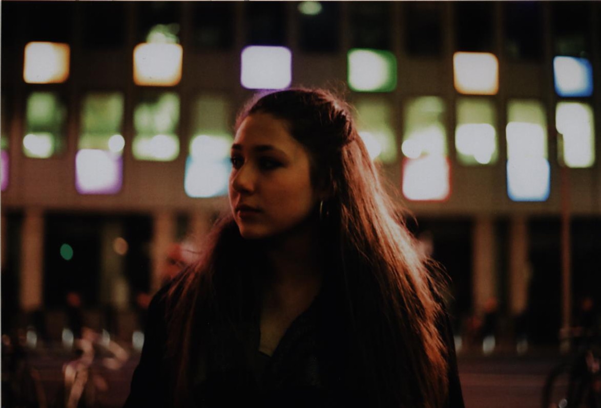
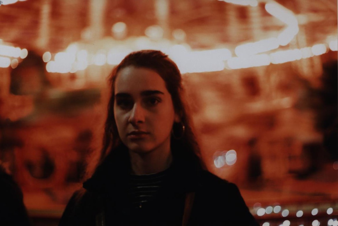
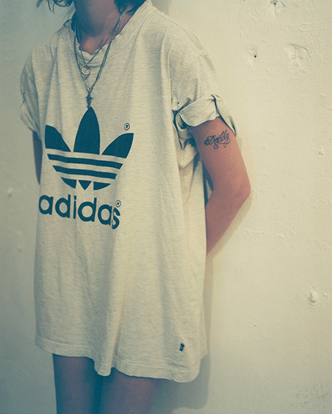
I decided to combine the work that I have done on my first strand with my previous photos that I took as a response to Saul Leiter. For this second development I will continue to work with portraiture, but take the photos in Saul Leiter's style, capturing reflections, interesting colours and locations. I will focus on incorporating a narrative and fashion into my photos. For this second strand I am planning on taking all the photos using a digital camera but editing them to have a film effect and interesting colour filters. I will focus on capturing street life, people and different textures in my photos.
ARTISTS
Here are the artists that I will be looking at throughout all of my developments. The reason I'm including all of these artists is because they all have a similar style to Saul Leiter and they also focus on street photography, portraiture or fashion:
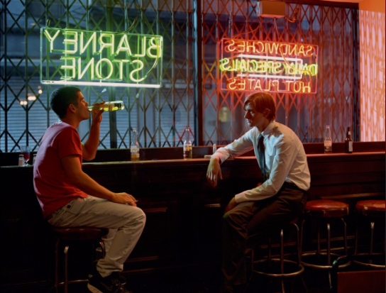
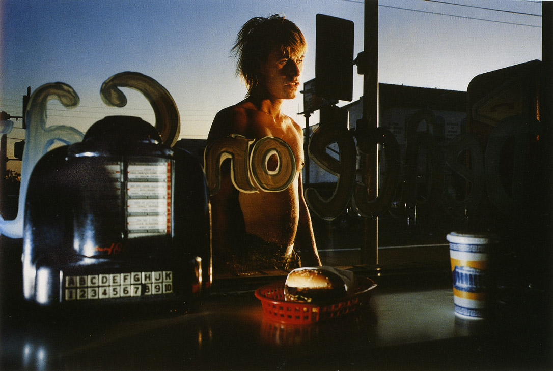
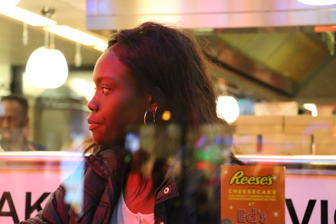
GARRY WINOGRAND: Winogrand was a New York street life photographer, and was known for his presentation of ordinary life of American people. Some of his work consisted of interesting shots that captured reflections and people. He mostly shot in black and white, but I decided to focus on the coloured photographs for my work.
GARRY WINOGRAND: Winogrand was a New York street life photographer, and was known for his presentation of ordinary life of American people. Some of his work consisted of interesting shots that captured reflections and people. He mostly shot in black and white, but I decided to focus on the coloured photographs for my work.
LAURIE BARTLEY: Laurie Bartley is a successful photographer that has worked for big fashion magazines and companies. Some of her work has a great depth of field and bright colours that make her photos resemble Saul Leiter's style.
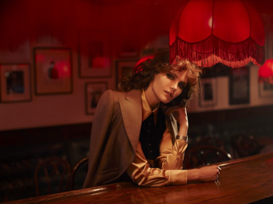
PHILIP-LORCA DICORCIA: DiCorcia is an American photographer that alternates between two types of photography styles; sometimes he shoots in very well lit, thought through set ups and other times he takes very informal snapchots.
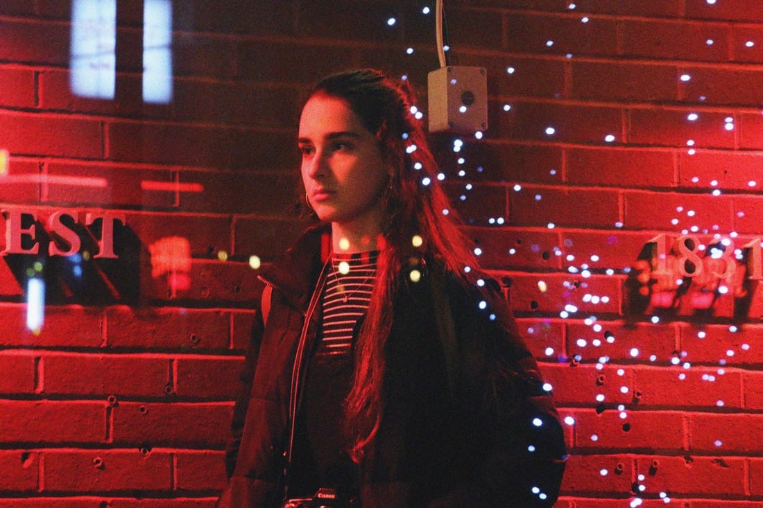
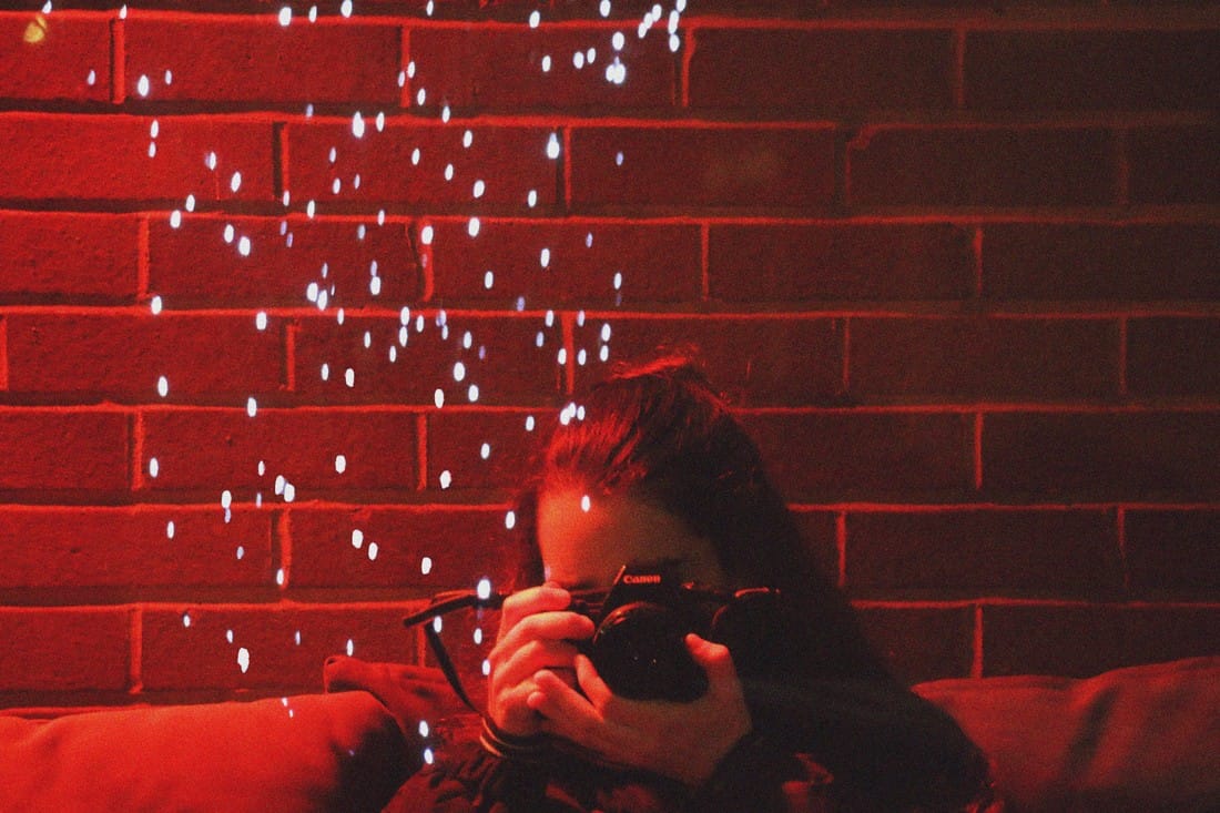
CONTACT SHEET
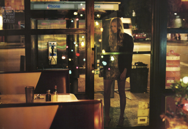
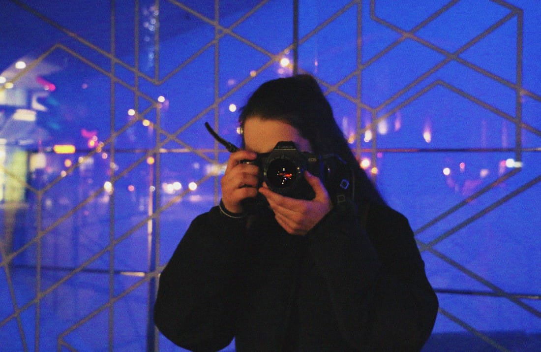
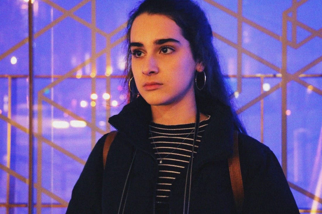
MY RESPONSE - For my response I continued to shoot photos of people through glass. I made the portraits abstract by including reflections and bright colours, as well as the bokeh effect in the background.
|
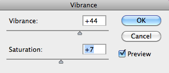
EDITED: To edit these photos I only increased the vibrance of the colours and added grain (noise) to the photos in order to reflect that vintage effect that can be achieved through using a film camera.
|
|
|
|
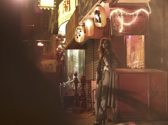
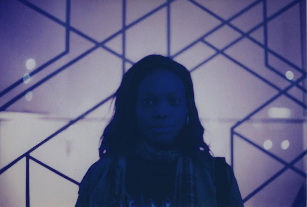
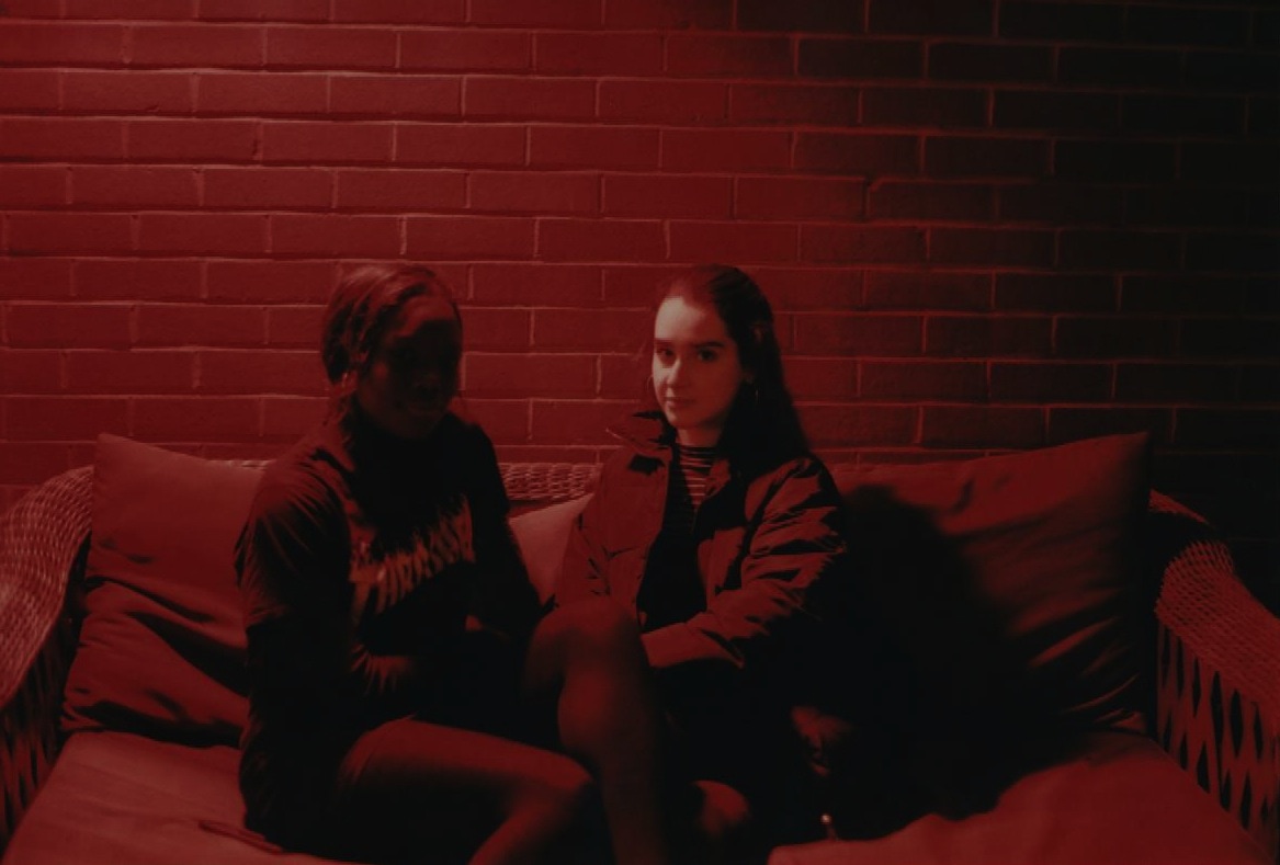
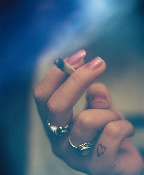
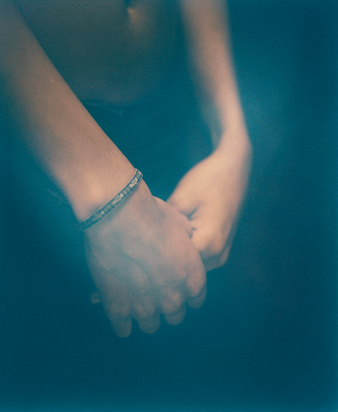
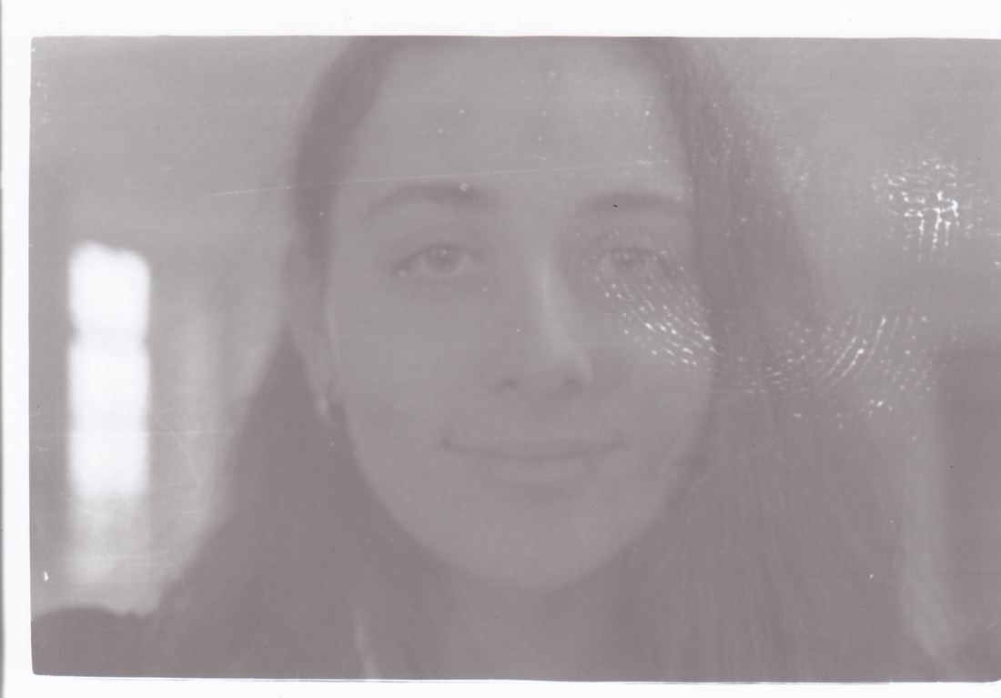
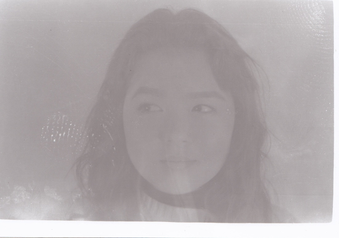
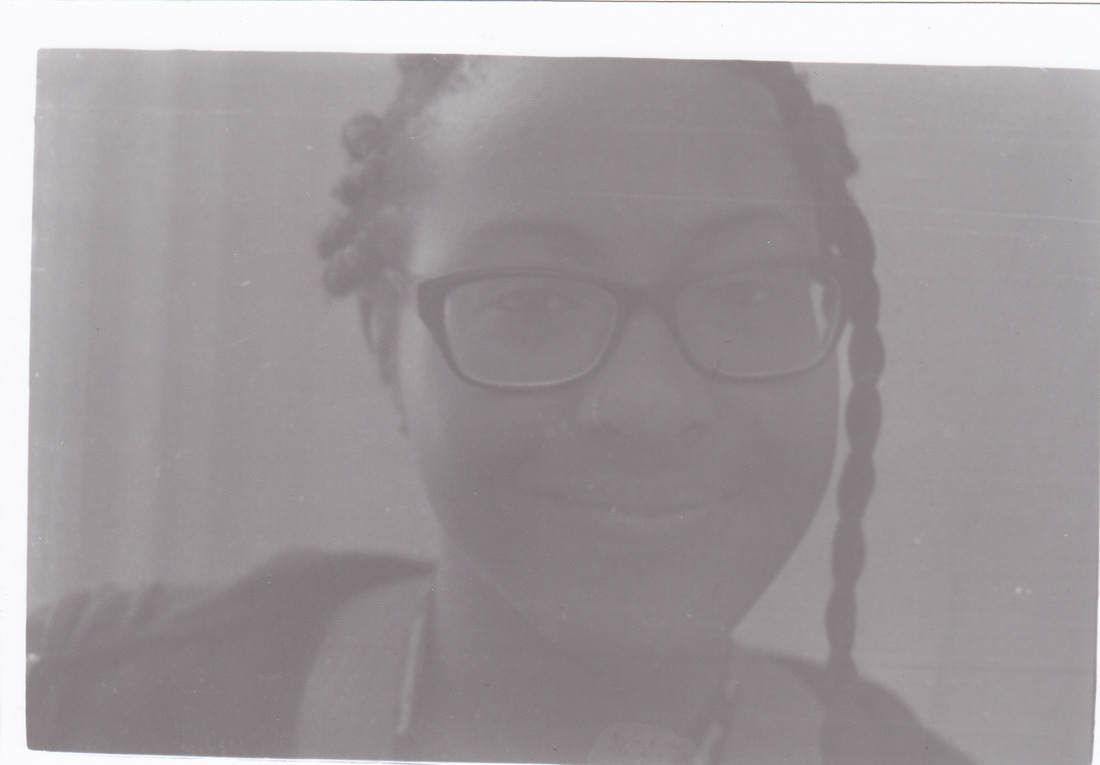
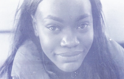
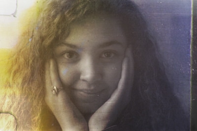
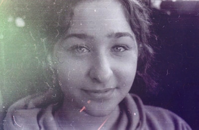
DEVELOPMENT (film)
For my third development I decided to experiment with film photography, but still continuing the theme of portraiture and abstraction. I though it would be interesting to work with film and for further developments distort the photos even more by working on the negatives themselves.
I was inspired by two artists who use film to create this response.
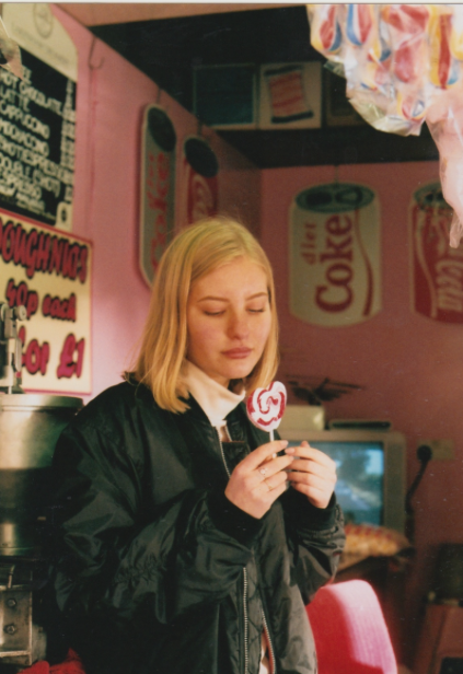
Chloe Sheppard - A 20 year old photographer based in London, who explores film photography in all of her shoots. She takes portriat photos of her friends and emphasises the raw colours. Her photography is inspired by the past and it includes a lot of feminist beliefs.
I was inspired by two artists who use film to create this response.
Chloe Sheppard - A 20 year old photographer based in London, who explores film photography in all of her shoots. She takes portriat photos of her friends and emphasises the raw colours. Her photography is inspired by the past and it includes a lot of feminist beliefs.
Edie Sunday - A 26 year old student juggling a phd in psychology and photograaphy, manages to take incredible photos using film. Her work reflects the surreal nature of lucid dreaming. The colours in her work fade together to represent the state of unconciousness in between dreaming and waking up.
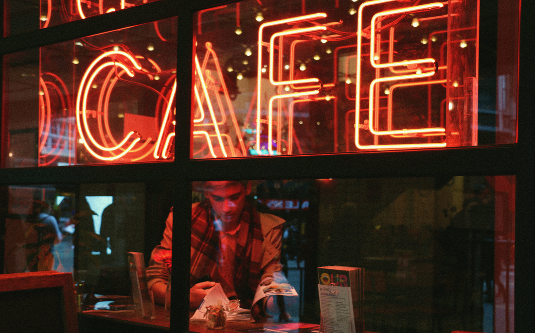
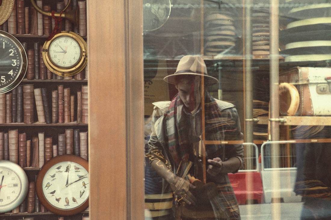
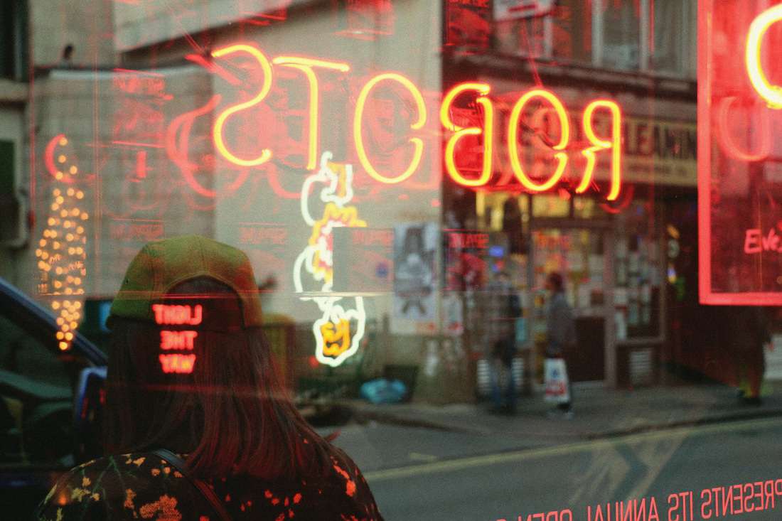
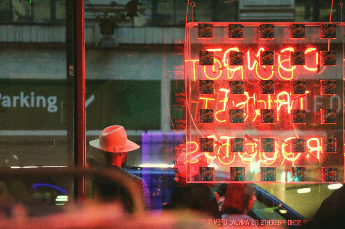
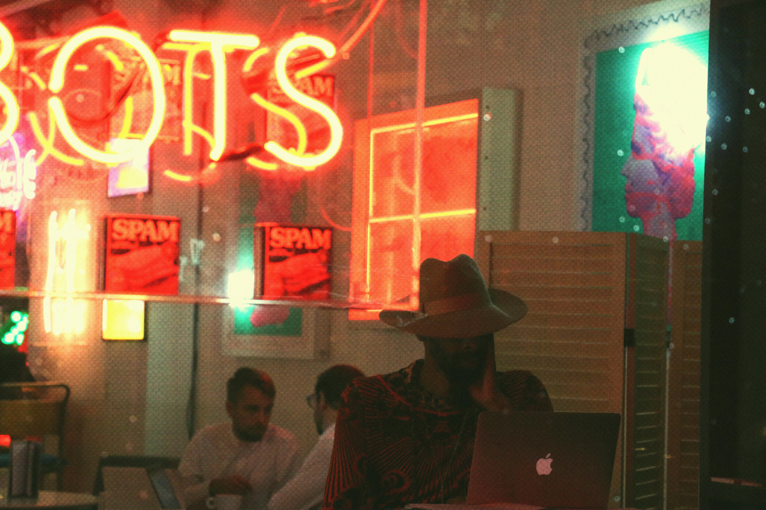
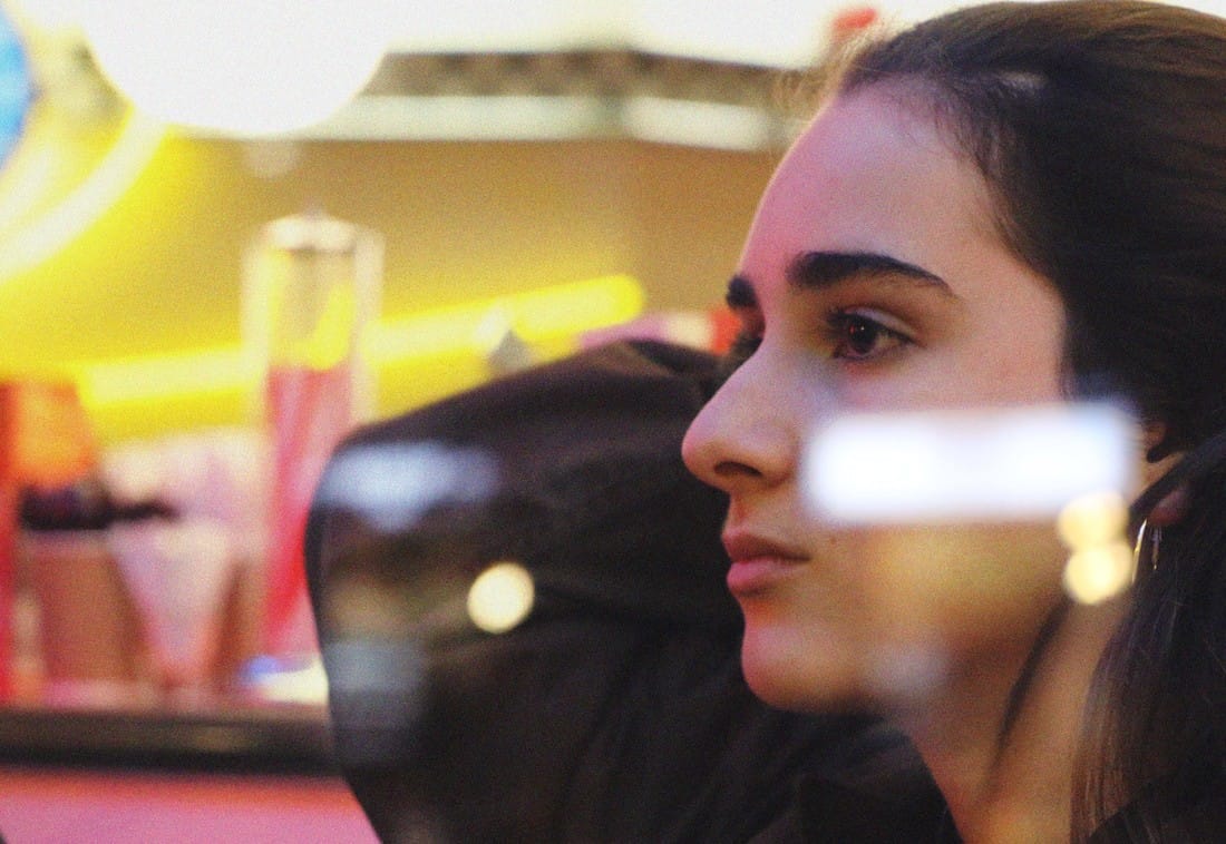
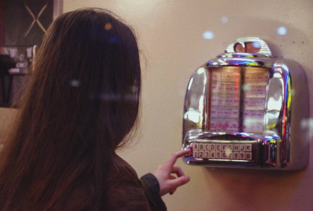
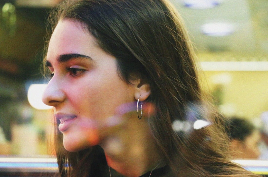
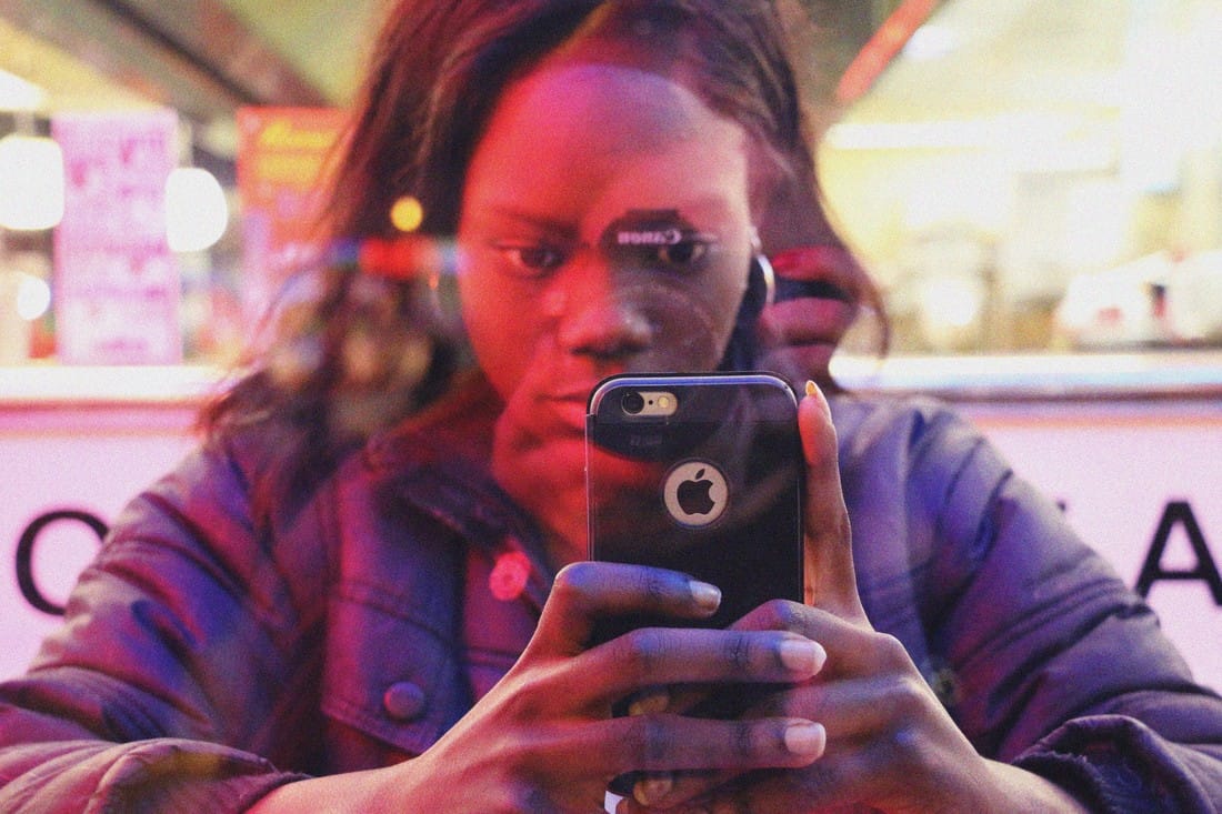
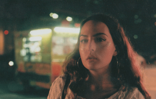
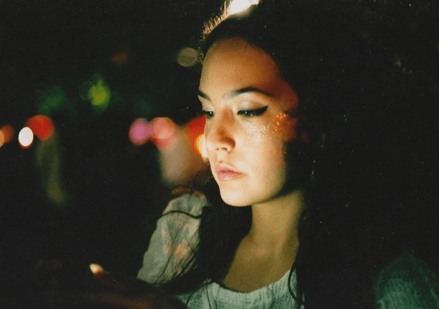
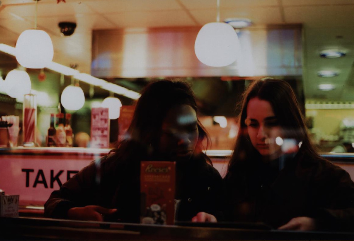
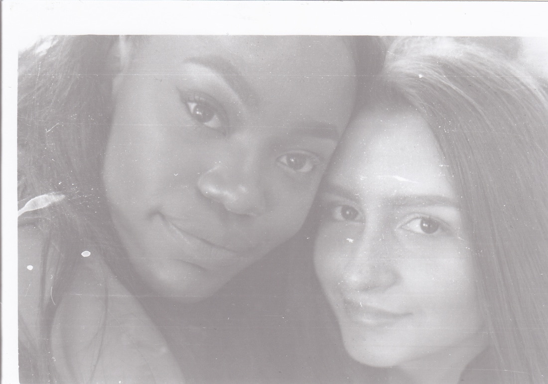
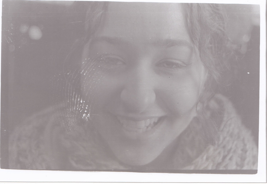
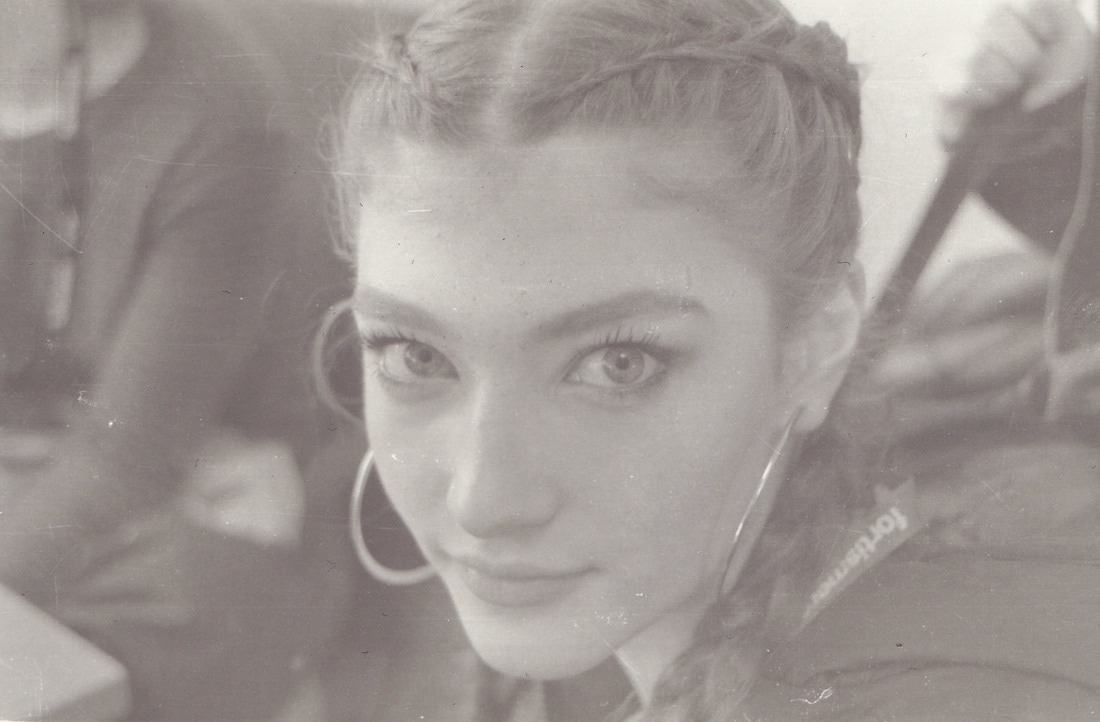
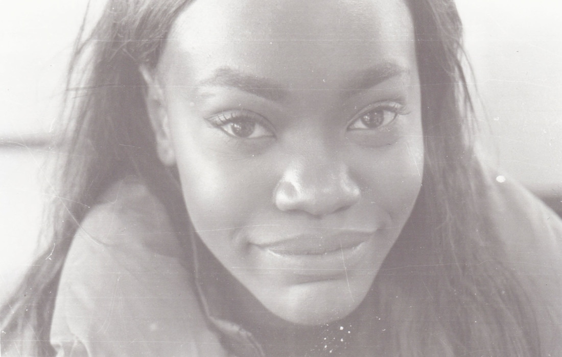
I wanted to take film photos in the same style I shot photos for my Saul Leiter response as well as for my second development. Continuing with the theme of reflection, light, colour and portraiture. I wanted the photos to have more of a vintage feel to them, instead of trying to edit the film effect in.
CONTACT SHEET:
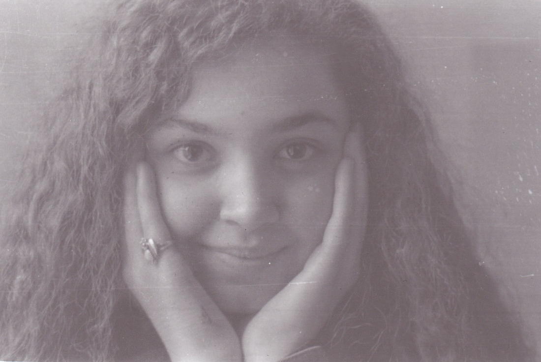
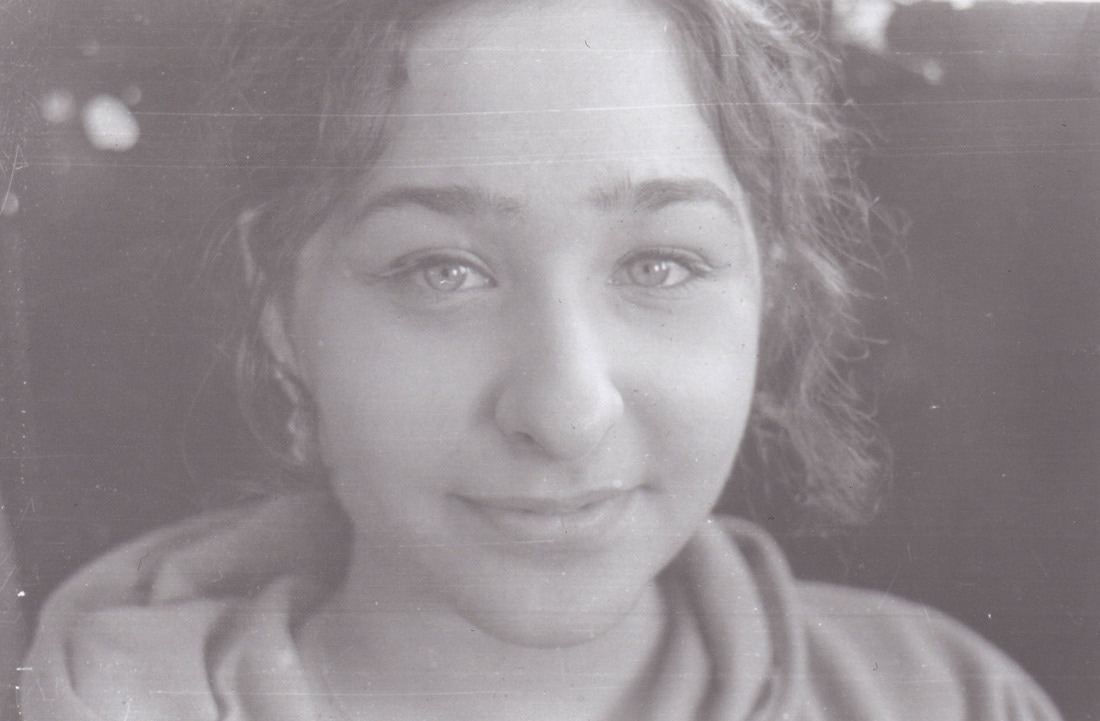
MY RESPONSE:
I did not edit these photos because I didn't want to ruin the rawness of film photography.
I did not edit these photos because I didn't want to ruin the rawness of film photography.
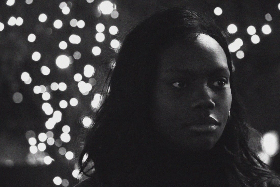
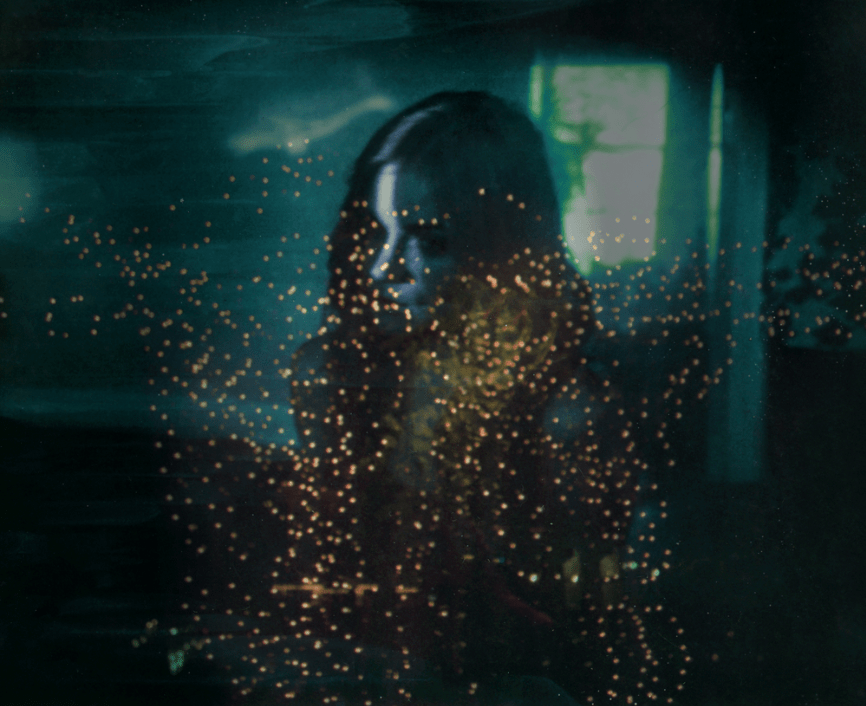
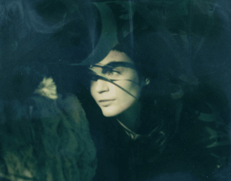
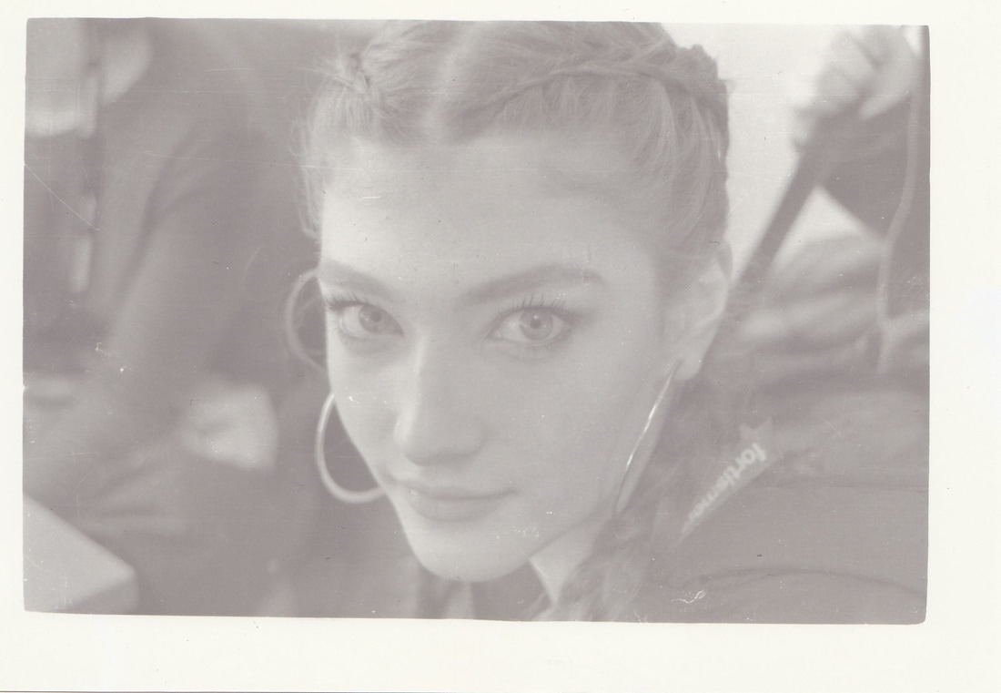
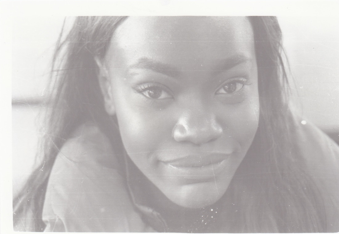
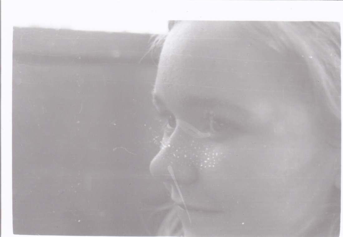
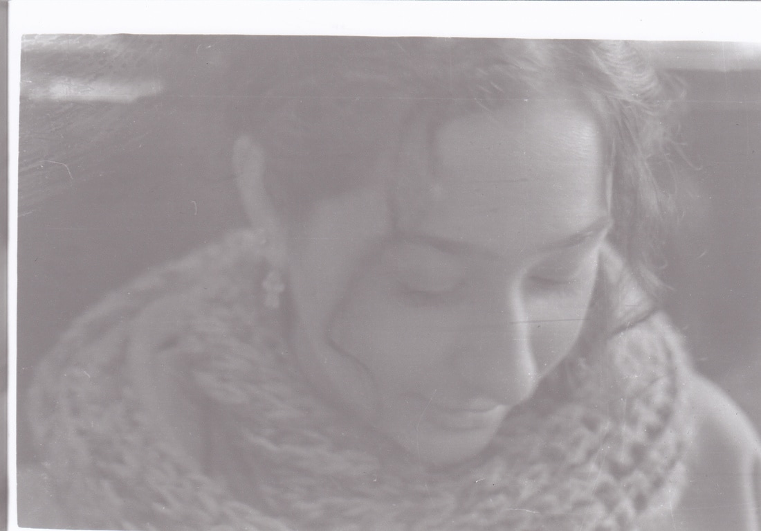
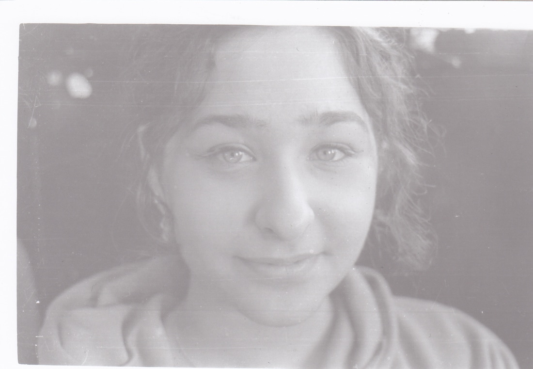
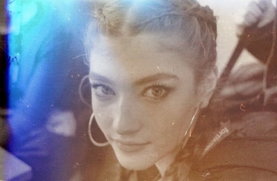
DEVELOPMENT (close up + washout colours)
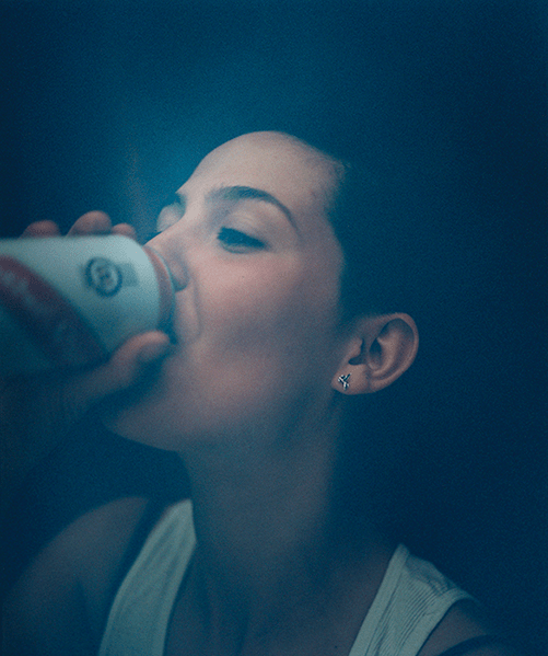
Tyrone Lebon - A fashion and portrait photographer based in Los Angeles and London. He shot photos for brands like Louis Vuitton as well as Calvin Klein and Topshop. The series of his work that I am focusing on is 'Nothing Last Forever'. It is a photography book of a collection of photos that share a colour palette of shades of blue and some delicate warm colours. The close ups have a strong focus point and a large depth of field.
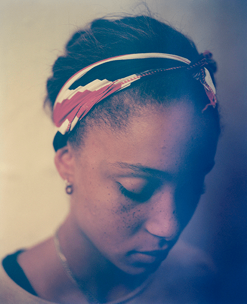
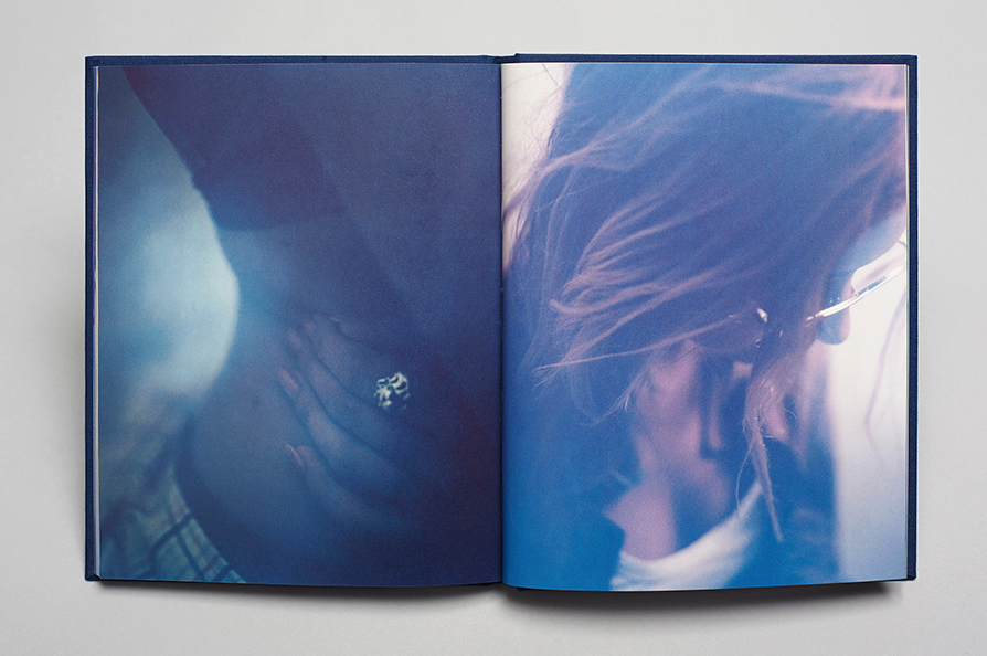
Jacob Sutton - Sutton is another photographer that used a similar technique in his photos as Tyrone Lebon. His series of photographs are black and white and focus on specific facial featues of the model. The background is very blurry and fades in grey which contrasts to the sharp focus on the model.
I am going to incorporate these techniques into my series of close up photographs, while continuing the theme of portraiture and abstraction and bringing in more attention to detail. I will use a film camera to take these photos.
CONTACT SHEET:


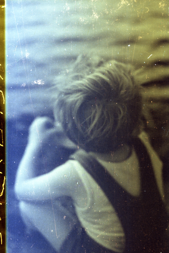
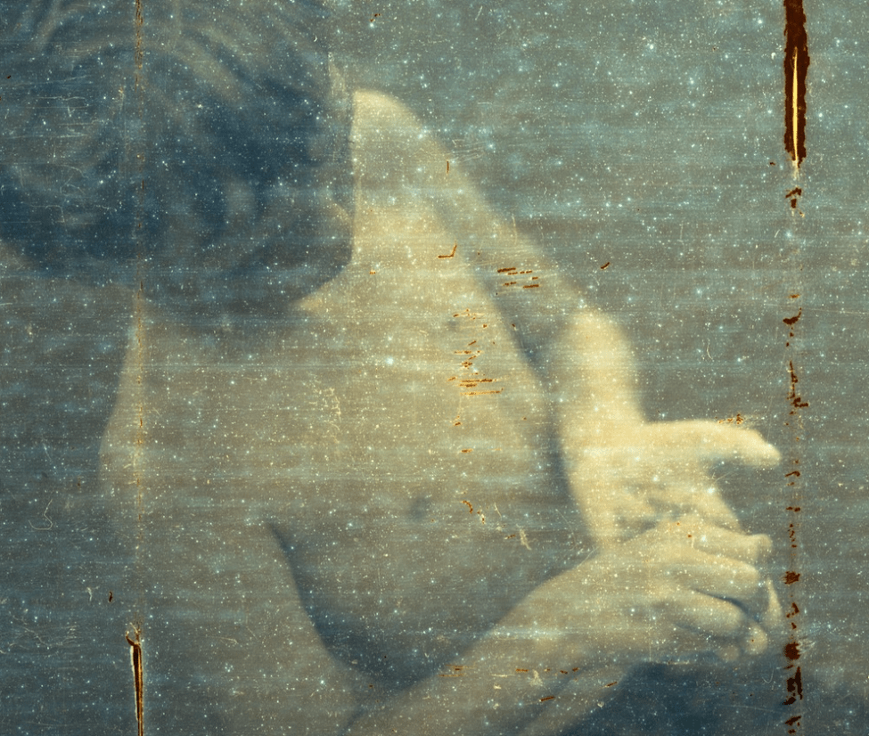
MY RESPONSE:
The photos that I took for this development I took on a canon film camera.
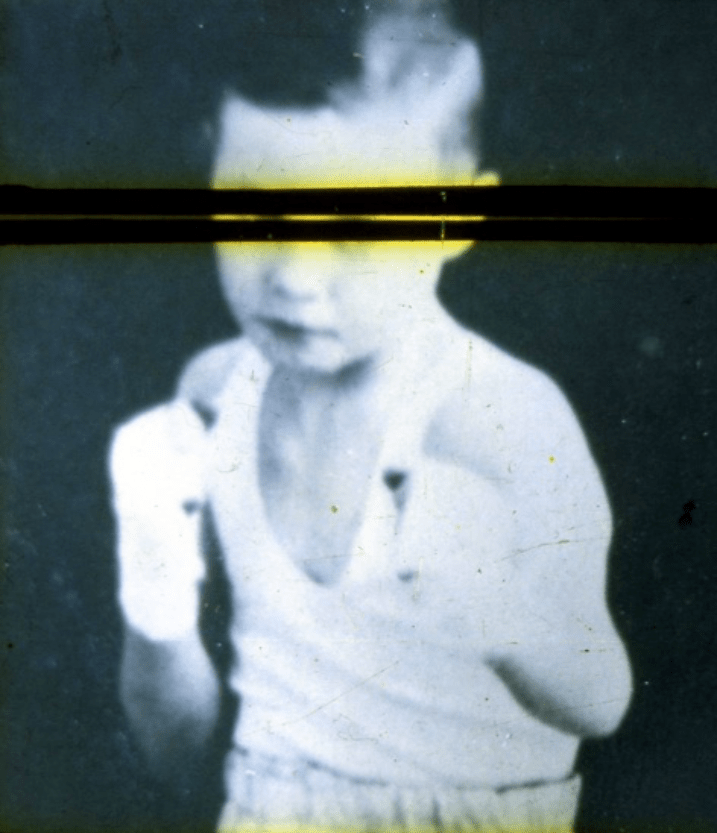
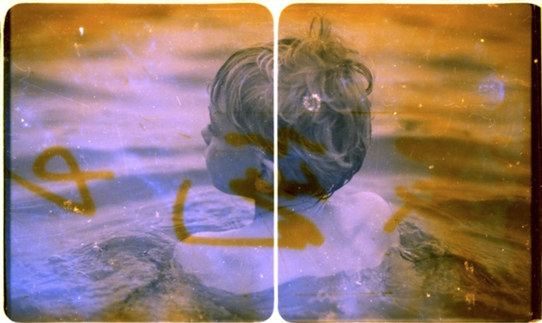
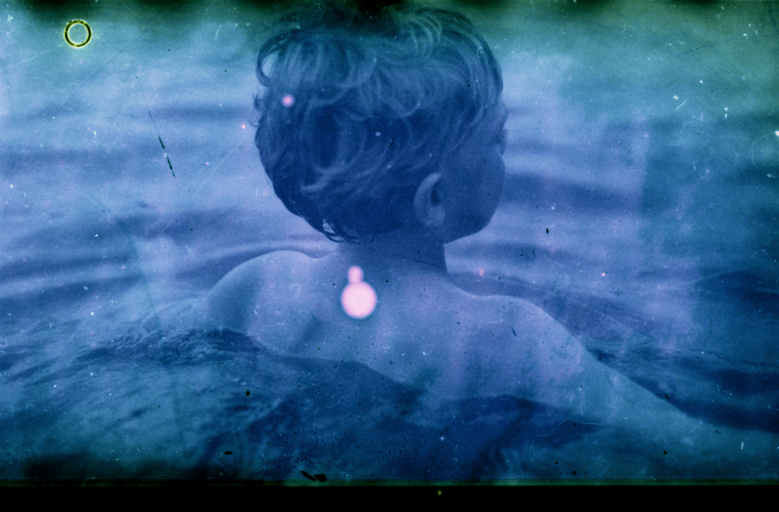
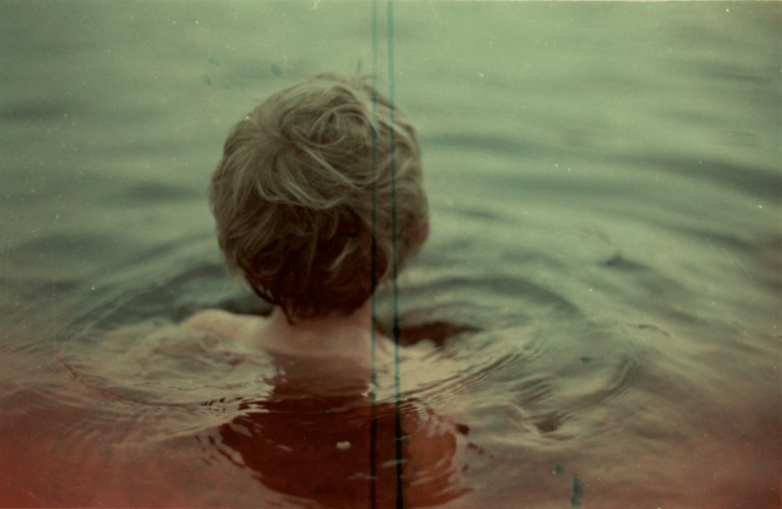
DEVELOPMENT (bleach film)
Robin Cracknell - A London based photographer captures the timelessness of memories in his photographs, focusing on documenting his son growing up. He uses a combination of traditional film photography, cimatography and the use of text and drawings to produce formless narratives in his work.
DEVELOPMENT
FINAL